Due to the gradual shift away from tape-based mediums and toward digital mastering, hardware scopes are used less, but still persist inside software. To those video industry creatives who were not trained in the machine room, scopes can be intimidating. Nevertheless, understanding scopes should be part of every video professional’s core knowledge base, and is especially crucial to the colorist. Here are three practical ways to use scopes in Resolve.
Ascertain Color Bias
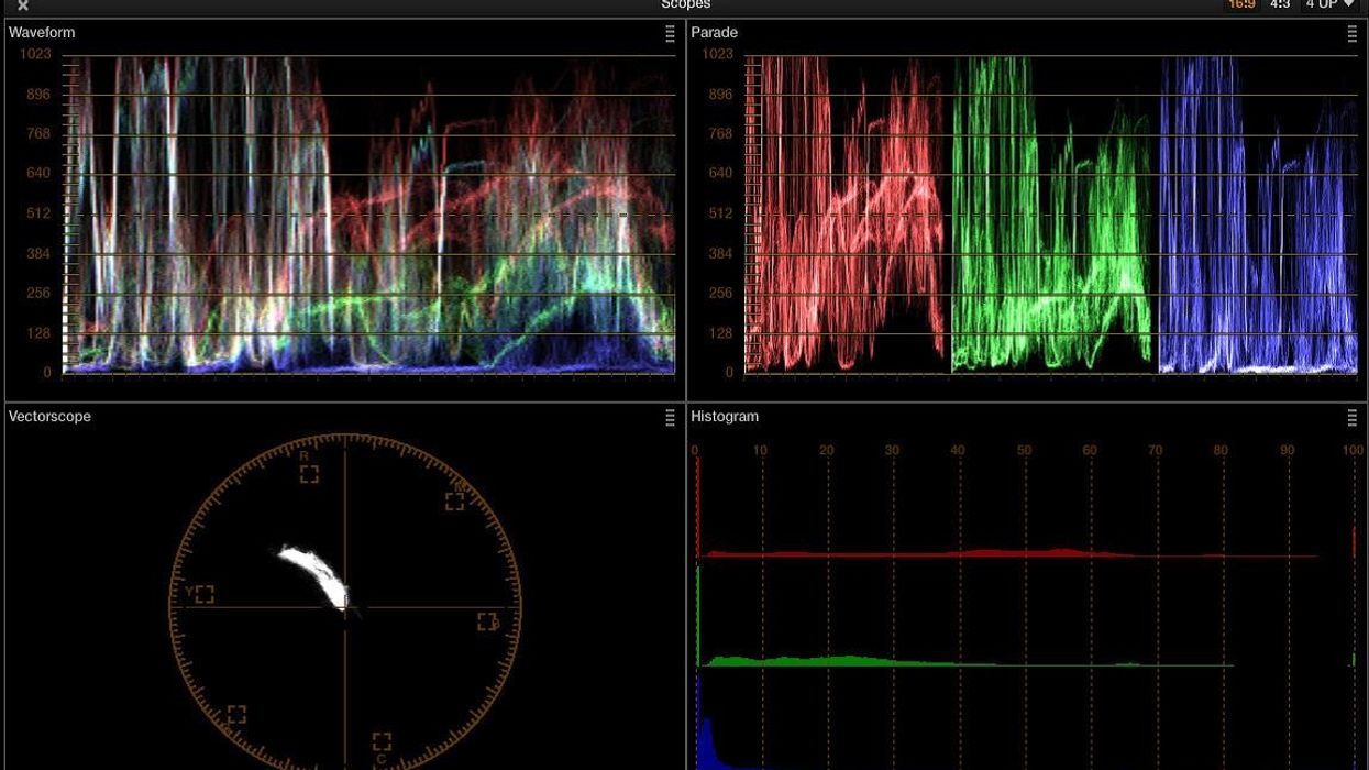
Scopes can immediately tell you how an image is tinted. I like to grade in a subtractive manner by evaluating what's wrong with the image and performing the opposite action to correct for the bias. Scopes communicate information in a more efficient way than our eyes, since our vision acclimates to an image within seconds. Our environment also affects how we perceive images, and sometimes grading is performed in suboptimal conditions, like on-set grading environments where a dark environment with neutral grey walls is unattainable. Scopes, on the other hand, present a readout of the visual image that is mathematically absolute as opposed to aesthetically subjective.
Scopes can also be used to balance the whites and blacks. Using the waveform view and the color wheels, the three color channels will combine to create white when there is no color contamination in the highlights or shadows. In the image below, the back wall has a reddish hue, and the scopes confirm this. In the correction, I nudge the highlights to compensate for the color shift to create a true white, which creates a more natural look.
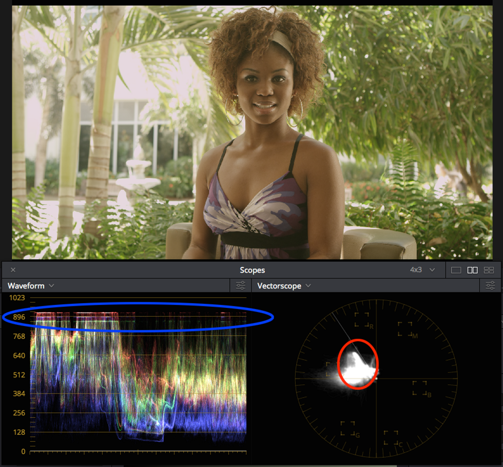
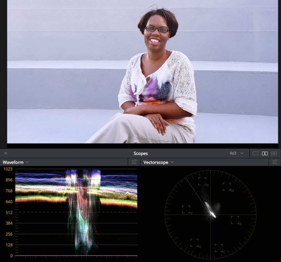
In this image, the wall behind the subject looks strange, and sure enough the scopes read a red-magenta bias in the highlights (blue oval). A vectorscope blob representing the subject's skin rests below the skin tone guideline (red circle). While the skin indicator is only a rough indicator of where skin tones are likely to land, these two clues will aid in creating an initial correction.
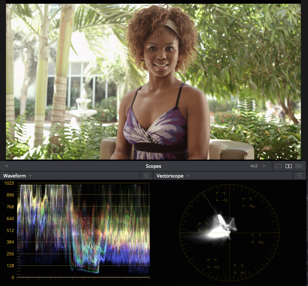
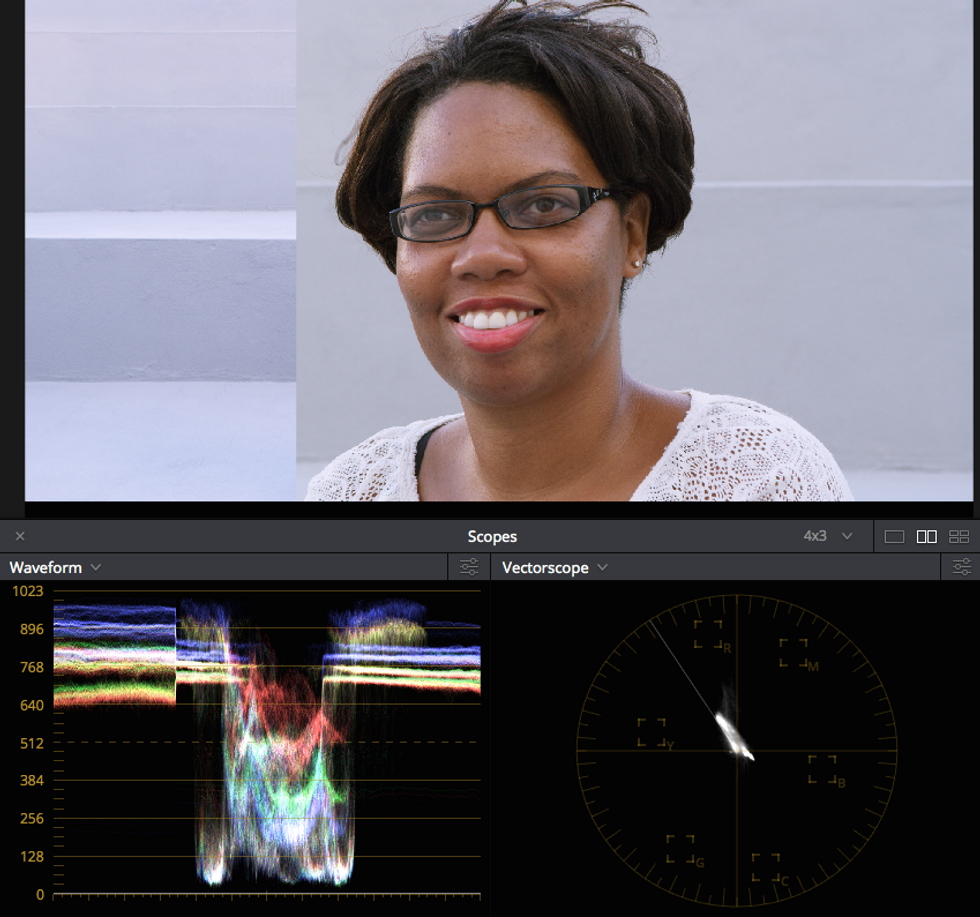
While the image is far from complete, already the image is looking better. The blacks and whites haven't been too pushed and the highlights are now white, as indicated by the white in the waveform's upper register. The smudge on the vectorscope representing the subject's skin is closer aligned to the skin tone indicator, and sure enough the subject looks healthier than before.
Dial in Product Shots
Use scopes to evaluate the colors in a product shot. Cameras may capture aberrant reflections or muted colors compared to the high gloss and saturation that product packaging employs. Since product colors tend to incorporate very specific tones, pulling a decent key on the elements to be treated should be a cinch. The scopes can be used to dial in their exact colors and even match them against the stills from a print campaign. Adjust the hue and saturation values until the colors line up.
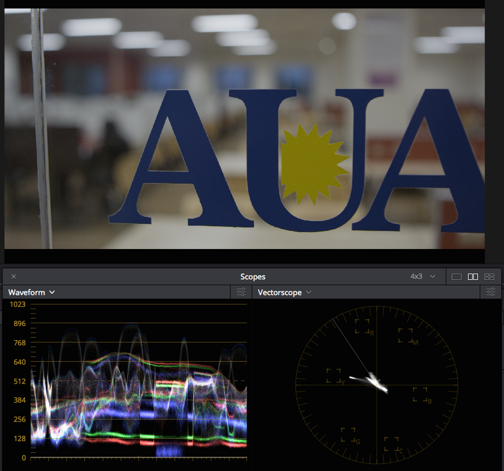
The client's logo, here featured on a glass door, needs brightening. They've informed me that the sunburst should be a saturated yellow. It's looking a bit dingy at the moment, which can be observed on the vectorscope streak that falls short of the yellow box, a rough indicator for where the client's color may fall.
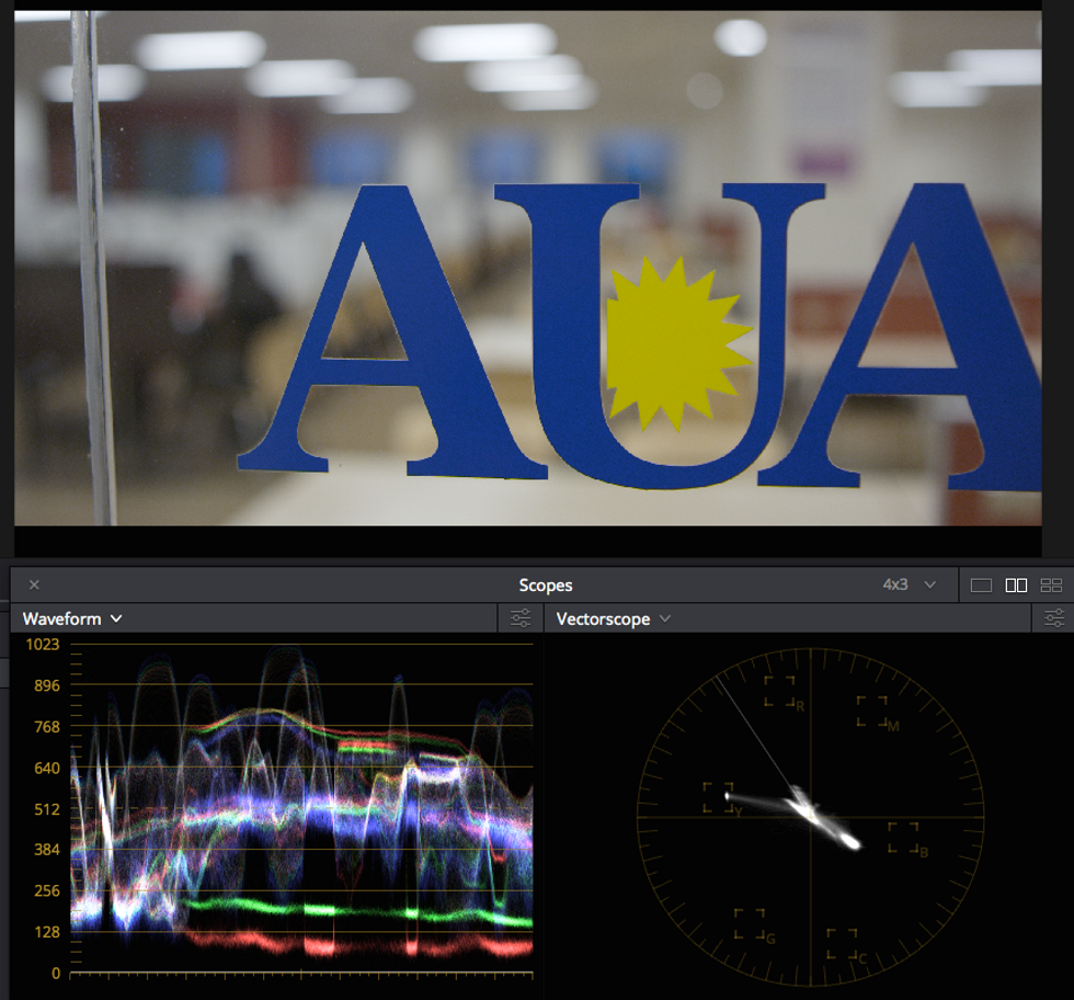
After brightening the shot overall, separate keys were pulled on both the blue letters and the yellow sun and affected individually. The sun's saturation is now neatly in the yellow vectorscope square, which the client prefers.
Match Shots and Balance Backgrounds
Without scopes, significant time will be spent going back and forth trying to match two shots by eye. Instead, after achieving a primary grade on a master shot, use Grab Still and Play Still to place the image alongside another. Align the three color channels in the parade or vectorscope representing the background as best as possible. Adjust the luminance to get it even closer. With some practice you should be able to achieve a match without looking at the image at all.
Here's our wide master shot that we'll use for matching the closeup. Grab a still of it for reference.
Play Still allows us to compare two shots side by side. The waveform shows a visual representation of exactly how mismatched the two shots are.
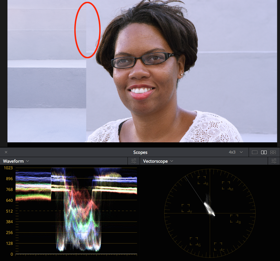
By using the master shot as a guide and working with the closeup image further, the backgrounds edge much closer together, nearly becoming seamless (red circle). The waveforms are also much closer together, although note that there are multiple brightness values as the light hits different parts of the stairs where she's sitting.
At the end of the day of highest importance is that shots match consistently throughout the program. Using stills will help with consistency so that the colors don't drift over time.
What other ways of using scopes have you found useful? Let us know in the comments.
Tristan Kneschke operates Exit Editorial, which specializes in high-end fashion color grading, in New York City.
 No Film School's coverage of