Watch: What Makes the 10 Best Title Sequences of All Time So Compelling?
Title design is all about how you use these four basic ingredients.
Movie titles are an art form in and of themselves. In fact, they might even be considered your screenplay’s true hero.
This new video essay from CineFix gives some meaningful details about cinema history’s best opening title sequences. After watching this, you might consider your film's titles not as an afterthought, but as an integral part of your production.
There are four visual elements or techniques that stand out among the top title designs:
Typography
Typography, or the way that your letters are arranged, is the one thing that every title sequence has in common, but its usage varies wildly and can be just as memorable as the film itself. After all, what is Star Wars without its iconic scrolling text prelude?
CineFix made a bold choice with its pick of Gaspar Noe’s Enter the Void (2009) as #10 on the list, just as Noe made bold choices with his typography. As the essayist states, “The styles are bold, bright, eclectic, even tacky or cliche, but they’re also carefully thought out and deeply personal, with each individual title carefully thought out to evoke its character or crew member.”
Graphic design
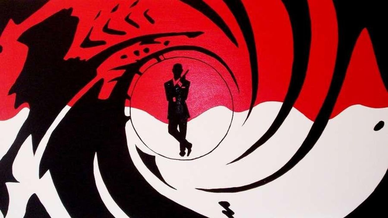
Graphic design includes typography but takes it a step further to include other visual elements, like photography and shapes. James Bond movie titles are the stuff of graphic design legend— to the point where they are made into outstanding title mashups and myriad internet memes. CineFix chose Goldfinger as its #9 pick, particularly because of its innovative overlay of cinematic images and evocative shapes. These titles accomplish one of the things titles are meant for: setting the tone for the film.
The Goldfinger titles were created by Robert Brownjohn, but it’s Maurice Binder who did most of the Bond films, with a whopping 14 titles from the franchise to his name. CineFix gave the #7 spot on their list to Binder’s first, Dr. No (1962). Explaining the choice, the narrator recounts that Brownjohn “seems to have somehow captured the suave, hip, uber-cool, hyper-masculine metropolitan-ness of the character of Bond with nothing more than a grid of colorful circles; that’s graphic design at its finest.”
Cinematic imagery
Most title sequences don’t just employ graphic design. Naturally, the majority include film imagery, which can be used not only to set the tone of the film but also to set up its actual story. One of the most brilliant ways to do this—which lends itself to text overlay—is with a long take. This is done beautifully in the #6 choice,Touch of Evil (1958), wherein we follow the camera through a crime-in-progress that unfolds over three minutes.
Cinematic imagery can also be used to literally set the scene, as so many New York-based films have done, giving us glimpses of the iconic city skyline. The essayist describes how this is done in the #3 choice, Taxi Driver (1976): “Taxi Driver’s steamy, grinding, rain-smeared tour of [New York City's] nighttime underbelly is perhaps the most enduring.”
It’s also noted how important music is in an opening sequence, a topic which really deserves a post all its own. “Set to the same brilliant Bernard Herrmann jazz score you might expect of a sequence that romanticizes an NYC taxi driver, it instead builds a contrast, and right from the jump, we are transported into the world of Travis Bickle, peering solitarily through the distorted lens at the scum with which we’re surrounded.”
Foreshadowing
Particularly interesting about the Taxi Driver opening is that the Chemtone process that was used to create the smearing lights effect is used again in the very last scene of the film, creating a sense of foreshadowing.
Title images can also be used for foreshadowing without explicitly being part of the story, like in CineFix’s #5 choice, Fight Club (1999), which uses a dark mix of synaptic brain imagery and closeups of explicit violence to the point where “we begin to suspect the shape of the truth before we know its specifics.”
Animation & CGI
A classic title sequence technique that often involves each of the other three elements is animation or CGI. Many live-action films have kicked off with animated or hybrid-animated introductions. If done cheaply, this can come off cheesy, but if done well, it can work wonders to bring a viewer out of the cinema and into the world of your film.
In CineFix’s #8 choice, Catch Me if You Can (2002), a perfectly retro-feeling style and color palette are employed to create an animation that tells a microcosm of the film’s story. Even more suitable to the movie’s vintage aesthetic, the sequence was hand-animated on paper with hand-carved stamps and then composited onto computerized backgrounds. What better way to set the tone for this stylized drama?
CGI is used to spectacular effect in #3 on the list, Lord of War (2005). CGI doesn’t create creatures or explosions here; rather, it allows us to follow a dramatic POV shot of a single bullet’s journey from the production lines to the forehead of an unsuspecting victim.
Some of the greatest title designers experimented with all of these elements, as with CineFix’s #1 choice: the entire body of work of Saul Bass, who created more than 60 iconic sequences, including for everything from Hitchcock’s Vertigo to Scorsese’s Goodfellas.
There are so many other notable title sequences and tactics from cinema history. What’s your favorite? Let us know in the comments.


![Ethos, Pathos, Logos: 20 Effective Ways to Advertise [Infographic]](https://nofilmschool.com/media-library/ethos-pathos-logos-20-effective-ways-to-advertise-infographic.jpg?id=34064614&width=600&height=600&quality=90&coordinates=560%2C0%2C0%2C0)