Here's How You Can Give Your Film the Summer Blockbuster Look
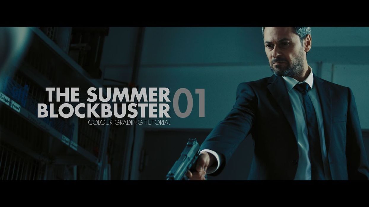
If you've seen a big tentpole movie release in the last 5 years, there's a good chance the color grading has skewed heavily towards teal and orange. Countless movies have used this grading scheme for one simple reason: it works. The fact that only a handful of post houses handle final color correction and grading for most of the big Hollywood films probably factors into its popularity, but if you'd like to give your movie a bigger budget feel, check out this tutorial from Juan Melara below:
While Juan is using Blackmagic DaVinci Resolve for the grade here, you could accomplish this look in any grading app that gives control over specific nodes or layers. Some of you probably have some pretty strong opinions about the look, but it does work well for separating skin tones from the rest of the background. The ancillary benefit is that since people subconsciously associate this look with Hollywood films, it can help make your work stand out from the rest of the pack.
He has also posted a few color grading breakdowns, as well as some examples showing what his Kodak film stock LUT can do. The first is footage from Alex Montoya’s film Maquillaje:
For more helpful tips on grading, and to check out the film LUTs, head on over to Juan's website.
Links: