There's quite a number of idioms we use in English to communicate how we feel. For instance, when we're sad we say we're "feeling blue," or when we're angry we say we're "seeing red." But—last time I checked humans can't really—feel colors. So, why does it make so much sense?
We're getting into color theory territory with that question and there are a lot of thoughts and ideas that try their hand at answering it, but regardless of whether or not the emotional response we experience from colors is due to nature or nurture (or both), the fact still remains that it does occur and using colors as a means to convey a message does work. (Just ask any marketing agency.)
This is why paying close attention to the kinds of colors you're using in your films is so important, because whether you intend them to do so or not, every single color is communicating to your audience or eliciting an emotional response. So, if you have a good idea of what kinds of emotional connotations each color has attached to it, you could use them effectively to tell more interesting stories.
StudioBinder has created an infographic that illustrates the psychology behind the use of color in film—each color containing a list of emotions or qualities that are connected to it. Check it out below:
 The Psychology of ColorCredit: StudioBinder
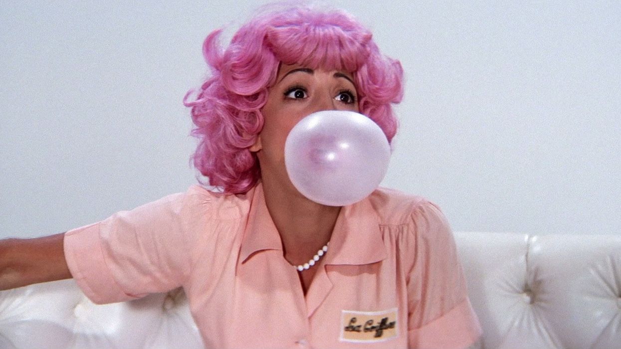
Choosing a color palette for your film is tricky if you don't know which emotions go with which color. While some are more straightforward than others, like red with passion and danger and blue with sadness and tranquility, colors like purple, yellow, and pink may prove to be a little more tricky to find their emotional connotations. However, as demonstrated by the infographic, studying how films have treated these colors can inspire the way you choose to treat them in your own work—I mean, Denis Villeneuve chose different colors to represent certain ideals of morality in Sicario: blue for justice, black for corruption, and beige for the true morally ambiguous nature of human beings.
This infographic is actually a snippet from an e-book StudioBinder will be releasing within the next few weeks. So, if you're interested in learning more about it, head on over to StudioBinder's website.
Source: StudioBinder—Imgur


![Ethos, Pathos, Logos: 20 Effective Ways to Advertise [Infographic]](https://nofilmschool.com/media-library/ethos-pathos-logos-20-effective-ways-to-advertise-infographic.jpg?id=34064614&width=600&height=600&quality=90&coordinates=560%2C0%2C0%2C0)