How Filmmakers Are Making Text Graphics Pop in 2018
Here are some of this year's trendiest text graphics (so far) that might give you some new ideas.
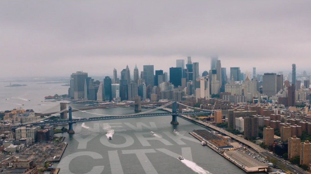
One thing that all great films have are really good text graphics. Whether they are movie titles, lower thirds, or even end credits, talented filmmakers and designers find ways of incorporating new and creative elements into the text we see up on screen, and even though 2018 has just begun, it's shaping up to be a pretty stylish year in text graphics.
In this video, StudioBinder lists several popular trends in text graphics that you'll see in films and TV shows in the coming months, some of which may not only show you how to use them wisely in your own films but also inspire your own designs. Check it out below:
Whether you want to go big and bold or use some kinetic typography, the art of designing text graphics is as expansive as your own imagination. Names like Tom Kan, whose has worked on text graphics for Enter the Void and Speed Racer, and Saul Bass, who is basically the godfather of title sequences, are great sources of inspiration if you want to take your text graphics to the next level.
In fact, it wouldn't be a bad idea to study the title sequences and text graphics of many different kinds of films and TV shows—old, new, and from varying genres—to get an idea of what techniques graphic designers use to establish mood and create a style for a project.
What is your favorite title sequence? What kinds of techniques have you used in your own text graphics? Let us know down in the comments.
Source: StudioBinder