Those of you who have finished a project know that the post-post production life can be a bit difficult. Even Ingmar Bergman admitted to a general malaise after production on Persona wrapped in 1965. Bergman wrote in his diary that since the filming had ended and his stars and crew were headed back home, he was left alone, depressed, and self-pitying: "On Monday the endless saga at the Royal Dramatic Theatre begins again. How will I put up with it?" A few months later he resigned his post as head of the theatre.
The adjustment back to normalcy after pouring every ounce of energy into your film is indeed tough and many of us don't even have the luxury of falling back on being the head of a national theater company to keep us busy. We take solace in refining the details and extending the dream as long as we can. One great way to do that is through designing and releasing promotional materials. It's fun, easy, and for the most part, way less stressful than anything else you've done for your film so far. No one's going to judge your filmmaking abilities off of a poster, and that is a very liberating sentiment.
For me, movie poster design and cutting a trailer are really the last two things I can do to extend the life of my short as its fate is judged by strangers in far-off cities around the world. While the search for an artist can be difficult (it took me about two months to finally nail down a partner), the process itself can be very quick if you have an idea in mind that you're able to easily communicate. It's even better if you can familiarize yourself a little with Photoshop and are able to mock-up a terrible design that the artist can then improve.
Here is an example of the process I went through with my poster artist, Ali Hoffman.
Coming up with movie poster ideas is probably the most challenging part, but I had been sitting on a sample for our movie poster design for three or four years already. I'd been using it as a way to build up an aesthetic for potential backers while crowdfunding and as an entry point for my own crew into the world we were trying to create. You can see it in the background of the Kickstarter video I created, next to the dude in a tuxedo standing with an electric razor in his hand. Or below.

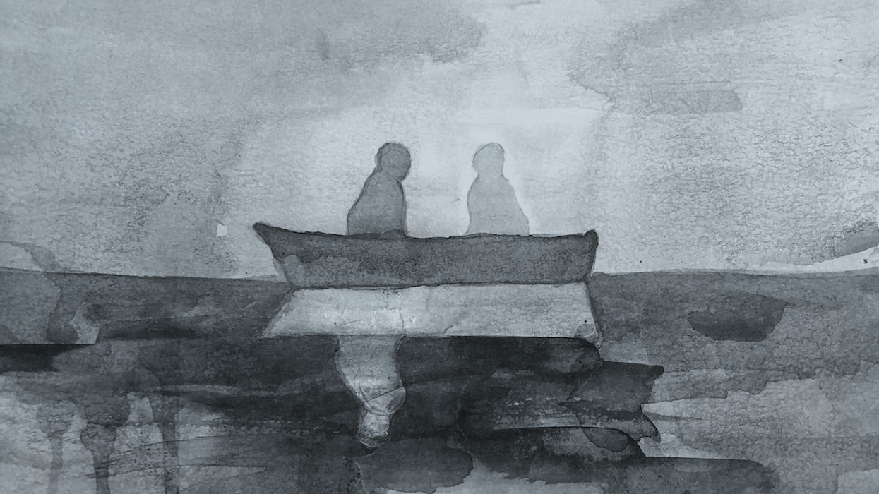
It seemed like a sensible place to start. Ali is a very talented watercolorist, so we went back and forth for a bit on how we could update this into something a little more groovy. At first, it didn't go so well.

But after some encouragement and nailing down a few more details, our collaboration led to this.

A valuable lesson here was one that rang true throughout the entire filmmaking process and that was to play to your artist's strengths.
One thing that wasn't so clear, however, was how we would get that super professional looking credits block at the bottom of the one sheet. Our movie poster design wasn't yet complete. Thank God we have the internet because, after about an hour of experimentation with different Photoshop templates, I found one that works really well and wanted to share it here. I found an article by the aptly named "tipsquirrel.com" whose apparently "nuts about Adobe". What makes this template so great is that it effectively has a different key for each credit designation, such as, "EDITED BY" "MUSIC BY", etc.

When you download the template for the movie poster design, the zip file contains a map to these designations, the font, which can be substituted for another ultra condensed typeface if you'd like. Popular poster typefaces include Bee, Univers Thin UltraCondensed, Tall Skinny Condensed, and Triple Condensed Gothic. You can switch between regular letters and credit designations by simply using lower case for credits and upper case for names.
Another thing to take into consideration for your movie poster design is what visual artists call the rule of thirds. The rule of thirds is used in visual arts such as photography, art and design that divides an image into nine equal sections- two equally spaced horizontal lines and two equally spaced vertical lines. It is believed that following the rule of thirds is more effective in creating energy and interest to an image and placing the subject of the image within the nine sections than just typically centering the subject.
This is a lot less complicated than it sounds. My artist and I abided by this rule by splitting it up into three simple sections for the eye, the title at the top, the image in the middle, and the credits block at the bottom should be enough. We had a lot of fun with the movie poster design and so we decided to go ahead and come up with a few more movie poster ideas to make an alternate as well, using the same process. Here's the terrible mockup I sent her.

And her response:

We were pretty much on the same page here, but I was interested in making the poster look less digital and more minimalist. I found a piece of clip art and a poster I liked online for reference.


And that did the trick:

- Martin Scorsese's Advice to Aspiring Filmmakers ›
- The Difference Between 'Story By,' 'Screenplay By,' and 'Written By' ›
- Film Crew Positions And Why All Jobs on a Movie Set Matter ›