Even if you've never boned up on a lick of color theory, you already know a lot about it. Think about it. You know that feeling blue means feeling sad. When something is red hot it's super duper hot. Shoot, even if I said, "Hey guys, I'm feeling really yellow today," you'd probably have a good idea of what that means. But why? And how can colors be utilized to make your storytelling better?
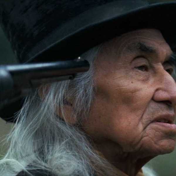
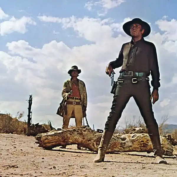
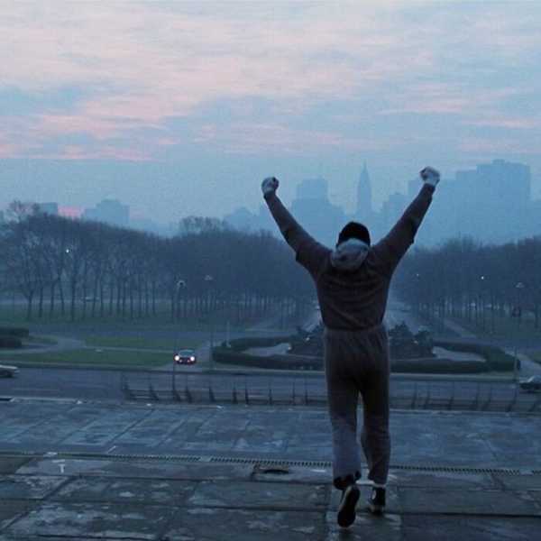
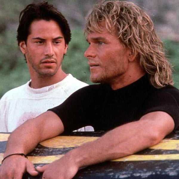
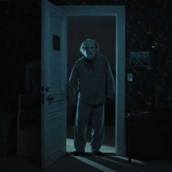
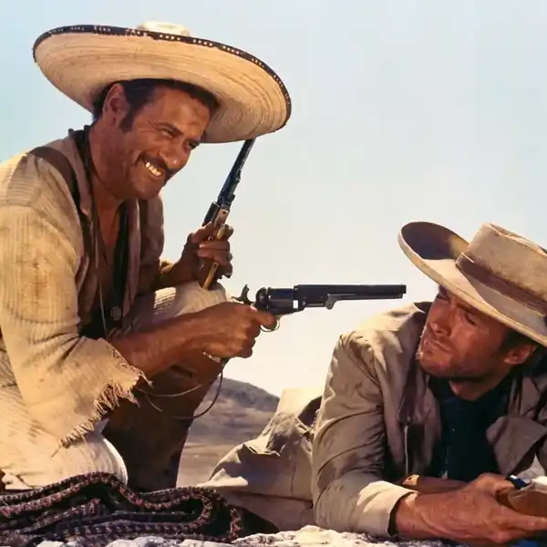
Well, just check out this supercut by Kat Smith. In it, we see the colors filmmakers have used in their films to not only create moods and atmospheres, but to also inspire specific emotions in their viewers.
It's no secret that color can manipulate people's moods and emotions. Marketers use them all the time to inspire customers to buy products or communicate the idea of a company or brand. Think about it, which colors come to mind when you think of fast food? Red and yellow, right? You've got McDonald's, Carl's Jr./Hardees, KFC, Burger King, Sonic, In-n-Out — the list goes on. Why do all of these fast food companies use these two colors in their logos? It has everything to do with the psychology of color. Red says "hunger" and "appetite", while yellow says "happy" and "friendly". Even the combination of the two colors communicates speed. So, according to color theory, when you see a red and yellow sign you think, "Whoa! I'm hungry, that place looks friendly enough to make me happy, and I can be fed in no time at all!"

And these psychological and emotional associations go for virtually every color in the color spectrum. It's actually one of the first things you learn when you study aesthetic theory. You can obviously Google color charts that have corresponding emotional connotations, but here's one that gives you a pretty good idea of what I'm talking about.
 Credit: Madalinabalaban.Ro
We've said before that emotional responses to colors varies greatly based on culture and context, but Plutchik's Wheel of Emotions highlights some of that are universal:
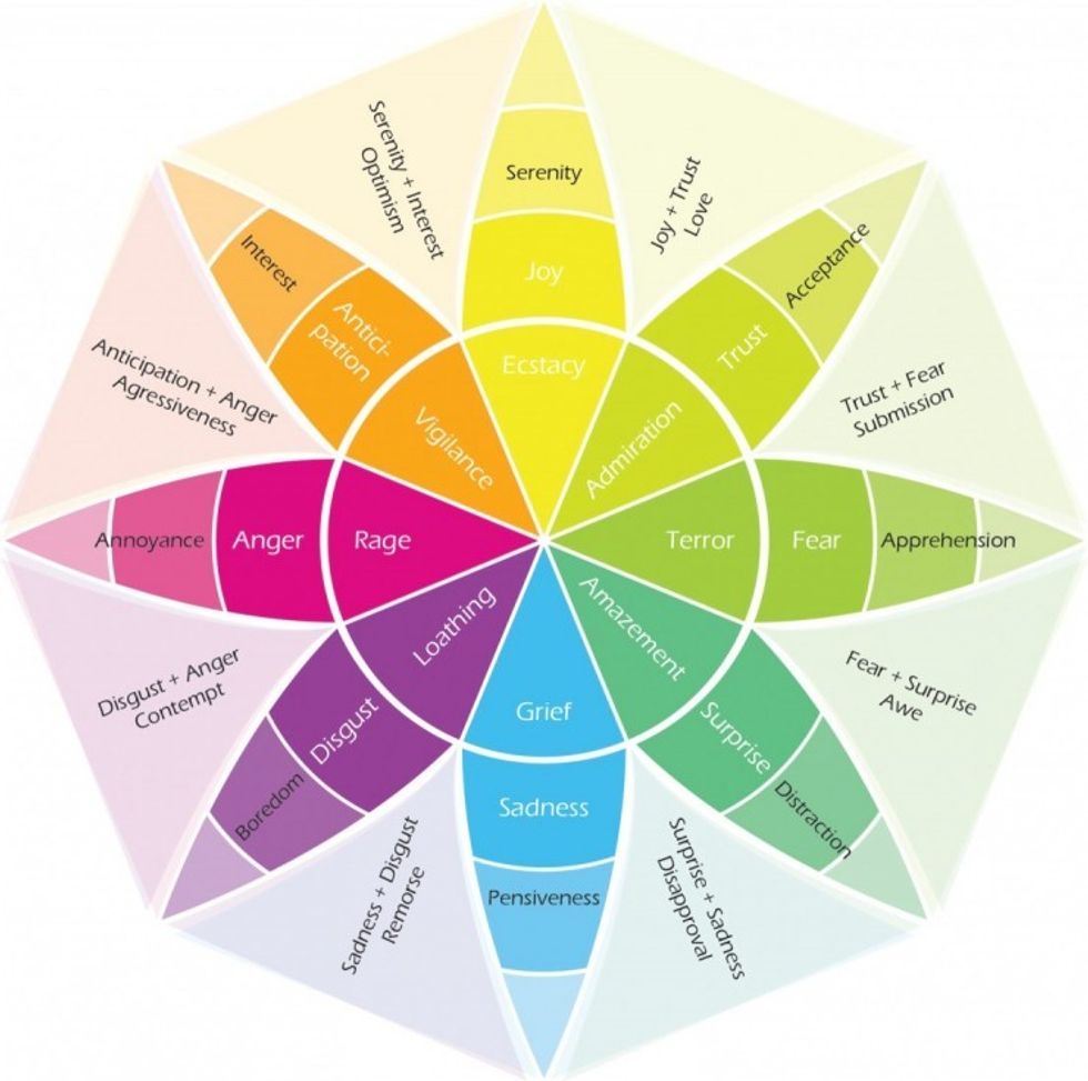 Plutchik's Wheel of Emotions
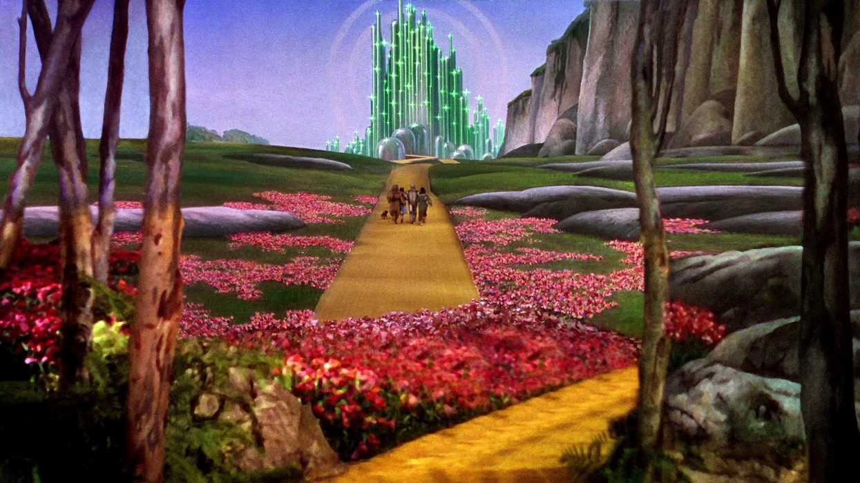
Filmmakers have used color for many things: to make a shot more beautiful (Wizard of Oz), to alert the audience of impending doom (The Sixth Sense), and to make a statement about the social mores of your country (I Am Curious (Yellow/Blue). There's no doubt that color can be used for more than making a scene look pretty and interesting; it can be used to add a new dimension to your narrative, as well.
Learning what each color does to an individual emotional and psychologically can open doors for your storytelling capabilities, allowing you to include colors in the frame that inspire the desired emotion you which to evoke. That's why so many love scenes are shot in warm lighting, because reds and oranges signify passion, heat, and romance, and why so many sad scenes are shot in color lighting, because blues and greens signify loss, loneliness, and grief.
This might be a good primer on the topic of color theory, but there's a whole world of information out there about it. You can check out a couple of other posts we've done on color theory, which highlight the many ways color can be used in telling stories, like how Guillermo del Toro uses it to inflict fear in Crimson Peak or how Denis Villeneuve used the color spectrum to represent the moral spectrum in Sicario.
Source: Kat Smith