I made a New Years resolution this year to get more involved in cinematography. As a writer, I'm constantly battling with the way my words look on the page. So much so, that I often forget that someone needs to interpret those words and get them onto the screen. That's why I have been trying to study the best screenplays of the past few years and see how those writers had their words put onto the screen by the Director of Photography.
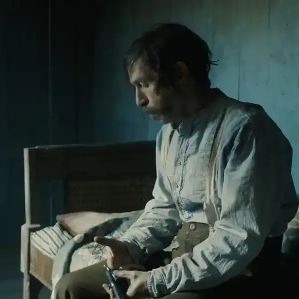
In doing this, I wound up on Google, in a deep dive, and came across the 2015 version of Macbeth. As a sucker for Shakespeare and his theatrical interpretations, I threw the movie on.
And holy crap! This is one of the best shot, if not the best shot movie of the 2010s — certainly one of the best all time.
Today I wanted to cover some of this visual perfection and tell you the technical ways cinematographer Adam Arkapaw and director Justin Kurzel brought this film to life.
The Cinematography of Macbeth
In an interview with American Cinematographer, Arkapaw talks extensively about the look and feel of Macbeth.
American Cinematographer: How did it feel to shoot such a classic story?
Adam Arkapaw: My dad was an English teacher in Australia. I never really understood how great literature was, or why my dad loved it, until high school, when my dad took me away for two weeks to study Macbeth. He showed me the art behind the words and the various meanings that could be deduced from the text. It was an inspiring and eye-opening experience for me as a teenager, the genesis of my love of literature and storytelling. So, many years later, it was really meaningful to have an opportunity as a cinematographer to give back to this play.
Why did you and Justin Kurzel choose to shoot digitally?
Arkapaw: The obvious choice would have been to use film because it’s a period piece, but we wanted the movie to look more contemporary. We didn’t want it to feel nostalgic. So we shot with the Arri Alexa XT Plus [in ArriRaw].
Why did you choose to shoot in anamorphic?
Arkapaw: The aberrations of anamorphic help create an expressionistic and painterly effect. And they also play against the sharpness of [digital capture]. Anamorphic seats the aesthetic somewhere in between a softer film look and a harder digital look. We mostly used Panavision C Series [lenses], and also the E Series. We also carried a Panavision ATZ 70-200mm [T3.5] zoom and an Angenieux [Optimo] 48-580mm [T5.6] zoom.
The anamorphic look varies with the T-stop. Many old-timers liked to shoot between T4 and 5.6.
Arkapaw: At that stop, you [no longer see] the aberrations. I was more between T2.8 and 4. Wide open is a bit much for me. It’s also about depth of field. In general, I like having some depth so you can enjoy the textures behind the actors; I like to see the design in the background of shots. However, I will draw out the actor from the background for a powerful close-up when it’s the right time to do it.
How did you and Kurzel define the vivid looks in the picture? Did you talk about looks ahead of time, or did you propose things on set?
Arkapaw: Justin and I met in film school, and we’ve known each other for 12 years. We’ve probably done 20 commercials together, as well as his two features. So over time we have developed a lot of trust in each other, and we definitely have a shorthand. I know what he likes and doesn’t like. He’s very trusting with me about coverage, lighting and color, to the point where I don’t really need to run a lot of what I’m going to do by him. On occasion, if he was expecting something else, he might say, ‘Why don’t we try this?’ Otherwise, I just know him so well from our shared aesthetic and long history that he trusts me to do what I think is best.
 Credit: @CinemaPalettes
The colors here are vivid and earthy. They're the colors of death. Of souls returning to dust. And if you think I'm over analyzing that, check out our color palette post. The same interview with American Cinematographer, Arkapaw talks about bringing those complex colors to the screen and the LUT package needed to make everything feel authentic.
How many cameras did you use on the film?
Arkapaw: We shot with two cameras about 50 percent of the time. I operated the A camera, and Simon Tindall operated the B camera. When I operate digital cameras, I never really use the viewfinder because the digital image looks so crappy that it’s a bit depressing. So I look at the monitor; we can also get a LUT on the monitor, and it’s nice to see what the image is going to look like. I light off the little onboard monitor as well.
Given the colors in this movie, I imagine that the LUT image could look quite different from what the eye saw on set.
Arkapaw: Yeah [laughs].
You’re pretty fearless in terms of color variations.
Arkapaw: Like I said, there’s so much scope for expression with Shakespeare. And in the case of Macbeth, you really are getting inside the character’s head — he’s seeing apparitions. Once you’re inside someone’s head, it’s a dreamscape; there really are no boundaries to what you can do. So one liberty we decided we would take was to not be restricted to matching every shot in a sequence.
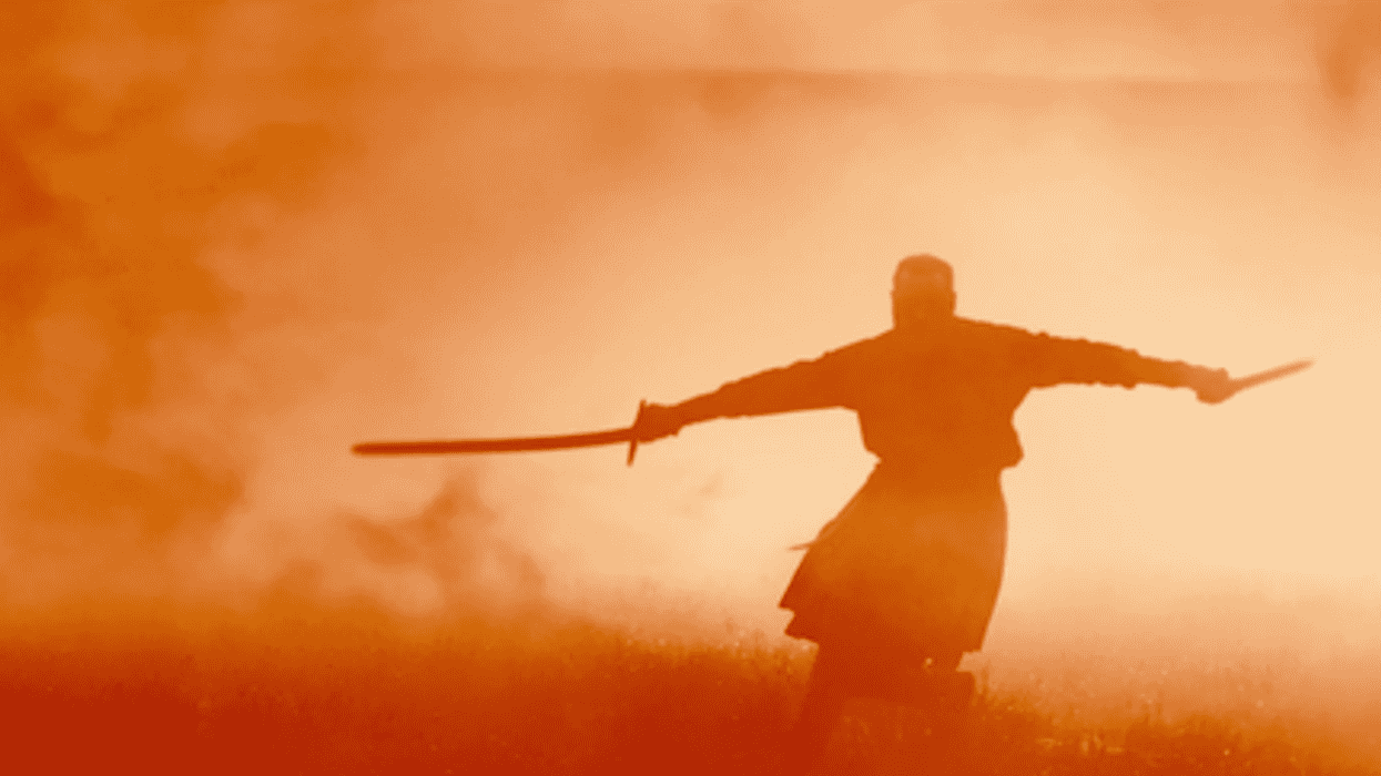
Yes, as we go from the soldiers fighting, to the witches, to Macbeth, the image goes from greenish, to yellowish and then to magenta.
Arkapaw: That was another subversion we tried to do. You might expect the witches to be colder or more macabre, but we wanted them to be warmer. We tried to use the sun and flares to make the image sort of heavenly — more angelic than witchy, I guess. The battle shots aren’t all matching, which evokes Macbeth’s PTSD. We tried to be inside his mind and see all the gruesome, traumatic things he would have seen in battle. Being a great commander, he would have been through many battles; in Justin’s interpretation, that took its toll and made him descend into madness.
Do you create these colored looks with LUTs you’ve prepared ahead of time?
Arkapaw: Yes, I like to create a range of LUTs in prep — a range from cold to warm, and a few LUTs for specific scenes. For example, when Lady Macbeth [Marion Cotillard] goes back to Inverness, I used a specific LUT where the mid-tones are really lifted and there’s a cyan wash into the shadows, so the scene has a more heavenly look than the rest of the film. And the climactic fight with Macduff [Sean Harris] also has a particular LUT.
That final orange, smoke-filled duel has a dreamy, almost hallucinatory ambience.
Arkapaw: It’s a great way to end the film, a crescendo. The wood is set on fire, and that motivated the whole color spectrum, leading us to this warm glow. We came at it a few times from scratch to find the right levels of orange, yellow and red.
How many different LUTs did you use on the film?
Arkapaw: I’d say about 10. In addition to the LUTs for specific scenes, I’ll do a high-contrast and low-contrast LUT with cool, neutral or warm looks. The high contrast is for the sun, and the low contrast for the clouds. Then I will flick through the LUTs before I shoot the scene and find the one that feels just right with the design and the performance. I definitely like to go for a look as much as possible when I’m shooting. I prefer to go even too far on set rather than to try to be subtle about it, because then, when you get to the grade, the idea is already burned into the director’s head. Once the director gets used to the footage in the editing room, you can never really do anything too extravagant or different in the DI.
How did you create these LUTs?
Arkapaw: I made the 3-D LUTs with colorist Greg Fisher at Company 3 in London using [Blackmagic Design’s DaVinci] Resolve. We tried a few different versions of the LUTs before we settled on our favorite [options]; we shot tests out at our location to test them under various lighting conditions. I did the final grade at Goldcrest in London with Adam Glasman. [The final deliverable was a 2K DCP.]
Collaboration With The Director
When you're watching Macbeth you can tell the Director and DP are on the same page. Watch Justin Kurzel talk about how he set his vision for the film and how he took it upon himself to film on location, but make it look personal to every scene.
The look and landscape are accentuated by shooting on location and teamwork these men put into honoring the story, Shakespeare, and an artistic vision. I stumbled upon a complex analysis of the story that declared Macbeth to be the most visually stunning movie of all time.
Every Frame A Painting (sort of)
While this is not Tony Zhou, it's a wonderful discussion of how cinematography adds to the story. Visuals for such a popular and epic tale can often be overshadowed by the importance of the words, but these shine brightly alongside fantastic performances and direction.
TECHNICAL SPECIFICATIONS
So how exactly was this movie shot and on what cameras? Here's the full technical breakdown for Macbeth.
2.39:1
Digital Capture
Arri Alexa XT Plus; Vision Research Phantom Flex
Panavision C Series, E Series, ATZ; Angenieux Optimo
What's next? Learn about There Will Be Blood's Cinematography!
As Roger Deakins said, "There's nothing worse than an ostentatious shot or some lighting that draws attention to itself, and you might go, 'Oh, wow, that's spectacular.' Or that spectacular shot, a big crane move, or something. But it's not necessarily right for the film — you jump out, you think about the surface, and you don't stay in there with the characters and the story."
Macbeth is the perfect example of fluidity, so it'll be great to look at a similar collaboration in There Will Be Blood.
What are some of your favorite visual movies?
Is Macbeth the best shot movie of the '00's?
Let us know in the comments!
Source: American Cinematographer