Why 'The Batman' Cinematography Is Different Than Every Other Superhero Movie
Few superhero movies look as exquisite as The Batman.
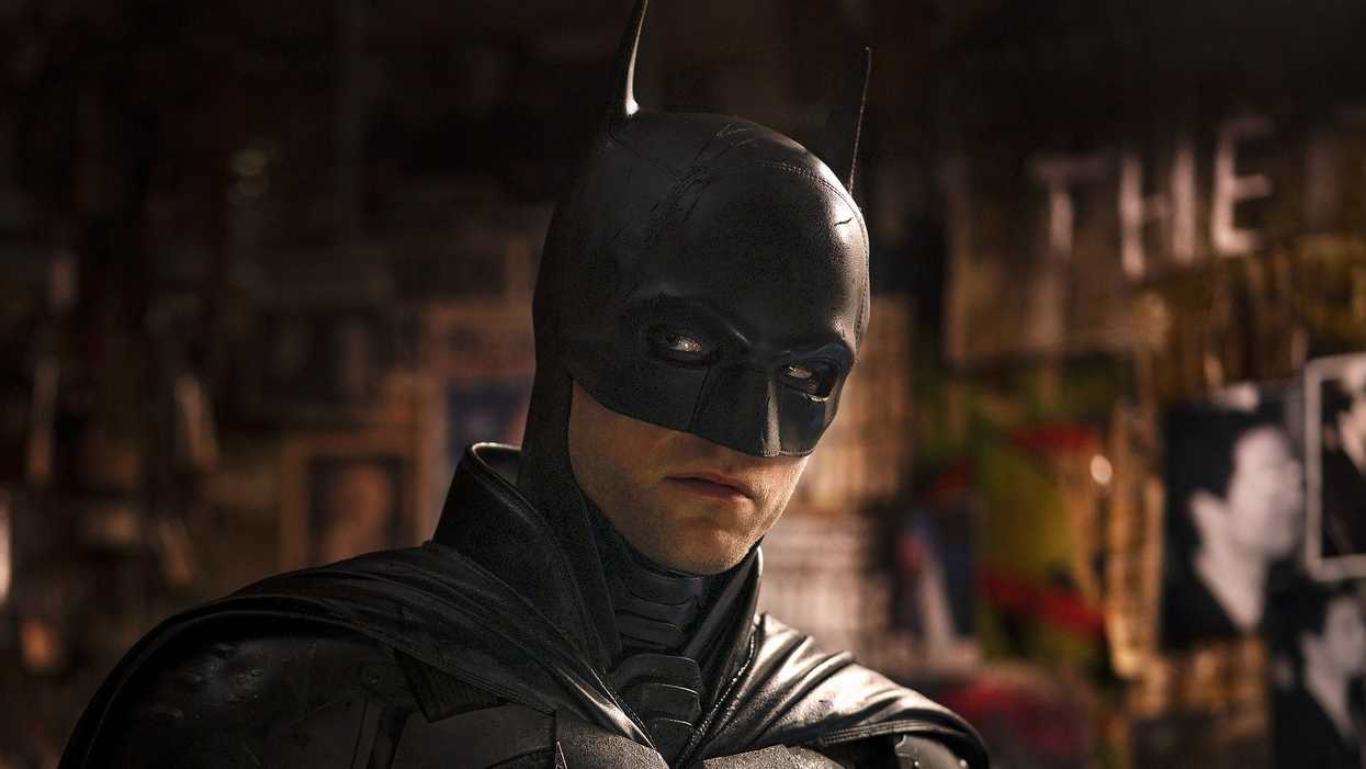
It's been a few weeks since I saw it for the first time, but I can't stop thinking about The Batman. The product of Matt Reeves, DP Greig Fraser, and a whole lot of talented people who acted, built sets, wrote the project, and more. I think it has to be one of the best superhero movies of all time.
And when it comes to look, and the cinematography, I think it might be among the best, if not the best. The Batman is the first superhero movie since Sam Raimi's Spider-Man that absolutely has a unique point of view. Its cinematography is transcendent.
Check out this video from Patrick Tomasso, and let's talk after.
Why The Batman Cinematography Is Different Than Every Other Superhero Movie
As I'm sure you know, most superhero movies are extremely expensive. That means they're made by studios with an agenda.
Marvel, which makes great crowd-pleasing movies, has a look and feel they've grown accustomed to while making their films. Even as auteurs like Taika Waititi and Chloé Zhao make movies inside the studio, there's a look and feel forced on them. We rarely see a system bucked. Someone like James Gunn can get his humor across in Marvel, but he can't really make a "James Gunn movie."
Well, since DC and Warner Bros. struggled to find their own consistent voice, they pivoted. And in a smart move, perhaps the smartest one they've had, they started leaning into directors. This has led them to several hits. But none have looked as good or felt as personal as Reeves' The Batman.
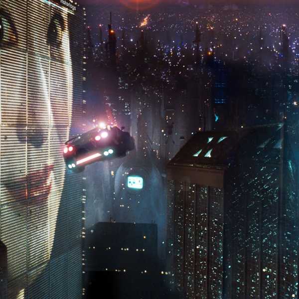
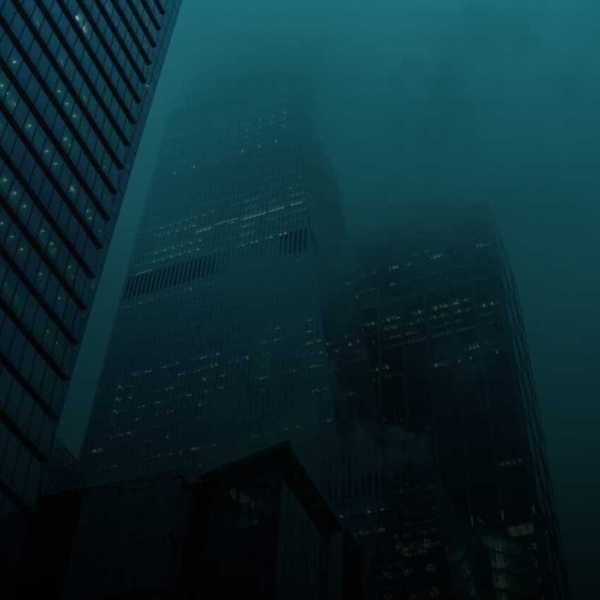
Reeves and Fraser created an immersive world draped in darkness and mystery that makes most modern blockbusters look bland. The lighting, color grading, and new approach to digital cinema with the use of 35mm film are all important things in building the story. They also shot The Batman using anamorphic lenses and worked in post to perfect the images.
But how did it all come together? Fraser told IndieWire:
“Bruce Wayne lives in the shadows—he isn’t a guy who walks around shopping centers during the day. This is a noir film, and most of it is set at night. My concern was that it might be hard to see anything, so I scoured the internet for images that were dark but easy to see, and I collected them in a document for Matt—and for myself—that I called ‘Dark but Light.’ Those references informed certain decisions, like making sure there were almost always pools of light or bright areas in the frame.”
They did active things, like wetting the streets in every scene so the city always looked like it had just rained.
Fraser says, “When everything is wet you subconsciously register that it’s constantly raining, that the city never dries. It underlines that it’s a very difficult place to live in.”
To expand on this urban environment, they had to find a color to go along with the noir aesthetic.
Fraser says, “There is color, but it’s not as saturated as most movies. I wanted the colors to be dusty and a little dirty.”
All of this gives the movie a tangible point of view. We see the city as Bruce sees it. So few other movies even try this, but this laser focus of saturation and darkness is what we want. We can identify with Batman's task of cleaning a city where he sees endless filth. We get how he can't concentrate on anything else, because we cannot either. It builds the story perfectly. We become as obsessed with solving a case, we become as immersed.
The work between Reeves and Fraser is what sets this movie apart. It deeply cares about how the audience experiences the world of a hero and their drive—it doesn't just pander to them to experience something and to forget it later.
Let me know what you think in the comments.
Source: Patrick Tomasso
- The Cinematography behind BFI's Premiere 'Dawn Every Day' | No Film School ›
- Read and Download 'The Batman' Screenplay | No Film School ›
- How 'Laid' Uses Lens Swaps to Dictate Genre and Tone for a Killer Rom-Com | No Film School ›
- These 21 Movies Had The Best Cinematography of All Time | No Film School ›
- DP Alvin Sun on the Importance of Shadows in 'The Killgrin' | No Film School ›