Watch: Breaking Down the Colors of 'Twin Peaks'
With the reboot of 'Twin Peaks' just hours away, this video looks at David Lynch's use of color in the groundbreaking series.
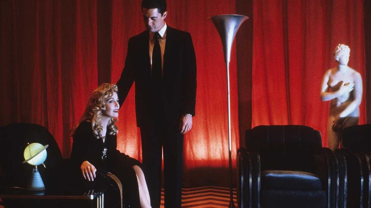
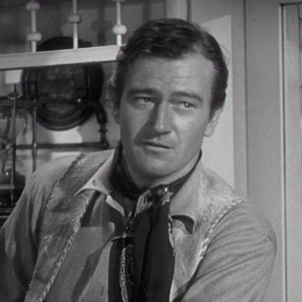
As a director, David Lynch is known for many things, though, oddly, his use of color isn't usually one of them. As this essay from Fandor Keyframe notes, "When discussing David Lynch, one typically examines the strangeness of the characters and the stories," though "seldom is his use of color explored." This is because, the essay argues, "his color films tend to have understated color palettes." Except, of course, when they don't.
According to the video, in every iteration of Twin Peaks (from the original series, to Fire Walk With Me, and perhaps, tonight's reboot), "colors work to create a sense of ordinariness. The palettes seem so plain that when Lynch chooses a more vibrant color palette for a significant scene, the disparity is especially compelling and noticeable." The director himself, who has produced two masterpieces, Eraserhead and The Elephant Man, in black-and-white has said, "I wouldn't know what to do with color. Color to me is too real, it's too limiting."
This video looks at several shots fromTwin Peaks , breaking down the frames into the Hex Color Codes present in each shot. It's a fascinating way to look at the use of color in this epochal series, as well as a great way to get ready for tonight's premiere of the mini-series, all nine episodes of which will be directed by Lynch himself.
Source: Fandor Keyframe