3 Ways David Fincher Uses Color to Completely Mess with Your Head
The color palettes David Fincher uses in his films are just as powerful as his dark, unstable characters.

There are a lot of words to describe David Fincher's films but "subtle" isn't really one of them. The worlds he creates have a characteristic normalcy, albeit dark and slightly off, but as their stories progress we're always brought to the nightmarish carnival that is Fincher's creativity—peeking past the curtain to see a fight club, a missing woman stabbing a man to death mid-coitus, and a mummified man barely alive laying in a room full of pine tree air fresheners.
However, there are areas in which Fincher uses some restraint and finesse in order to carefully lay the groundwork for his more over-the-top sequences, one of which is color. In this video essay by StudioBinder, we get to see how the director employs different color palettes to communicate important themes and character traits to his audience, as well as to ramp up the anticipation in suspenseful scenes.
Representing inner and outer conflicts
All movies have inner and outer conflicts. Many times Fincher will utilize complementary colors to represent visually what is happening emotionally on screen. It's actually a pretty literal reading of the color palette: two colors from opposite sides of the color wheel mirror the inner and outer conflict of a character who wants the opposite of what they actually need.
Conveying rigid worldviews
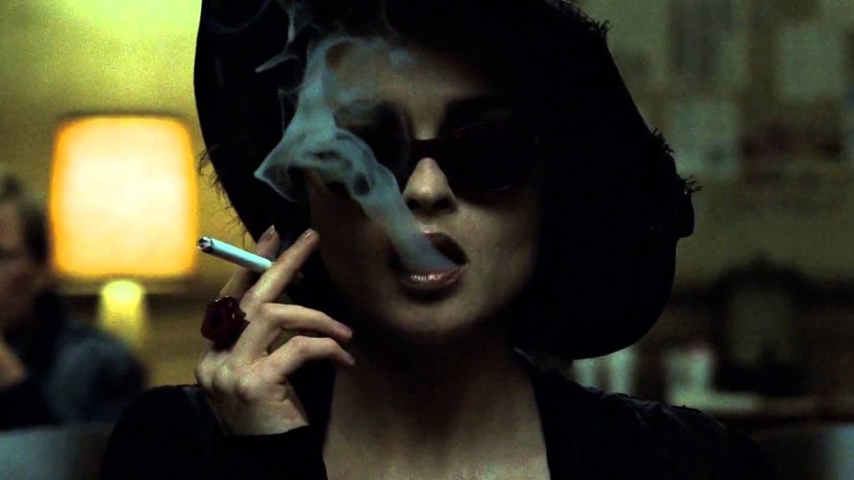
Like many filmmakers, Fincher uses monochromatic colors, but he uses them as a means to convey mundanity, boredom, or stagnation, or as StudioBinder puts it, "rigid worldviews of unbalanced characters." The Narrator (Edward Norton) in Fight Club is shown in a wash of colors that all seem to bleed into one another, creating this earthy, muddy look that perfectly represents his 9-to-5 khaki nightmare of a life in which he is but a piece of perfectly assembled IKEA furniture—until Tyler Durden, dressed in a red leather jacket and rosy shades, completely deconstructs him.
Drawing attention to elements to build anticipation
Color can be used as a great harbinger of both doom and hope: a flashing red light on a dark and desolate street, a black figure stomping through the snow, a dot of yellow on a sprawling blue ocean. Fincher includes isolated splashes of color in his films, too, only he uses them to build anticipation for the horror that is about to befall the characters in the scene. Think about it—John Doe's orange jumpsuit against the dusty rolling desert hills, the orange power tools in Martin Vanger's torture room, the Zodiak Killer's black outfit casting a shadow on a bright and sunny day at a California lake—each one of these examples don't overtly tell you, "Someone's 'bout to die," but those colorful elements keep grabbing your attention as if to remind you of their presence and their murderous intentions.
If you want to know more about David Fincher's creative use of color in his films, check out StudioBinder's very interesting, very thorough blog post about it.
What are some other ways that Fincher, or any other director, has used color to tell better stories? Let us know in the comments below.
Source: StudioBinder

 Richard Gere and Uma Thurman in 'Oh, Canada' via Kino Lorber
  Uma Thurman in 'Oh, Canada'via Kino Lorber


