Adobe has introduced a handful of new tools in the 2019 version of After Effects, with one of the most powerful being the new Responsive Design - Time feature. This new function gives users tight control over the duration of animations when precomposing.
Below, let’s take a closer look at how to use this new feature.
Why Should You Use Responsive Design?
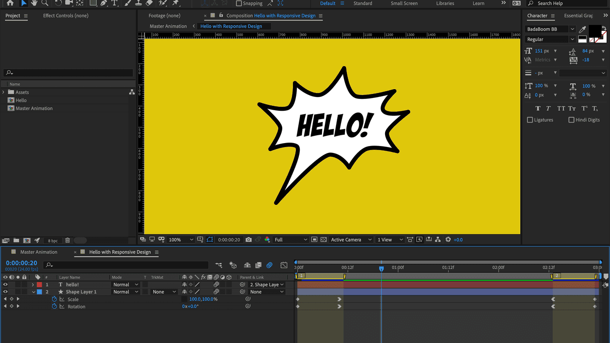
Let’s take the following animated speech bubble as an example. This particular composition is three seconds in length, with a ten-frame intro animation and a ten-frame outro animation. The graphic simply rotates and scales up for ten frames at the beginning of the comp, and then rotates and scales back down at the last ten frames. Let’s say that I want to nest this animation in another composition and that I have the ability to quickly change the duration to fit a particular piece of video. This is where the new Responsive Design feature comes in handy.

How to Add Protected Regions
First, I will grab my shape layer and press the U key. This will show me all of the keyframes for the intro and outro animations. I’ll next go to Composition > Responsive Design - Time. In this menu you will see three different options—Create Intro, Create Outro, and Create Protected Region of Work Area. Once I select Create Intro, a new region highlighted in blue will be placed at the beginning of my composition. These are simply markers with a duration.
For the intro animation, I’ll move the end of the marker to make sure it covers the second keyframe of my intro animation. This region is now protected and I can simply repeat this step for the outro with the Create Outro option.
You can also enable responsive design in the Composition Marker dialogue box, where you will find a Responsive Design - Time checkbox.

Working With a Precomp
Once my intro and outro regions are in place, I can now nest the composition in a master composition. Right away you will notice that we can see the protected areas as they are highlighted at the beginning and end of the precomp. These keyframes will now automatically stick to the protected regions of the precomp layer, no matter how I stretch or trim the layer.
If I were to perform the same actions with a precomp without Responsive Design, the keyframes would not move to respond to the changing trims, and I would have to open up the precomp to move the keyframes and/or change the duration of the actual composition. Using responsive design allows me to work quickly with a precomped animation without having to constantly jump back and forth between compositions. I can now easily visualize, retime, and position animations in one comp.

The icing on the cake? This responsive design feature also works with the motion graphics templates you export for use in Premiere Pro. Be sure to let us know what you think in the comments below.