As you know, we love talking about film color palettes here at No Film School. They can help captivate your audience and put them in the right tone from scene to scene. So how can you do that before the audience even gets into the theater? The answer is the movie poster.
Posters have been evolving since their onset. And nowadays, color plays an even bigger role in getting the audience to react to seeing the film. We've all seen the images where all movie posters look alike. It's maddening. But there is a specific reason.
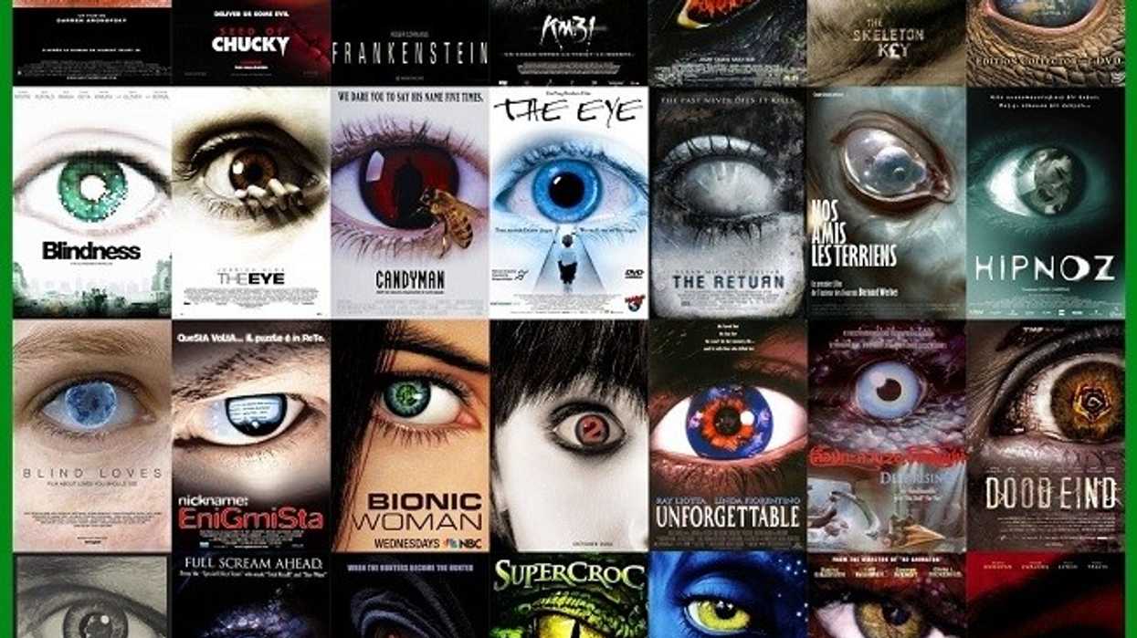
 Credit: Gizmodo
James Verdesoto of Indika recently sat down with Vanity Fair to go over how movie posters have evolved over time, as well as the psychology behind them. Check out this video from Vanity Fair, where Verdesoto takes us through the evolution of movie posters and how a creative color design scheme and framing captures the eye.
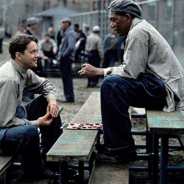
What I love about this video is how much Verdesoto focuses on framing. We all know about the rule of thirds, but it's interesting to see how he uses it to evoke emotion. Trapping characters, idealizing power struggles, and spacing out which stars get the hero pose.
The other takeaway is which colors get associated with which genre.
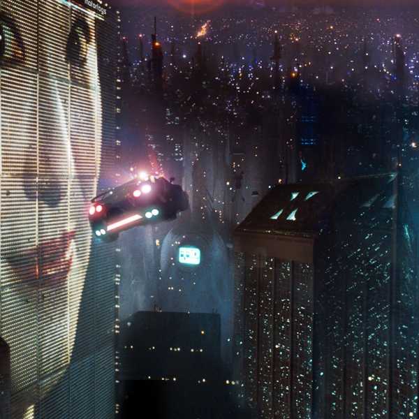
Blue and Yellow for thrillers. Black, White, and Orange for action films.
I hope this post has helped broaden your understanding of film color palettes when creating movie posters. So whether you want to learn about color grading, film colorists, or you're just obsessed with the way David Fincher uses color, utilize it on screen and in your marketing materials too.
What are some of the unique movie posters?
Let us know in the comments!