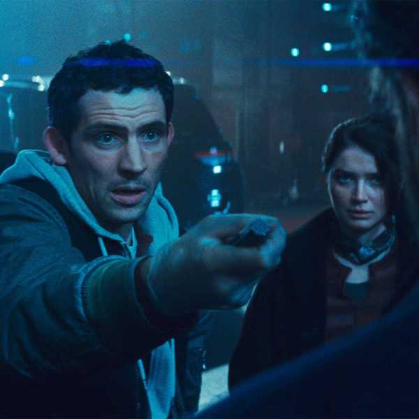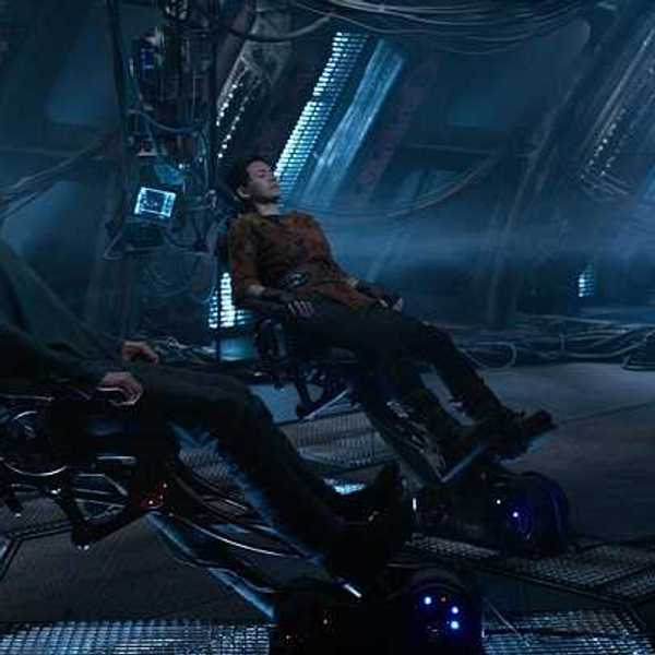
Title sequences are a critical, artistic element of any TV series, designed with intense attention to detail to serve their key purpose—grabbing and keeping audiences. One creative studio, Digital Kitchen, produced two standout title sequences unlike any others this year, receiving Emmy nominations for their work on Spider-Noir and Smoke.
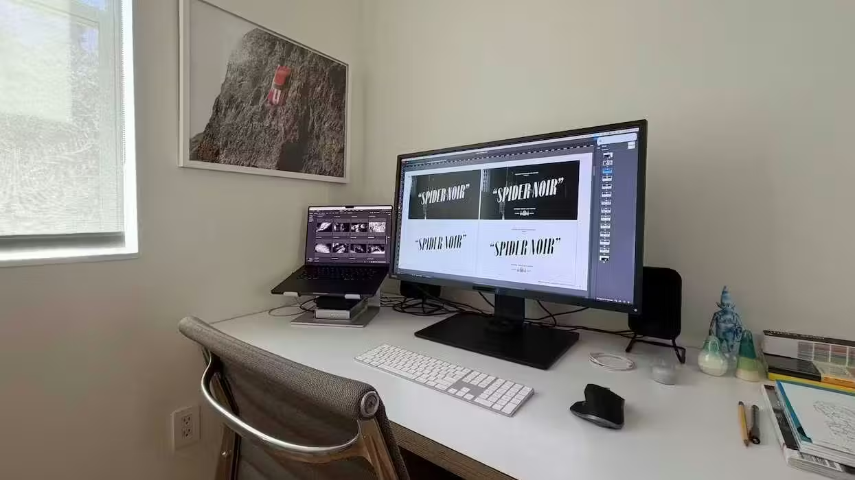
The team used After Effects and Photoshop to bring these uniquely distinct title sequences to life. While the design for Spider-Noir leaned into the show's historical context to create a mysterious yet bustling city feel, Smoke leveraged practical effects to creatively capture the raw feeling of a high-stakes drama.
We sat down with Executive Creative Director Mason Nicoll, Creative Director Andrew Julien, Art Directors Rachel Brickel and Peter Pak, and Senior Motion Artist John Van Unen to get an inside look at what it takes to craft Emmy-nominated artwork.
Mason, how did you first get into title design? What drew you to it?
Mason Nicoll: Starting as a print/web designer, titles were another source of creative inspiration–R/GA’s title for Alien is still one of my favorites. But it wasn’t until I joined Digital Kitchen in the late 90s that the possibility of creating a main title became a reality. My interest in the medium was fueled by the artists I followed, like P. Scott Makela and the design collective Tomato, who were moving into title design at the same time.
What was the inspiration behind the title sequence for Spider-Noir? The inspiration for Smoke?
MN: For Spider-Noir, we wanted to honor the time period and create a title that felt like it used old Hollywood VFX techniques to create the sequence. Pulling inspiration from classic noir cinema, films like The Lady from Shanghai and The Third Man, designer Arik Weiss also looked at surrealist photographers and films of the French New Wave to bring in the fractured, hallucinatory point-of-view.
On Smoke, our designer, Ana Criado, had this great idea to focus on individual objects (items which would be part of an arson investigation) and watch them burn in reverse. The inspiration draws on the way an investigator might piece together the clues and build the story in their head.
Andrew, can you walk us through how you began these projects? Can you talk about the collaborative process and how you created the sequence from start to finish?
Andrew Julien: For Spider-Noir, we started with deep research into noir films, era-specific photography, historical references, and the Spider-Man mythology to help develop multiple creative directions for the title sequence. The showrunners picked their favorite, and from there we began to refine the visual language, how it’s brought to life in motion, the musical approach, eventually building out a boardomatic based on the development of the designs and ideas.
With the general look and flow in a good spot, we then began to establish the pacing, rhythm, editorial structure, motion theory, and the key visual beats for the sequence. Working closely with the show’s production team, we always looked to include elements from the series, but in an intentional and custom way and as part of the world-building to craft a distinct visual world for the title sequence. The entire process is a constant and close collaboration between our team of artists, designers, and animators to continuously iterate and refine.
Rachel, what about for Smoke?
Rachel Brickel: For Smoke, building upon the design and references created by Ana, we started by testing how different objects and materials burned–initially in a foil baking tray in my driveway–developing the burn technique and designing a set that could withstand the extreme temperatures. Mason directed the narrative and developed a list of items that reflected the characters of the show as well as the initial tone. I then sourced props and hand-crafted additional elements for the shoot, while Jose Ponce of the Art Department hand-lettered the journal pages that were ultimately burned on camera.
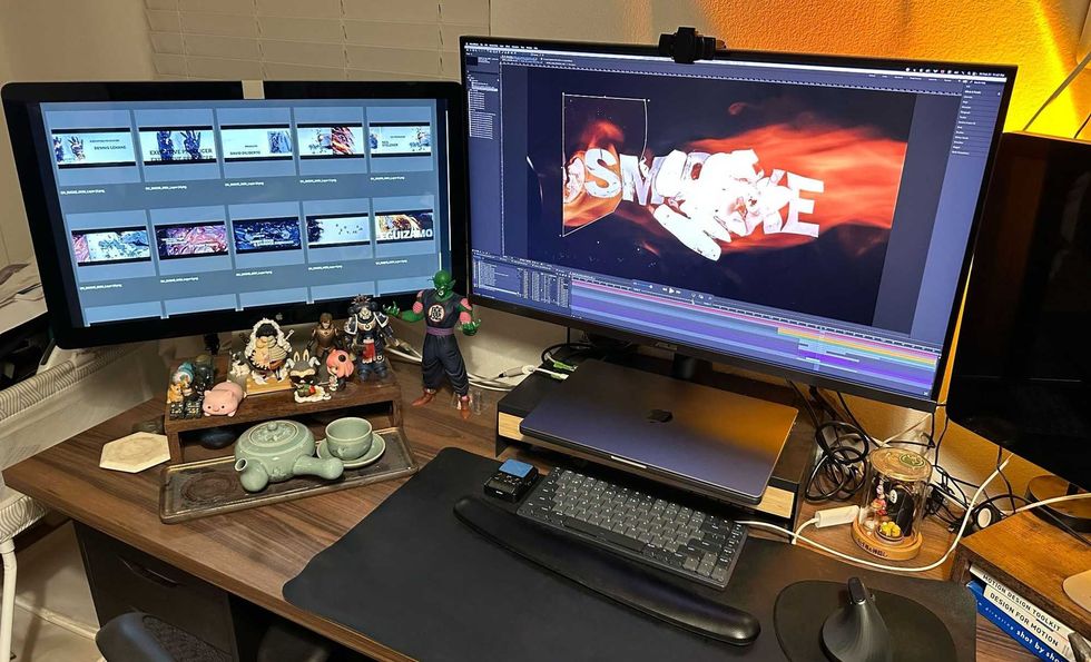
With Mason by my side, I filmed the sequence using both a top-down camera and a handheld camera to capture unexpected compositions as they naturally emerged. Editor Justin West then shaped the footage to build tension around Thom Yorke's "Dialing In." Peter developed the animation system that drove the sequence and established its overall graphic language, while Simon Chan, Motion Artist, designed the typography animation and integrated the graphic design details throughout. Mason also designed our logo that is at the end of the sequence, which I physically cut up and burned on layers of film. Peter, Simon, and I then tag-teamed to create the animation using many layers of footage, primarily in After Effects.
 Courtesy of Peter Pak | Digital Kitchen
Peter, can you talk about which Adobe tools you used to complete each title sequence, and why? How did your workflow differ, and what stayed the same?
Peter Pak: We used After Effects and Photoshop to animate both Spider-Noir and Smoke. Illustrator was also used to create the Spider-Noir logo. Not only does our team know these tools best, but they were also the best fit for both projects.
The biggest difference was the workflow: Smoke was simple enough to keep in a single After Effects project. Spider-Noir was much larger, with multiple animators working on different shots at the same time, so we built it in a more modular way that could easily be assembled while keeping everything consistent.
Even though the workflows were different, the project organization stayed the same. We used the same folder structure, naming conventions, and file organization on both projects, which made collaboration much easier.
Describe your favorite part or component of each title sequence. How did it come together and how did you achieve it?
RB: For Smoke…the importance of human craft mixed with science and art. We really had a chance to play with the elements of nature, but with human intervention. Every shot was a science experiment that we learned from and continued to inform us and allow us to sharpen on every take.
John Van Unen: For Spider-Noir, my favorite part was bringing the 3D environments to life. I always enjoy the research phase, so before we started, I spent some time gathering historical references for 1920s New York buildings, streets, and subways. Finally, getting to play with the classic noir lighting, using sweeping lights and dramatic reveals, was a real treat.
What were some specific challenges you faced on each project? How did you go about solving them?
RB: There were two main challenges when working on Smoke. The first was finding a way to control and art-direct the burns. Objects were heated over 2,000 degrees Celsius to create the effects. Understanding the amount of heat, angle, and distance needed to create the effect took a lot of playtime. We needed to hit things from multiple angles and origins to create movement the way we wanted for the transformation.
We also needed to burn the objects, but without the fire. Mason really emphasized the importance of not showing the flame as much as possible. We didn’t want this title to turn into just another fire title sequence. It had to feel different. It was important we didn’t do what was expected, and instead did something that hadn’t been seen before.
AJ: On Spider-Noir, we had the challenge of defining a unique motion language that balanced contemporary noir while developing an editorial-driven motion theory that felt fresh. Additionally, we wanted to reinterpret dailies to feel not as borrowed moments from the show, but as raw assets used to build distinct moments that feel bespoke to the sequence while maintaining a unique narrative.
We solved these challenges through extensive—and sometimes, obsessive—experimentation, iteration, and testing before we landed on an approach we all felt happy with.
If you could share one tip about After Effects or Photoshop, what would it be?
PP: My biggest tip is to stay organized from the start. A clean project with clear naming, folder structure, color labels, and organized compositions will save you far more time than any shortcut or plugin. As projects grow and more people get involved, good organization makes collaboration easier, reduces mistakes, and lets you focus on being creative instead of searching for files.