Film fan culture at large has finally caught up with the importance of graphic design. Now there seems to be as much scrutiny on title sequences and poster design as on actual content.
And rightly so. An evocative design concept can elevate a film or series into something iconic, many times beyond the shelf life of the actual material.
Legendary artist Saul Bass not only embodied this but arguably pioneered the idea of a designer as a crucial artistic collaborator. The Royal Ocean Film Society’s new video essay on Bass’s movie posters examines his style, his methods and why his designs endure.
“I want everything I do to be beautiful… I don’t give a damn whether the client thinks it’s worth it… I want to make beautiful things even if nobody cares." - Saul Bass
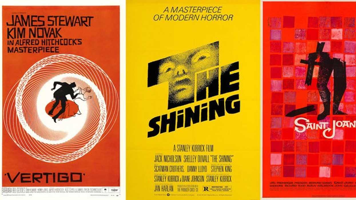
One of the most compelling factoids here is that Bass and Stanley Kubrick cycled through over 300 drafts until they arrived at the final poster for The Shining. Perhaps that’s not surprising in the context of Kubrick’s notorious perfectionism.
300 drafts!
However, this level of diligence was also reportedly employed by Bass. His early work (Royal Ocean Film Society zeroes in on Carmen Jones and The Man With Golden Arm) is so simple it doesn’t feel like the culmination of hundreds of drafts.
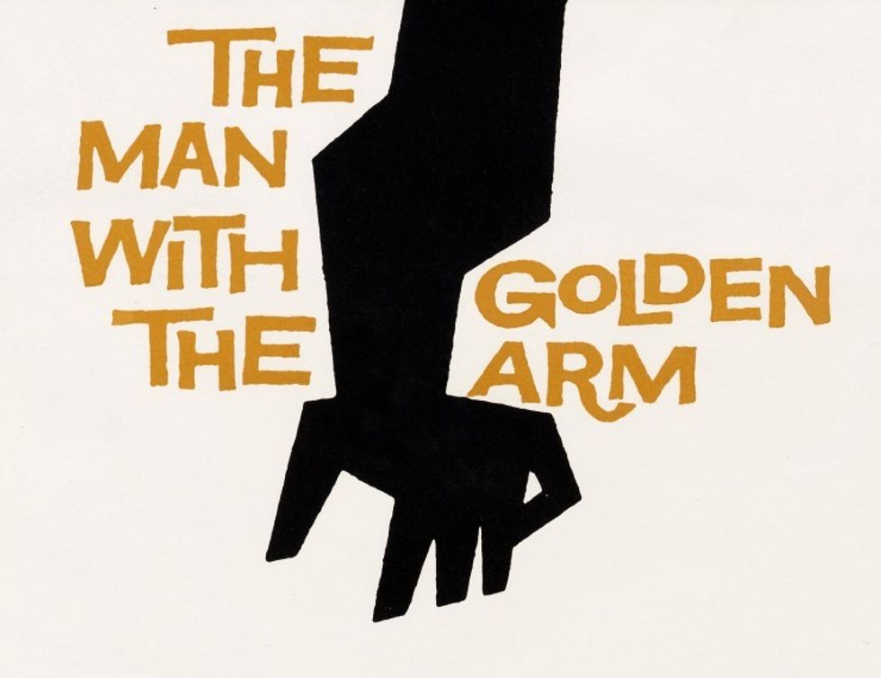 Credit: One of the designs that put Saul Bass on the map
But the ability to do what the essay describes as "symbolize and summarize," requires a specific kind of genius. Bass managed to create one simple visual statement that was both provocative and natural to the movie itself.
The essay casually breaks the Bass aesthetic into three approaches: color, layout, and style.
It’s mindblowing to realize that the majority of Bass posters use ONLY three colors: Black, white and then a variable contrasting color. Seriously. Scan through his most famous work right now: Only. Three. Colors.
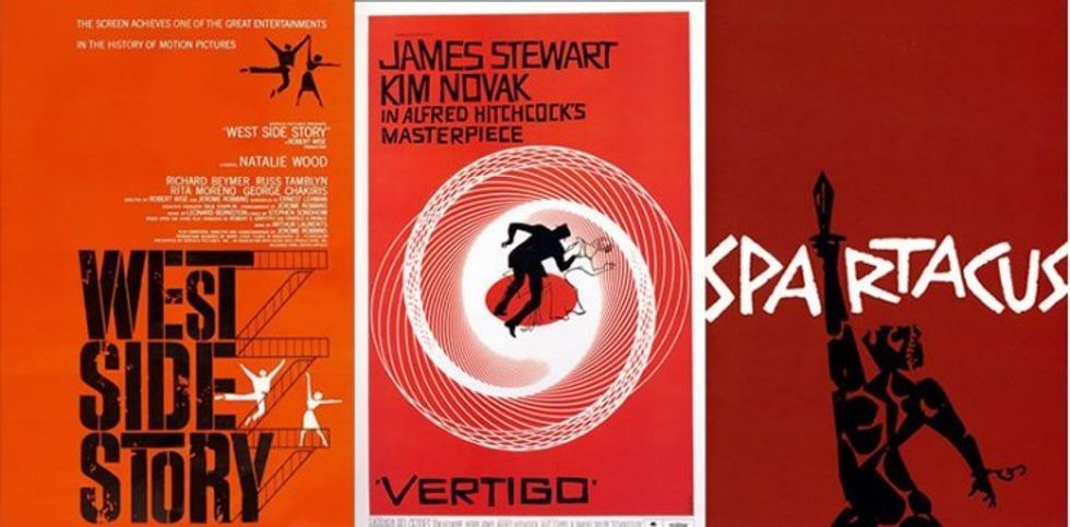
Then there’s Bass’s unique, asymmetrical layouts with radical uses of negative space. This arrangement forces the eye to one emblematic image that’s powerfully suggestive of the film's theme rather than its stars or literal plot.
As the essay says, “It’s ideas, not Hollywood superstars, that are at the forefront.”
When one looks back at Bass’s posters, it’s almost shocking that they were all commissioned and approved by major Hollywood studios. Ironically now as interest in design has grown, the corporate filtration of marketing art is more streamlined and risk-averse than ever.
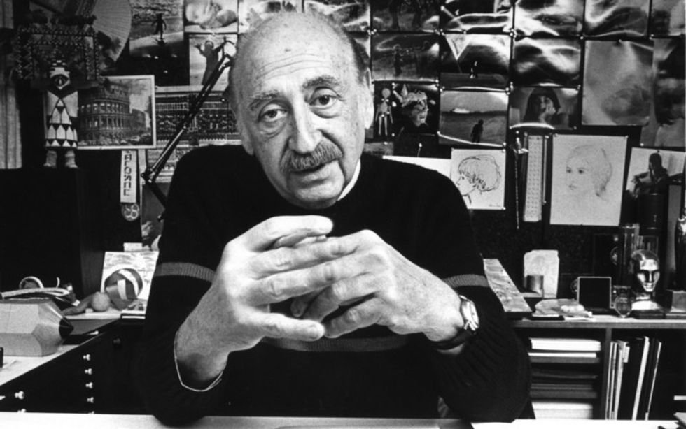 Credit: Saul Bass in 1985
The essay ends with words straight from Bass: “I want everything I do to be beautiful… I don’t give a damn whether the client thinks it’s worth it… I want to make beautiful things even if nobody cares.”
Living by that credo, with the vision and discipline to back it up, it’s not surprising that Bass’s work withstood the vagaries of the industry and the test of time.
Source: Royal Ocean Film Society