Avid Tutorial: How to Bring Your Shots to Life with These Basic Color Correction Tips

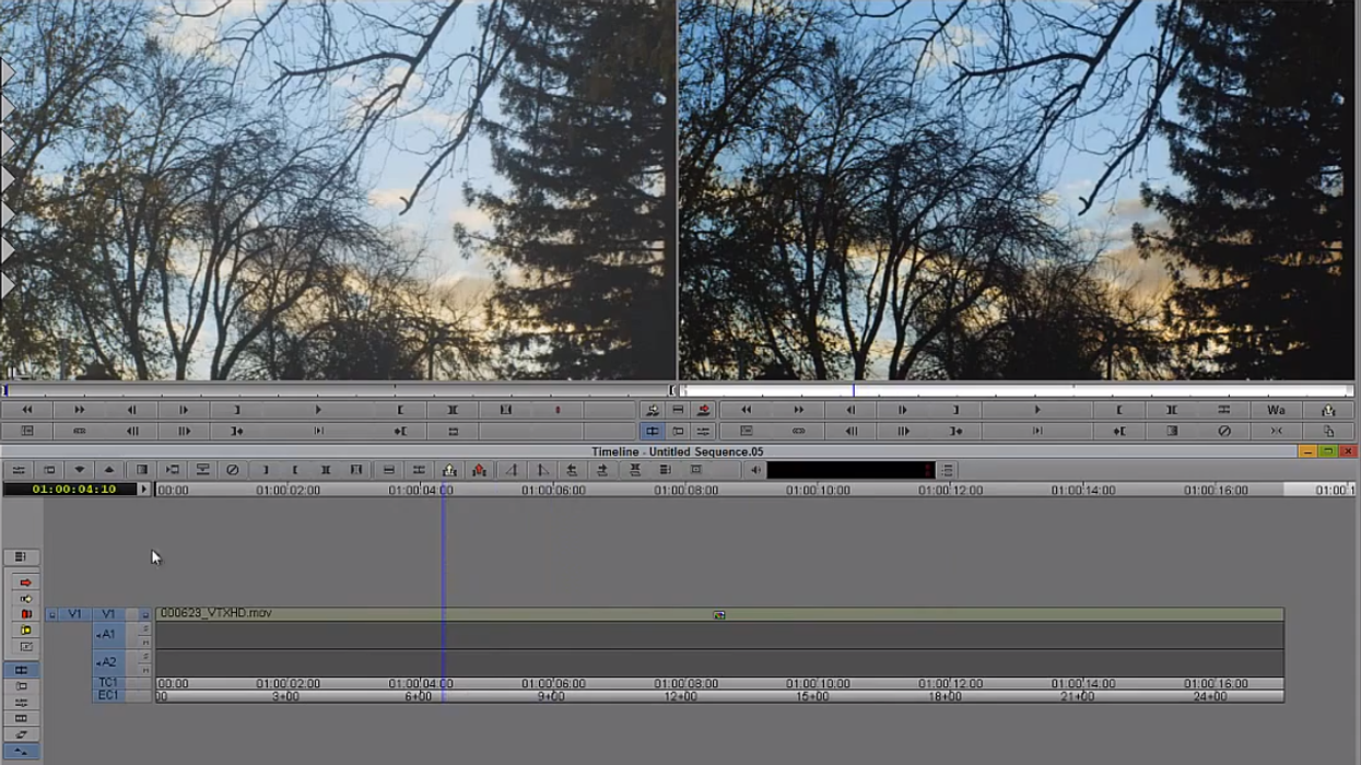
As most post-production folks know, Avid Media Composer is not the most intuitive piece of software. Even the simplest of tasks can take far too much time if you’re unfamiliar with the Avid interface and workflow. However, once you’ve grown accustomed to the program, it becomes one of quickest and most powerful editorial tools at your disposal. Because Avid is such a prominent tool within the industry, yet one that is shied away from by many younger filmmakers, I will be starting the “Avid Tutorial” series (and a Premiere version as well). Each post will be an aggregation of the best topical video tutorials from around the web in order help people become better oriented with the key concepts and functions within the software. So without any further ado, let’s take a peak at some of the basic color correction functionality built into Avid Media Composer, and see how you can take your shots from bland to vibrant in a few easy steps.
Here are Kevin P. McAuliffe's color correction tutorials from CreativeCOW's fantastic "Learn Avid's Media Composer" series:
For those who shoot with flat or log profiles, how you control and portion the dynamic range of your image is absolutely crucial. Simply maximizing the dynamic range in any given shot can immediately give your images an incredible amount of depth and "punch". Now that various scopes and waveform monitors are built into just about every NLE, this simple task should become habitual with all of your projects. However, while the lift, gamma, and gain controls are most useful for maximizing your dynamic range, they can also be a tremendous creative tool for shaping the tone of your image. Personally, I always maximize my dynamic range first, then play around with the gamma controls in order to push the image in one direction or another. This way, you can get dreamy "washed out" style images while still holding onto deeper black levels, and on the flip side, dark and high contrast images while still holding the highlights.
In McAuliffe's second video, he shows you easy it is to correct the chrominance issues in your shots. While it's always preferable to nail your color in camera, it's not always possible due to time constraints or the limitations of various cameras. In these cases, it's important to know how to quickly and efficiently solve these problems in your NLE or color grading software. One of the best tips he gives in this video is to use the black and white stripes on your slate as a reference point for your editor or colorist. It's usually not as easy as it sounds to find a true black and a true white region of the actual image to use a reference, so defaulting to your slate can save you a tremendous amount of time and guesswork.
What do you guys think? What is your basic process for color correction? Do you have any other color correction tips for editors? Let us know in the comments.
Link: Learn Avid's Media Composer - CreativeCOW


