When I first saw Skyfall, shot by Roger Deakins, I was struck by his use of bold colors in one scene, and then the complete lack of colors in another. From the high energy neon lights and costumes in Shanghai to the drab gray of the remote and deserted Japanese Island of Hashima, the colors in each of these scene settings established a tone that would give a savvy viewer a hint as to the story that would unfold.
But Deakins isn’t the only master of light and color. Cinematographer Seamus McGreevy was interviewed by CookeOpticsTV for their Masterclass series on YouTube. Talking about how the proper use of a color palette, carefully aligning opposite color shades, McGreevy outlines how a cinematographer can set a tone for the emotional gestalt of a scene. Check out the video below:
“Something that I really love, that is the most potent part of cinematography, is color itself. Color contrast, the juxtaposition of colors, they do have a very unconscious physical effect when watching a movie.” -Seamus McGreevy
McGreevy points out that many colors can amplify the emotions conveyed in a film is a way that a particular camera or lens can’t do in and of itself. Examples of the color palette of emotions look like this:
- RED: Love, Desire, Violence, Aggression, Power.
- ORANGE: Warmth, Enthusiasm, Friendliness, Happiness, Vibrance.
- YELLOW: Madness, Illness, Insecurity, Obsessive, Wisdom, Betrayal.
- GREEN: Environment, Immaturity, Corruption, Ominous, Darkness, Envy,
- BLUE: Cold, Depression, Loyalty, Peace, Passivity, Calm,
- PURPLE: Fantasy, Ethereal, Erotic, Royalty, Mystical, Power
- PINK: Innocence, Sweetness, Femininity, Charming, Delicate, Beauty
Examples in Film
According to Criswell’s Lewis Bond, red seems to give us the strongest reaction in an image, but there are no set guidelines of how a color can be used for a desired emotional reaction. If you look at the list above, the reactions are often contradictory. “But where one would use red to show hatred and cruelty,” Bond says, “another may use it to show passion and love. Green gives us hope, but can also show the mundane and lifeless.”
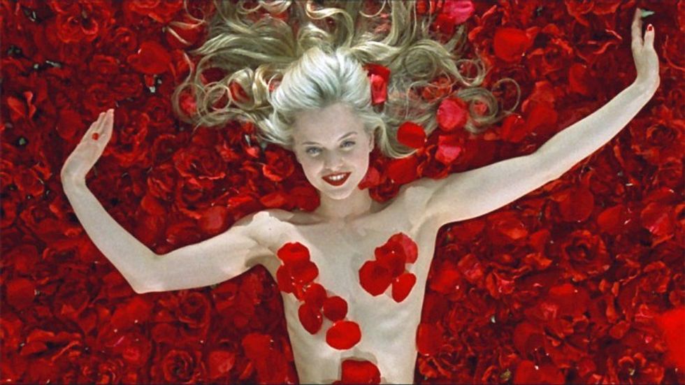 'American Beauty'
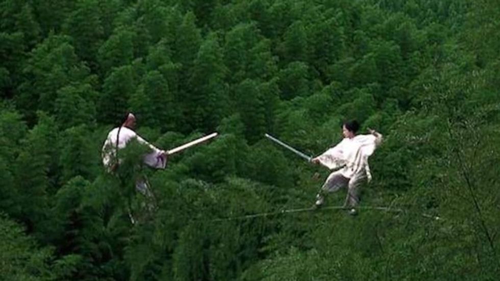 'Crouching Tiger, Hidden Dragon'
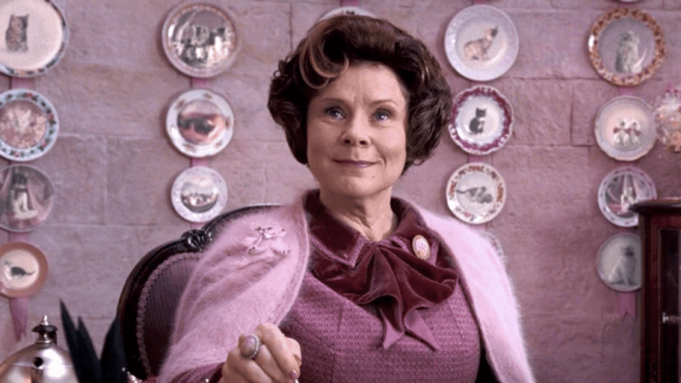 'Harry Potter and the Order of the Phoenix'
Balance is also critical in conveying a character or emotion. Sometimes that’s in how colors complement each other in an associative way, drawing the eyes, and sometimes that means a transitional move from one color to another.
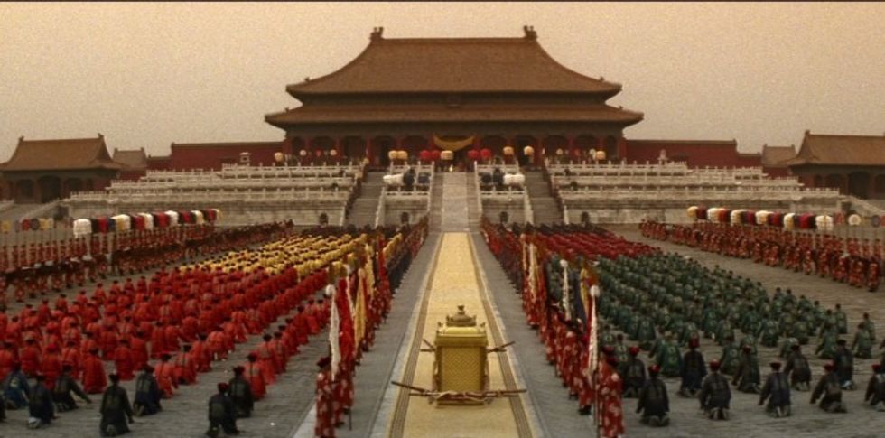 'The Last Emperor'
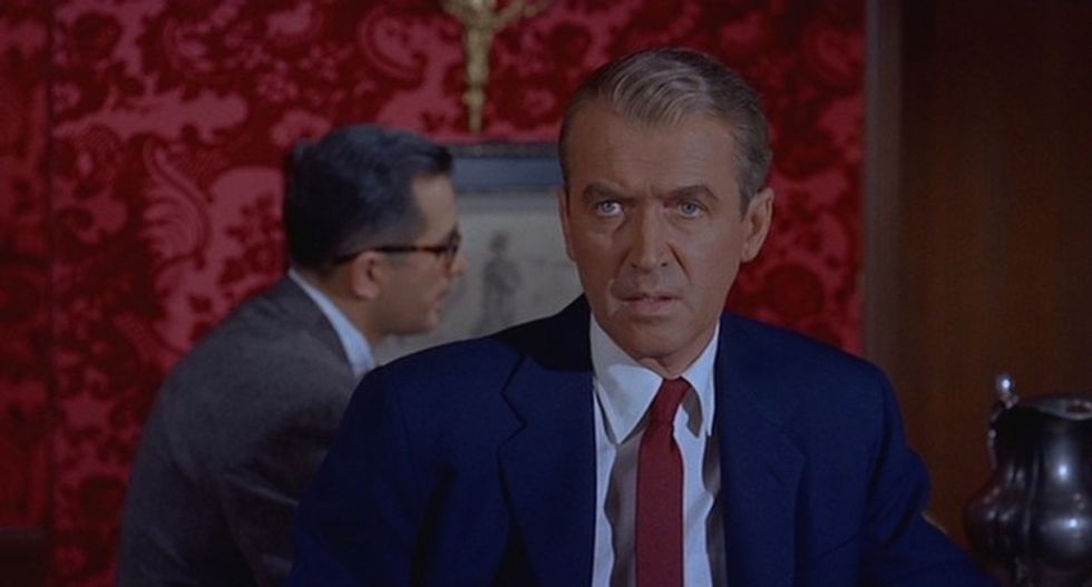 'Vertigo'
McGreevy also goes on to mention that the creation of a color palette is definitely different when comparing digital cinema to shooting on film. “Somehow film records color in a chemical way,” McGreevy says. “You get an almost stain glass window effect with celluloid that goes into your head in some way.”
Hue and Saturation
Hue and the intensity of it through saturation can really change the way the audience is viewing the film, and the story itself. You don't have to look any further than The Wizard of Oz to see how Hue and Saturation open up Dorothy’s (and the audience’s) world as she leaves the monochrome confines of her house (symbolic of her dreary life), and moves into the bright, colorful Land of Oz. And while she returns to that monochrome world at the end, she is never really the same and shares with her friends and family all that she experienced.
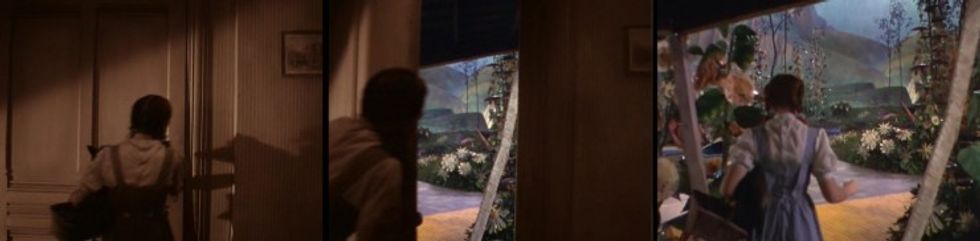 'The Wizard of Oz'
Value
Then, there's color Value, the dark or light shades of the color. This can not only convey a power or level of emotion but also where the character is headed. McGreevy says that in complex castings, where you have a lot of characters, you can use various color palettes for each character to provide separation and dimension. A more dangerous character bathed in red light, a priest in black/white to show his battle within, and the innocence of a warm red color.
Discordant Colors
Lastly, there are discordant color values, where the filmmaker uses color to draw the eye and hit the audience squarely in the face with a powerful thought. This was best used by Steven Spielberg in Schindler's List with the iconic red girl image of a young Jewish girl clad in a red coat, surrounded by the Nazi's leading her, and six million others, to their doom.
Costumes
Costumes can also tell you a lot about the character. In Breaking Bad, Walter White moves from a basic red shirt, indicating his acceptance of the dangerous life he has chosen, but when he removes that shirt to show an even deeper red shirt underneath, the audience can expect his character's descent into his evil nature has a deeper floor than the audience first sees, and will experience as time goes on.
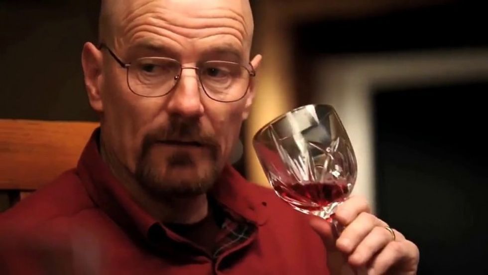 'Breaking Bad' (AMC)
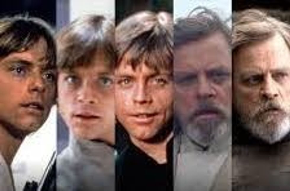
Then there's Star Wars' Luke Skywalker, who begins in a solid white costume in A New Hope, indicating his idealistic innocence. Then, Luke is next seen in gray for The Empire Strikes Back, indicating he's in a time where he is tempted by both sides of the Force, but he's wearing black in Return of the Jedi, which actually indicates his mastery of his powers, not that he's fallen as one would expect. But he's on par with his father, the evil Darth Vader, who he's trying to save. By the time we get to The Last Jedi 40 years later, Master Skywalker is wearing muted colors, indicating he's closed himself off from the Force. A shadow of what he once was. And if you look carefully, you can see the character of Rey in the new trilogy begin to mirror this evolution for herself.
The overall color pallet that a cinematographer chooses, in collaboration with everyone from costume designer to the art director, can prepare the audience for the world in which they are about to journey through. And it can even become a character on that journey itself.
Roger Deakins once said that, "It's easier to make a color look good than it is for color to service a story.” Skyfall was a solid James Bond picture. One of my favorites. But it isn’t the story that makes it so for me or even the kinetic action scenes. It’s the light, the color, and the amazing cinematography. That’s what keeps me coming back to it again and again.
Source: CookeOpticsTV