Whether you’re a seasoned colorist or you’re brand new to the craft, you’ve probably spent a good amount of time chasing a more cinematic look for your grades. This is a worthy pursuit, and we talked about some key strategies for it earlier this year.
But in addition to understanding what we’re after, it’s often necessary to be able to recognize what we’re not after. And if the “cinematic” look is our goal, its nemesis is the dreaded “video” look.
So let’s discuss the concepts and characteristics that drive this look, and what we can do to improve them when they find their way into our work.
Check out my latest video below, then dive into a bit more detail.
Contrast vs. contour
One of the key drivers of the “video” look is an oversimplification of contrast.
Oftentimes, “video” grades are the result of too much emphasis on where the darkest and brightest portions of the image lie, and too little emphasis on the tonal journey in between. The better approach is to think not only of the total distance between these two extremes, but also ensure that along the way, the image has tonal detail, separation, and “snap."
So whether you’re going with a low-con, a high-con look, or somewhere in between, you can avoid the “video” look by ensuring you’re taking the time to create the proper contour, using tools like Resolve’s Custom Curves.
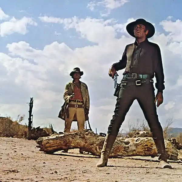
 Credit: Cullen Kelly
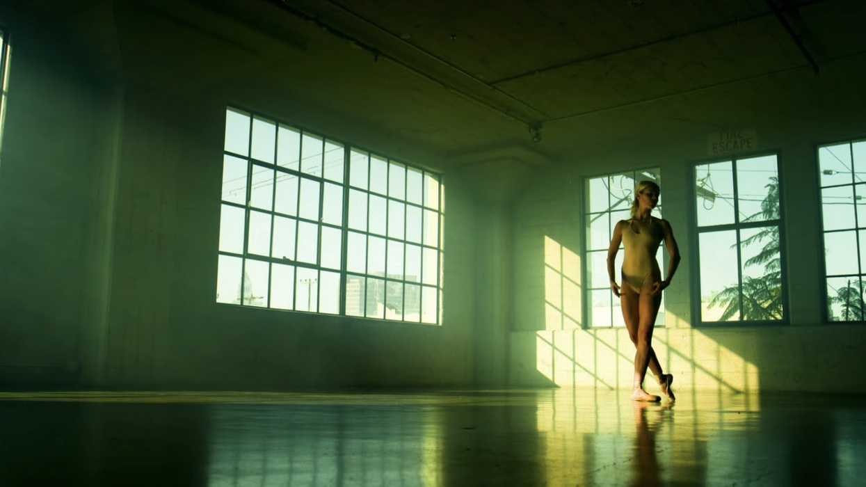
Saturation vs. separation
Another consistent factor in “video”-y grades is an overreliance on saturation.
Many times when we reach for the saturation knob, we’re actually looking for greater separation and can achieve more depth, harmony, and colorfulness by focusing on this factor.
One excellent strategy for increasing separation is to use Resolve’s Custom Curves to add split-toning, which involves pushing cooler colors into the shadows and warmer colors into the highlights. This often leads to more organic and filmic images compared to a simple turn of the saturation knob.
In closing
Now that we’ve studied video looks and how they relate to more cinematic looks, we have a great foundation for exploring and discovering more nuanced aesthetics which defy easy description, and which can make our color work truly unique. Happy hunting!