3 Tips to Color Grading Cinematic Images
Here are three helpful tips to create cinematic looking images in DaVinci Resolve.

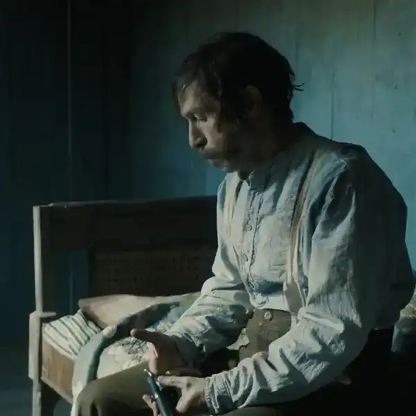
In my decade-long career as a colorist, I’ve worked on every imaginable type of content: short-form, long-form, advertising, non-fiction, episodic—you name it. And while each of these formats requires its own approach, one constant which spans all of them is the client’s desire for a cinematic look.
Virtually all of us are after more cinematic color, but we often come up short—in part because the term itself has become too broad to effectively aim at. To focus on the goal, I like to think of “cinematic” as referring to "an image whose key visual properties are consistent with those of printed film."
Printed film was the primary medium by which we consumed movie images for the first century of filmmaking, and thus is at the very heart of the cinematic aesthetic. In this video, I’ll show you my top three secrets for quickly and consistently achieving this aesthetic in Davinci Resolve.
Strong Contrast Is Your Friend
The first secret to cinematic color is to embrace strong contrast. This isn’t always easy, because, by its nature, a higher-contrast look requires more precision with where we set our exposure. Too often, we’ll pump in some contrast, get an image that looks blown-out or overly-crunchy, and then immediately back off on the adjustment.
But if you can stick with high contrast long enough to finesse your exposure, you’ll get a very different result, and find yourself well on your way to a more cinematic image.
Separation Beats Saturation
The second secret to cinematic color is to prioritize separation over saturation. When you feel a frame is lacking in overall colorfulness or pop, it’s all too easy to reach for the saturation knob, but this isn’t a very cinematic solution.
Instead, try using split-toning—pushing cool colors into the shadows and warm colors into the highlights—to increase your tonal separation and add depth to the image. This characteristic is present in virtually any film print, and deeply evocative when properly applied.
Create Color Density
The third secret to cinematic color is to create color density. Another key aesthetic property of film images is that colors can either be highly saturated or highly luminous, but they can’t really be both.
We can emulate this visual characteristic by identifying the strongly saturated colors in our frame and using a Hue vs. Lum curve to decrease their luminance. This simple technique is especially effective on the pure primary colors (red, green, and blue).
Do you have any color grading tips? Let us know in the comments below.
For more tips, be sure to subscribe to my YouTube channel.