How Color Immerses Us in 'The Queen's Gambit'
Take a look at the popular Netflix show's use of color and how production design adds to the visual story.
When you think of a "cinematic" image, what comes to mind? Is it a widescreen image? Is it one with a shallow depth of field or a certain look? No matter where you stand, the term may communicate more of an emotional connection to a story, one that captivates us in a way that's hard to pin to a single aesthetic.
In The Queen's Gambit, Anya Taylor-Joy plays Beth, an orphan with a cunning knack for chess, who's fixed on beating the best in the world. It's a story that grabs our attention through conflict without words while making the mundane feel cinematic. It's a visual buffet where meticulously planned imagery lands on the cutting room floor to draw us into the narrative.
The series style was curated by production designer Uli Hanisch along with set decorator Sabine Schaaf to capture the culture of the 1960s.
The palette is striking with floor-to-ceiling looks that layer visual subtext to the allegory. Hanisch told Domino, "A strong pattern, no matter if it’s plaid or stripes, gives the room a very strong corset, almost like cell bars or a cage," when describing his approach to Beth’s bedroom. He goes on to say that it's important to add personal touches that tell your story and to think about what colors speak to you.
There are reasons why color is such an important storytelling tool and knowing the basics of color theory will have an impact on your visual story.
Let's take a look at the brilliant use of complementary colors in The Queen's Gambit as explained by "about photography" and see what we take away for our own projects.
As pointed out, color is a powerful mood changer. Colder tones, like blues and grays, can elicit a feeling of sadness or loneliness, while warmer tones can suggest tenderness or joy. By understanding how we react to certain colors, you can harness those rules, or better yet, break them to illustrate a contrasting viewpoint.
There's a reason why we see red in a lot of horror films. It evokes a sense of danger, violence, and anger. It's the color of blood and fire. But red can also signal passion, love, and seduction. With horror, we'll often see dark shadows and red hues as part of the color palette. What if instead, your psycho killer walked into a room painted in pink, a color thought to be calming? Underlay some classical music in the scene, and you have a juxtaposing mood that will have a different impact on the audience.
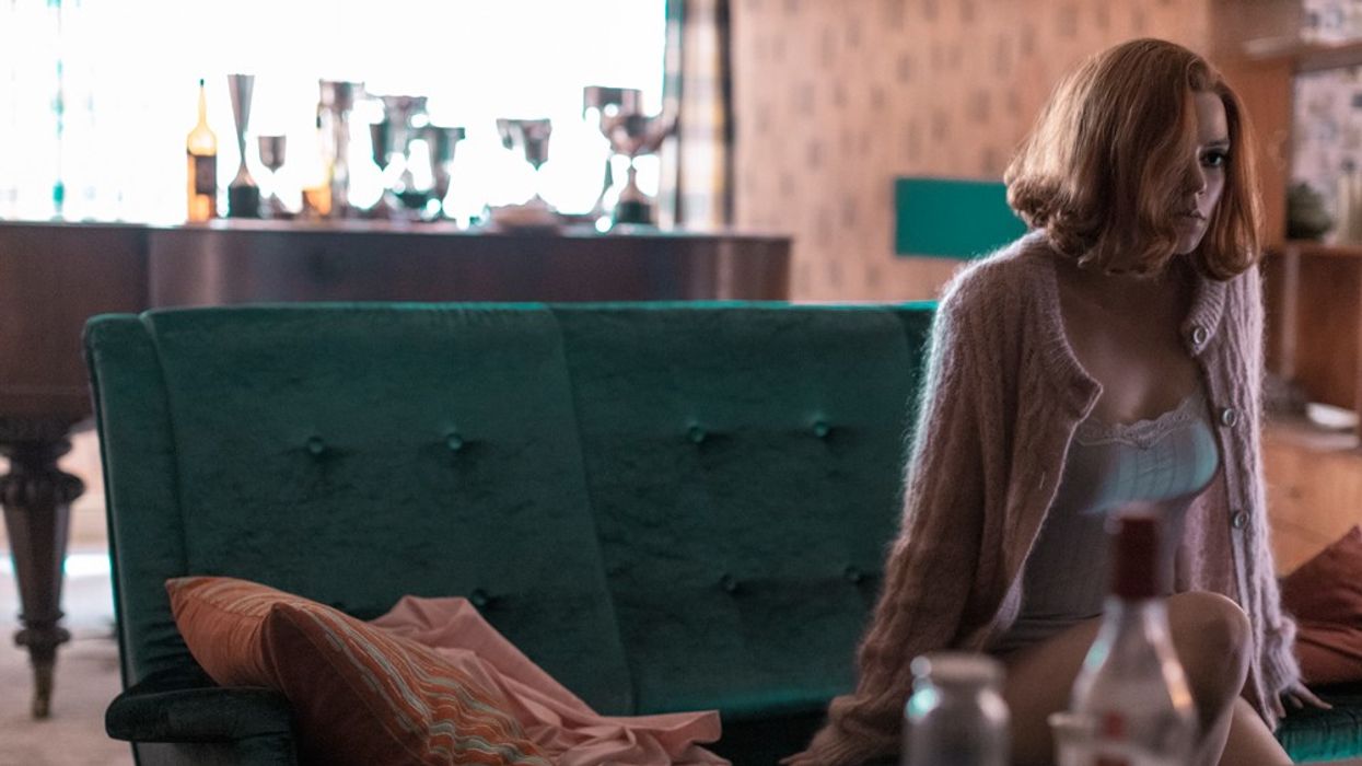
With The Queen's Gambit, a monochromatic palette plays an important role in the visual story. It's a type of look where two colors are predominantly featured in the frame. The series is styled to express different character moods without changing locations. And more often than not, the viewer isn't going to notice.
When Beth is adopted and moves into her new home, her bedroom is saturated in pink hues and textures. Without changing the set decoration, the production used color cues to amplify her emotional state, changing it from pink to milky greys when she feels depressed or lonely. It's a subliminal cue that directly impacts how the audience reacts emotionally to the story, and a technique every creator should know.
You'll see similar techniques in almost every film and television show. Production designers and cinematographers alike will sometimes create rules that match the character arc and the story. As the character grows and changes, so do their surroundings. Sometimes it echoed through color, lighting, or framing, or sometimes all of the above. Think of color as a visual journey that can be changed to fit your story. Knowing that, you can pull your audience in.
Checkmate.
Source: about photography