In Hulu’s The Man in My Basement, the home at the center of the story is more than just a backdrop—it’s a vessel of memory, grief, and history, as well as a stage for confrontation. For production designer Kathrin Eder, the task was both daunting and thrilling: translate a dialogue-heavy novel into a cinematic world where walls, textures, and objects could carry as much narrative weight as the script itself.
That meant months of collaboration with director Nadia Latif and many conversations with cinematographer Ula Pontikos, carefully mapping out the house’s evolution, designing and constructing a full-scale set in Wales, and engineering a basement that could both confine and expand under the camera’s eye.
Drawing on her background in social and cultural anthropology, Eder rooted her designs in the history of Sag Harbor, incorporating the Arts and Crafts movement and Craftsman influences to build a home that felt like a “jewel” of its community—while also layering in the visual language of absence, stillness, and emotional paralysis. Every decision, from stained glass windows that became a visual motif to authentic century-old wallpapers, was made with an eye toward how light, shadow, and movement would transform the sets on screen.
In the interview below, Eder walks us through the technical and creative processes that shaped the film’s physical world and how production design became a crucial bridge between psychology, history, and story.
You can now stream The Man in My Basement on Hulu.
- YouTubewww.youtube.com
No Film School: What were your first thoughts when you read the script for The Man in My Basement?
Kathrin Eder: My first thought was that it felt both intimidating and fascinating. The script was based on a book so heavy on dialogue, and I wondered how that would translate visually. But at the same time, I was drawn in by the subject matter, this layered exploration of race, history, and psychology. With my background in social and cultural anthropology, I felt a deep curiosity about how to approach it. That brought a sense of responsibility and also vulnerability. But that challenge motivated me. It pushed me to ask questions, to approach it with curiosity, and to trust that through collaboration with Nadia and Ula, we could find a visual language that served the story.
NFS: How did you begin envisioning the film’s physical world—the house, the basement, and the environments that shape the story?
KE: I began with the house, because it felt like the heart of the story. Nadia and I spent months talking about its backstory — how it came to be, what it meant to the family, and how it fit into the community of Sag Harbor. We wanted it to feel like a jewel of that community, tied to history and legacy, but also carrying the weight of forgotten-ness. The walls, the objects, the textures all had to reflect both memory and absence.
The basement was a different challenge. This basement wasn’t architecturally refined, and it’s rare to find one in Sag Harbor. It has stone walls and wood beams holding up the world above. We had to make it larger for cinematography, while still capturing that feeling of confinement, emptiness, and unease. We spent so much time in it, and it had to be a space where the characters’ inner worlds collide.
And then there were the environments beyond the house: the shop, the bar, the gas station. Each one was an extension of the world, grounding the story in daily life but also shaping the contrasts between inside and outside, community and isolation. Together, these spaces created a physical world that could hold the psychological weight of the story.
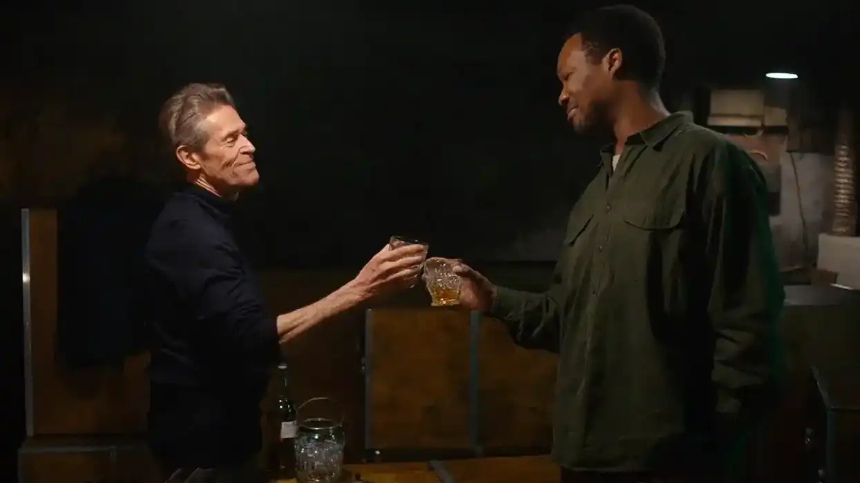
 'The Man in My Basement' BTS Credit: Projection PR
NFS: What central design ideas guided your approach?
KE: The key central idea for me was generational history. Charles, as the last member of his family, struggling to pay homage to that legacy and carry it forward. The house became a metaphor for that. It was designed a little larger than life compared to the real homes of the Sag Harbor community, because within the story, it stood as the heart of the community, a symbol of strength, family, and togetherness. Nadia loved the idea of pulling inspiration from the Arts and Crafts movement, with its deep connection to nature, and we also took the liberty of drawing from Craftsman-style homes, which are less common in Sag Harbor. Those choices allowed the house to stand out as a kind of jewel in the community.
From there, we drew on principles of grief, forgotten-ness, and depression. The spaces needed to carry that weight and the sense of objects being discarded rather than cherished, and Charles’ history fading away. And finally, there was the stillness that comes when you are emotionally paralyzed and struggle to create change. That stillness created the texture of the house and reflected Charles’s state of being, mirroring his inner life.
NFS: The house obviously plays a critical role in the film. Can you talk about why this location stuck out to you?
KE: The house was actually a full set build, but Sag Harbor was always the location in our minds. What stood out to me was the weight of history the community carries. There is a strong legacy of free black families who live there and shaped it. We wanted the house to reflect that, to feel like a jewel of the community and a metaphor for strength, family, and togetherness.
NFS: How much did you have to change the house for the film? For instance, were the stained-glass windows already there?
KE: The house was a full set build, and the stained-glass windows emerged naturally as part of the design. They weren’t scripted, but since stained glass is such a hallmark of the Arts and Crafts movement, it felt right to include them, and the layout revealed a few perfect places where they aligned with the shortlist and blocking Nadia and Ula were working out.
The windows seem to have taken on their own symbolism, which I love. They feel almost like the soul of the house, with many facets reflecting the layers of the human experience. And it was striking to see the windows featured in the trailer, almost like an actor in the film.
NFS: How did the production design reflect the psychology of Charles (the homeowner) and Anniston (the man in the basement)?
KE: The design really leaned into the vertical axis: above and below, light and dark, two sides of the same coin, polarities. Charles and Aniston exist in one dialogue, and the house with its basement becomes the vessel for that. The upstairs carries history, memory, and stillness, while the basement strips everything down to confinement and rawness.
That split wasn’t intended to just be architectural; it was intended to also be psychological. Charles is weighed down by legacy and paralyzed by it, while Anniston occupies a space of absence and shadow — or is it? Who is what and feels what? We attempted to hold these two worlds in one structure and create constant tension. Again, polarities: one full, one empty, both uneasy. It mirrors the way the book itself deals with questions of history, identity, and morality, and it speaks to how we continue to wrestle with those issues today.
NFS: Was there a set or prop detail that viewers might not consciously notice but was essential to the authenticity of the space?
KE: I wish we had seen more of the parents’ bedroom—it was one of my favorite spaces. Charles avoids it because it reminds him of what once was, but the room quietly tells us so much about his parents and who they were. There was a beautiful tapestry, and the headboard had flowers carved into the wood, symbolically interwoven to reflect their relationship.
What viewers might not consciously notice is that our wonderful set decorator, Hannah Nicholson, introduced me to a vendor in England with an incredible collection of authentic wallpapers, some more than a hundred years old. We acquired a few of those, and in that way, they’ve been forever eternalized in the house we created for the film.
NFS: Were there particular discussions with the cinematographer about how sets would be lit and shot?
KE: Yes, there were many discussions with Ula, our cinematographer. From the beginning, we talked about how the sets would hold light and shadow, and how the architecture could shape the camera’s movement. The basement was especially important; we had to design it larger than life so it could be lit and shot in ways that kept three weeks of cinematography visually interesting. Every choice in texture, color, and space was made with an eye toward how it would respond to light, shadows, silhouette, and camera movement.
NFS: Looking back, is there a particular design choice you’re most proud of in The Man in My Basement?
KE: Hmmm. I need to think about it. But overall, I am happy with how the design turned out on screen. It’s most often easier looking back to see what I would do differently next time.
 Kathrin EderCredit: Projection PR
NFS: How did this project expand or challenge your artistic voice as a production designer?
Eder: I think it’s still too soon to tell. What I can say is that I loved working in Wales and the UK for the first time and learning a new filmmaking system. I also loved the risk we took in building the exterior of the house in a swamp and creating an entire Sag Harbor neighborhood there.
Whether or not this project expanded my artistic voice might be something better asked of my closest collaborators; they often notice growth before I do. For me, it was about embracing the challenges of this project, trying new approaches, meeting a whole new group of inspiring and creative people, and seeing where that might carry me forward.