Film color palettes might be one of the most underutilized parts of your filmmaking process. It can be the difference between immersing your audience in a world or boring them to tears.
We all remember the first time we saw The Wizard of Oz. There's that magical moment where we go from the sepia tone to full color. The world explodes off the screen, and for a moment, we understand Dorothy's amazement as she enters Oz.
Here at No Film School, we're big believers in the power of color to help harness your storytelling capabilities.
So today, I want to dive into the film color palette and look at how you have device choices about those colors; it can make you a better filmmaker.
Let's dive in.
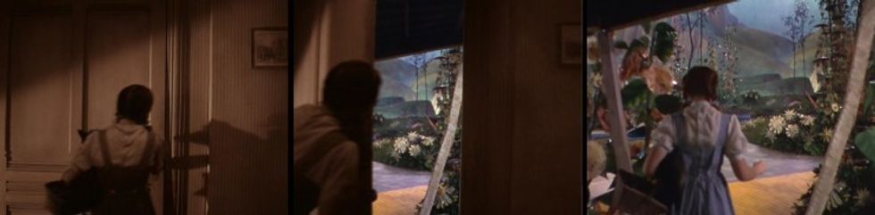 'The Wizard of Oz'Credit: MGM
Why Choose A Film Color Palette
Think about your favorite movies.
What were their color schemes like, and what do those film color palettes add to the story?
The use of color can bring a lot to your film, and studying how film color palettes can help amplify your work. As Roger Deakins said, "It’s easier to make color look good, but harder to make it serve the story."
Film Color
So, what is film color?
Well, film color can refer to your movie actually being shot in color rather than black and white, but today we're going to talk about the colors used in film that elicit emotions from the audience.
We're going to focus on Film Color Theory today.
Film Color Theory Definition
Film Color Theory is the theory that certain colors in film elicit specific emotions from the audience. Manipulation of these colors can be used to guide the audience toward the author's intent, juxtaposed against one another to convey a message, or subverted to create dramatic irony.
To properly utilize Film Color Theory, you first have to take a look at the color wheel in a film.
The Color Wheel In Film
A color wheel, or color circle, is an arrangement of color hues in a circle that shows the relationships among primary, secondary, tertiary, and other color combinations.
The infographic below details all the different kinds of colors and color combinations in cinema. It's an important tool for any director to keep by their side. This can help them decide how their sets should look, which costumes will pop on camera, and how scenes should be lit.
Directors wield significant power over what appears on screen. Collaboration with the art department, cinematographer, and costume designers is so important. Color is not just how you balance the camera, but also how people are dressed and how sets look on screen.
Color Palettes On Set vs. Post-Production
A great film color palette is actually created twice: once on set and once in the edit suite.
- Production Design & Practical Choices: Everything in front of the lens. You have costumes, props, paint, set dressings, and physical lighting gels.
- Color Grading & Digital Finishing: This is what happens in post-production. A colorist uses HSL (Hue, Saturation, Luminance) controls, Look-Up Tables (LUTs), and color space transformations to enhance, balance, or completely alter the footage shot on set. If you don't bake color into your production design on set, even the best colorist in the world will struggle to give your film a unified look later.
For example, consider all the magnificent work Wes Anderson has done. His movies are defined by their color palettes and what emotions are expressed through those images.
We have costumes that reflect those colors, but there's also post-production saturation to make them pop and evolve over the course of the movie.
 'The Royal Tennenbaums' Credit: @CinemaPalettes
The colors in this frame give us the poppy world of this movie and set the film's dark, depressed tone.
Anderson can also capture the opposite.
A world of adventure and a girl who wants to take on the world.
 'Moonrise Kingdom'Credit: @CinemaPalettes
To understand how all this still works, you'll have to understand how color works. And how you can manipulate colors to get what you want on the screen.
So let's break colors down.
What Goes Into a Color?
Hue
Hue is one of the main properties of a color, defined as "the degree to which a stimulus can be described as similar to or different from stimuli that are described as red, green, blue, and yellow." What it actually means is that hue refers to what color you're looking at. Or the color itself.
Hue is great, but you need other elements to deepen your understanding of color and express it on the screen.
Saturation
Saturation is another color property that describes how intense a color we're getting. It's the depth of the color at hand. The infographic below shows you how saturation works.
To truly appreciate how hue and saturation work, you need to look at color value.
Value
The value of a color describes whether or not a color is dark or light. A dark blue would have a higher value. A light blue, a lower value.
 What Goes Into a Color?Credit: Wikimedia Commons
The Role of Lighting & Color Temperature
You can't talk about hue, saturation, and value without talking about light itself. Color temperature (measured on the Kelvin scale) dictates the natural warmth or coolness of your scene:
- Tungsten Light (3200K): Warm, orange, intimate, or nostalgic.
- Daylight (5600K): Cool, blue, crisp, or sterile.
Directors and cinematographers often mix color temperatures in a single shot. They do these pairings sort of like wine and food; you want them to go together and bring out the most in each other.
This creates rich visual contrast and depth without changing costumes or paint.
Now that you understand how to choose and describe the colors you'll want in your movie's color palette, let's explore how those colors can influence emotions on screen and in the audience.
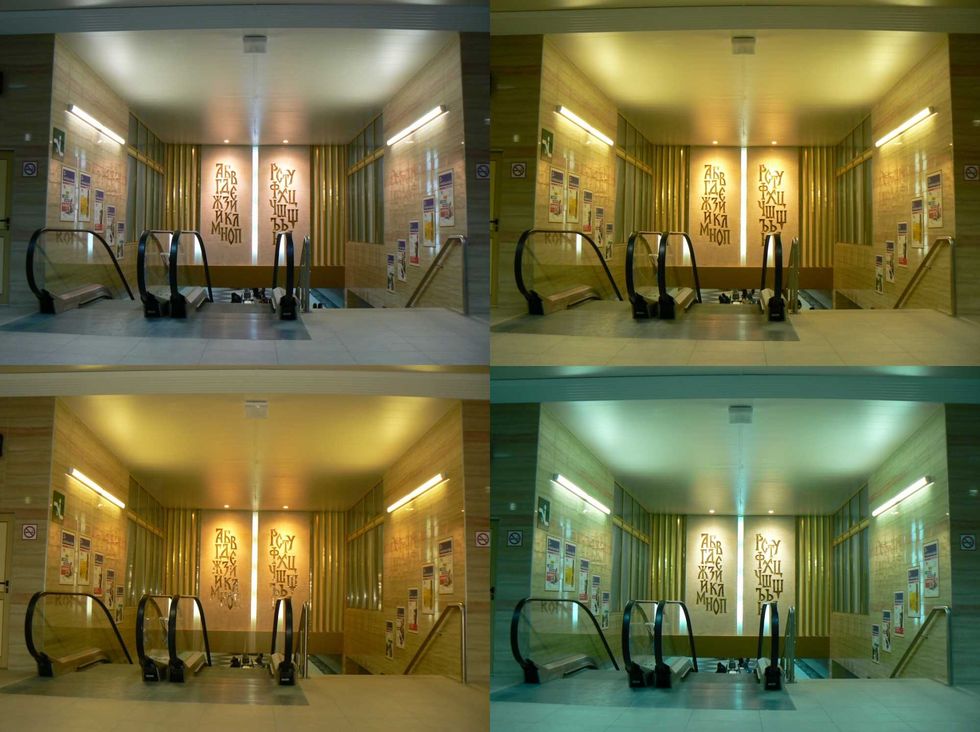 Collage of 4 images of Metro station "Sofia University", Sofia. The image illustrates the differences in the white balance setting. Up left: auto WB, up right: sun, down left: flash, down rightCredit: Wikimedia Commons
How Color Can Affect Emotions In Film
We all know that film is an empathy machine. A great story can take you pretty far, but film is a visual medium. We're not meant only to read things; we're meant to see things. And colors help us see the intentions behind what was on the page and what the director wants from us.
The infographic below sets up which colors will help you assign which emotions to scenes or parts of your movie or TV show.

Here's a quick guide from one of our other posts on color:
- RED – anger, passion, rage, desire, excitement, energy, speed, strength, power, heat, love, aggression, danger, fire, blood, war, violence
- PINK – love, innocence, healthy, happy, content, romantic, charming, playfulness, soft, delicate, feminine
- YELLOW – wisdom, knowledge, relaxation, joy, happiness, optimism, idealism, imagination, hope, sunshine, summer, dishonesty, cowardice, betrayal, jealousy, covetousness, deceit, illness, hazard
- ORANGE – humor, energy, balance, warmth, enthusiasm, vibrant, expansive, flamboyant
- GREEN – healing, soothing, perseverance, tenacity, self-awareness, proud, unchanging nature, environment, healthy, good luck, renewal, youth, vigor, spring, generosity, fertility, jealousy, inexperience, envy
- BLUE – faith, spirituality, contentment, loyalty, fulfillment, peace, tranquility, calm, stability, harmony, unity, trust, truth, confidence, conservatism, security, cleanliness, order, sky, water, cold, technology, depression
- PURPLE/VIOLET – erotic, royalty, nobility, spirituality, ceremony, mysterious, transformation, wisdom, enlightenment, cruelty, arrogance, mourning, power, sensitive, intimacy
- BROWN – materialistic, sensation, earth, home, outdoors, reliability, comfort, endurance, stability, simplicity
- BLACK – No, power, sexuality, sophistication, formality, elegance, wealth, mystery, fear, anonymity, unhappiness, depth, style, evil, sadness, remorse, anger
- WHITE – Yes, protection, love, reverence, purity, simplicity, cleanliness, peace, humility, precision, innocence, youth, birth, winter, snow, good, sterility, marriage (Western cultures), death (Eastern cultures), cold, clinical, sterile
- SILVER – riches, glamorous, distinguished, earthy, natural, sleek, elegant, high-tech
- GOLD – precious, riches, extravagance. warm, wealth, prosperity, grandeur
How Color Makes You Feel
As you can see, many colors take on specific feelings. You need to support the color with actions and set pieces within the screenplay. You can't just add color blobs. You need to have artistic intention behind every frame.
Take this image from Edward Scissorhands. Tim Burton is trying to set up an idyllic neighborhood to juxtapose against Edward's mansion. So he uses these pastel colors to make each house pop and to make the suburban lifestyle feel like a utopia.
 'Edward Scissorhands' Credit: @CinemaPalettes
Color Psychology in Film
What's Color Psychology in film?
This is the study of what complex emotions each hue can create when mixed with saturation and value. That's right, all our lessons are coming together! Let's take a look at this chart and really pull back the emotions and tone you can add to your stories.
Let's take a look at three drastically different films and how they use color.
First up, take a look at Harry Potter and the Deathly Hallows Part 2.
This is a somber movie. It's all about ending a series and the ending of many lives. That's not a joke. It's just a fact. So the movie thrives on the blues and greens, and not only on Lily's eyes. But you can't use bright blue and green. It has to be understated. That's where hue, saturation, and value come into play. It's muted, understated, and somber.
 'Harry Potter and the Deathly Hallows Part 2'Credit: @CinemaPalettes
What about something that's also dark, but needs to inject humor into its dead veins?
The Corpse Bride does exactly that by pushing more into primary color territory. It can be cold and somber, but these colors also give mystery and excitement.
 'The Corpse Bride'Credit: @CinemaPalettes
And sometimes you can also find stuff that's cold and warm. Like the movie Frozen.
Frozen combines the color schemes of the above two films, but pushes everything back into vibrant territory. It's a movie that plays off the cold of the snow but relates us to the warm characters searching for love, acceptance, and family.
 'Frozen'Credit: @CinemaPalettes
These colors work well together. And there's a reason for that.
There are four main types of color schemes based on color concepts that work well together. Let's explore them.
Four Types Of Color Concepts
As you dig into color palettes in film, you're going to need to learn four color concepts that will help you choose what works in your film or TV show. Check out this other infographic that describes all of the four color concepts, and we'll break them down below.
 Crdit: Gaddis Visuals
Monochromatic
Let's start with the most straightforward of the color concepts. Monochromatic color refers to a color scheme based around only one color. Like how The Matrix is based around the color green. It's in almost every frame and becomes part of the movie.
 'The Matrix' Credit:\u00a0Warner Bros.
Monochromatic doesn't have to be sad or somber. You can also have brighter monochromatic movies. Like how The Grand Budapest Hotel thrives on different versions of pink with variations in saturation.
 ' The Grand Budapest Hotel'Credit: @CinemaPalettes
Analogous
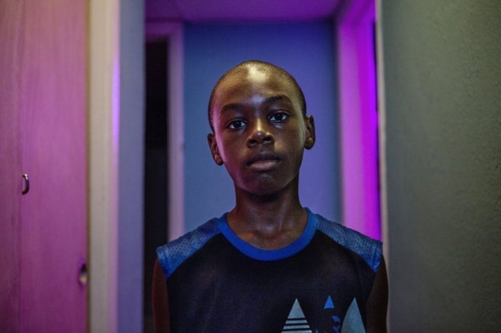
An analogous color scheme in film or TV refers to colors that are neighbors on the color wheel. Filmmakers often choose from either warm or cool colors for their analogous schemes because they generally fit the theme of the movie or TV show. The idea here is to get colors that find balance or harmony together.
Check out this image from Moonlight. See how it's full of purples and blues?
 'MoonlightCredit: A24
The same goes for this image from Mary Poppins. All these colors work together and sit near one another on the wheel.
 'Mary Poppins' Credit: @CinemaPalettes
Again, this works with warmer tones, like this shot from Ang Lee's Life of Pi.
 'Life of Pi'Credit: @CinemaPalettes
Complementary
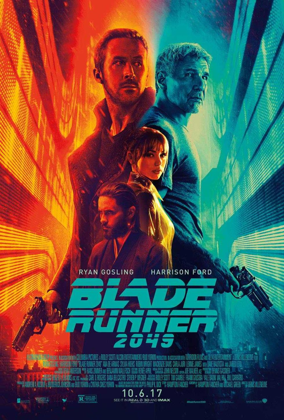
Complementary colors are colors on opposite ends of the color wheel that still look good together. You see them used on screen a lot, but you also see them in movie posters a ton.
The idea behind these posters is based on complementary colors that also play into our psychology. You can see how the manipulation of hue, saturation, and value contributes to the tone of each movie represented in these posters.
The Blade Runner 2049 one has maybe the most obvious with organ and blue juxtaposed.
 'Blade Runner 2049' Credit: Warner Bros
You can try your hand at it with our movie poster template!
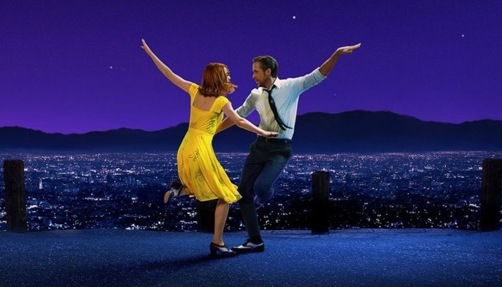
Outside of marketing, complementary colors also matter in storytelling. Like, if you're trying to bring a couple together and show their chemistry as well. And set them apart from the backdrop.
 'La La Land' Credit: Sony
Triadic
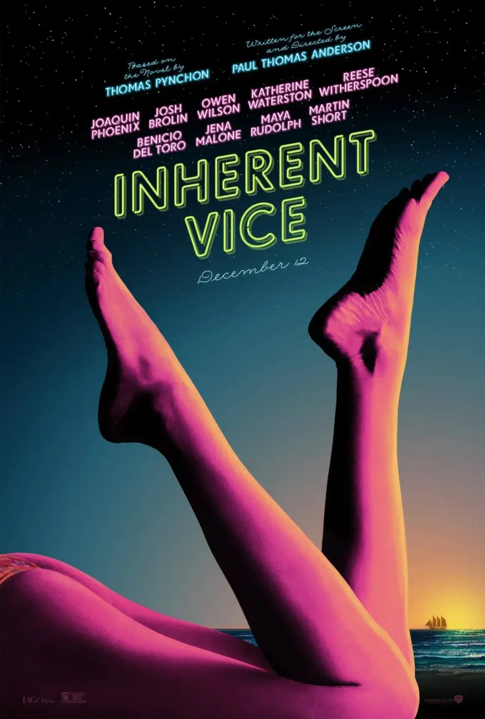
Triadic color schemes are schemes that use three colors at even distances on the color wheel. Like this poster for Inherent Vice.
 'Inherent Vice' Credit: Sony
That's poppy and neon, but what about something understated like the red doors in The Sixth Sense, juxtaposed against the yellow sand blacks in the rest of the movie?
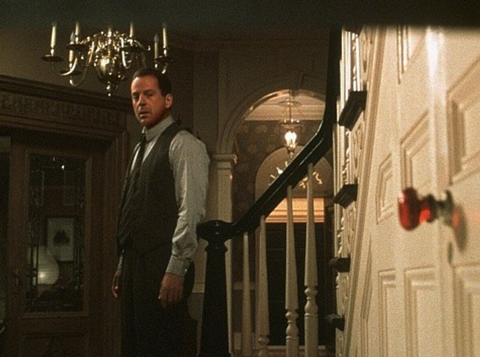 'The Sixth Sense' Credit: Disney
Here we have impending doom and a highlighted thing for the audience to key in on as Bruce Willis's character moves toward the door.
But what about when filmmakers use colors that don't go together at all?
Discordant Movie Color Palettes In Film
Ahhh, it is true that opposites attract. Discordant colors are those that are almost opposite each other on a color wheel. In color theory, a complementary color is the one directly opposite of a color. That means yellow and purple are complementary colors because they are directly opposite each other. Which makes them discordant. Makes sense?
Yeah, it's confusing. But let's jump into some examples.
 Credit: No Film School
Often, directors use discordant colors to make something stand out. Like the girl in the red coat in Schindler's List.
Or the woman in the red dress in The Matrix.
It also thrives in movies like Pleasantville, which are all about colorizing a world that's decided it's okay to be mundane.
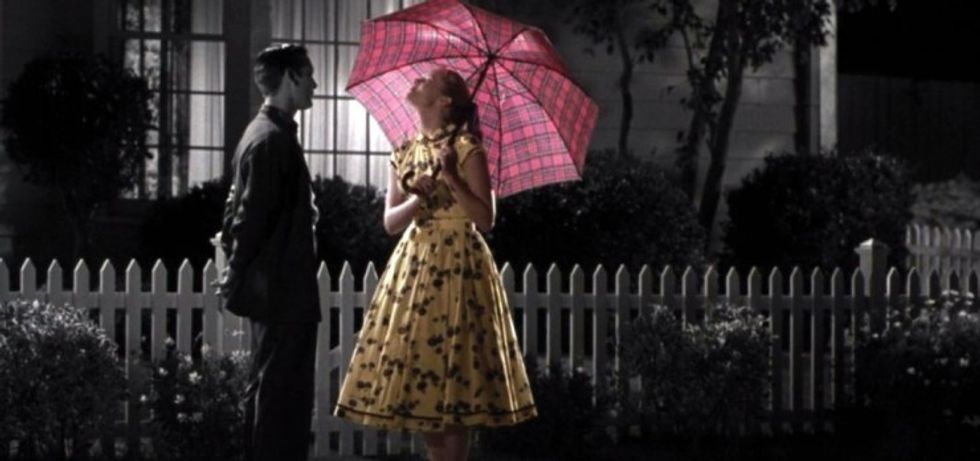 'Pleasantville' Credit: Sony
Associative Color Palettes In Film
The associative color palette in film or TV is basically the flag you fly when someone walks into a room. It's Umbridge's pink coat or Heisenberg's blue meth. It's the color we associate with the person or place.
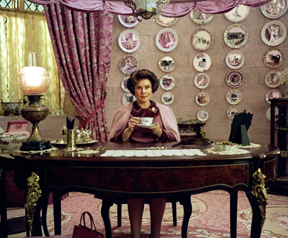 'Harry Potter and the Deathly Hallows' Credit: warner Bros.
Like the red of the entire rebel army in Star Wars. So we can also make the dirt under the salt red. Letting them fly their colors as they travel into battle.
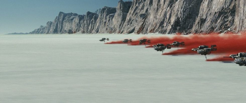 'The Last Jedi' Credit: Disney
So if colors mark a character, and we have a character arc, you may need to transition colors to help monitor that change.
Transitional Color Palettes in Film
You know I love a good character arc. If you're following my Free Screenwriting Seminar or Free Pilot Writing Seminar, you know that character arcs are incredibly important for dramatic conflict. You can mark these transitions with color to help emphasize them to the audience. Look how we used Walter White's transition into Heisenberg by darkening his attire and surroundings.
 'Breaking Bad' Credit: AMC
It doesn't have to be that drastic either.
One of my favorite recent films is Gone Girl. Look how Fincher uses the first and last scenes of the movie.
In the beginning, we see a cool-toned woman, her innocence on display. The cool colors give us the feeling of death.
In the end, he's warmed it up, but now you know she's capable of anything. She's very much alive. And if you mess with her, you might wind up dead.
 'Gone Girl' Credit: Warner Bros.
You can even use color to track characters and their tone over time.
Look at all these different takes on Superman over the years. And how his colors were used to represent the tone of the movie and the character.
'Superman'
 'Superman'Warner Bros.
 Why is it So Tricky to Adapt Superman to the Big Screen?
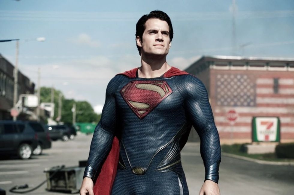
'Man of Steel'
Warner Bros.What Was One of James Gunn's Favorite Moments on 'Superman'?

'Superman'
Credit: Warner Bros.It can be hard to choose colors on your own. That's why working with a crew is wonderful. And so is utilizing a film color palette generator.
Film Color Palette Generator
I scoured the internet and thought that the folks at Colormind have a pretty great color generator tool.
Colormind is a color scheme generator that uses deep learning. It can learn color styles from photographs, movies, and popular art. You show them the colors you want, and they pull them for you. It's very intuitive and sort of works like Shazam for colors.
I also like the work done by Movies In Color. They actually pull the colors and color spectrums from movies and make them accessible to people all over to understand how people achieve what's on screen.
 Credit: Miyazaki
How to Build a Film Color Palette: A Step-by-Step Checklist for Indie Filmmakers
Ready to put this into practice on your next project? Here is a simple workflow to get started:
- Build a Lookbook: Gather reference frames using tools like ShotDeck or Pinterest during pre-production.
- Assign "Anchor Colors": Choose 1–3 primary colors that represent your protagonist, antagonist, or central themes.
- Wardrobe & Set Audits: Ensure your actor’s outfit doesn't accidentally blend into the wall—unless that’s the point!
- Communicate with key heads: Share your mood board directly with your DP, Production Designer, and Colorist before shooting a single frame.
Summing up Color In Film
I hope this post has helped broaden your understanding of film color palettes and how they can be used to make your story pop off the screen. As you saw in our film color palette examples, having a great screenplay is a good start, but the story can only be intensified with excellent production design, editing, and color work.
So whether you want to learn about color grading, film colorists, or you're just obsessed with the way David Fincher uses color, you know you can find it all here.
Special thanks to CinemaPalettes, where we got most of our images for this post.
What are some of your favorite uses of color in film?
Are there times color has taken you out of a story?
What are some great color tools for beginning and experienced filmmakers?
We want to hear your thoughts on making the colors in your movie color palette in the comments!
If you're interested in digging deeper into color, check out our post on how the colors of Wonder Woman help add dynamic action to the story!
Till next time...
- The Psychology of Color in Film (with examples) ›
- What Is The 60-30-10 Color Rule in Filmmaking? | No Film School ›
- "What We’re Doing Is Not a Scorsese Restoration": Behind the Curtain of the AI-Enhanced 'Oz' | No Film School ›
- Discordant Colors Explained: How They Work And Why Filmmakers Love To Use Them ›
- Associative Colors Explained: Just One Can Impact An Entire Movie ›