This post was written by Lisa McNamara and originally appeared on Frame.io Insider on Sept. 12, 2022.
And the best ones do more than just tell you the name and the people who star in it or worked on it—they’re there to represent the plot or themes through moving images, typography, and music. They set your expectations for the feel of the show, and entice you to keep watching.
They’re also entertaining and intriguing in their own right, mini-masterpieces requiring teams of artists to conceive and create.
Think back to some of the most iconic title sequences in recent memory: David Fincher’s Se7en, South Park, Mad Men, Spider-Man: No Way Home. Each one is completely unique in style, but with a common thread—they were all created by Imaginary Forces, the LA-based creative studio whose work has won more awards than we can easily count.
At this year’s Creative Arts Emmy Awards, Imaginary Forces has been nominated for no less than four title sequences—Cowboy Bebop, Candy, Lisey’s Story, and Foundation—all displaying a stunning variety of techniques.
In this installment of Made in Frame, we were privileged to hear from the art director and designer for the Foundation title sequence, Brandon Savoy, who steps us through the process and tools they used to create an Emmy-worthy open for an epic story.
An opulent history
Not unlike The Lord of the Rings or Dune, Foundation comes with a weighty legacy and a serious fan base. So not only are the show creators charged with satisfying an audience that has high expectations, the main titles must be equally exceptional and of the highest quality. It’s no small ask, when you consider the breadth of the story and the depth of the themes contained within.
Imaginary Forces’ creative director Ronnie Koff explains the approach to the title design:
“The opening title sequence is about iconic monuments of power, and the demise that comes from hubris and ego. Originally, this was designed to reference militaristic-style propaganda, each frame ties us back to those compositions. The saturated color palette also comes out of that style, and red in particular, is used to signify Soviet-era visuals,” he says.
“Our intention was to create a vibrant interpretation of the ‘living mural’ as depicted in Foundation. The Mural of Souls is an ever-evolving painting of the historical events within the Galactic Empire. We essentially set out to build a pop propaganda piece that would signal the march of the Empire. Using vibrant colors and the sacred math that predicts the empire’s downfall, we wanted to show the opulence and dissolution of a once-proud legacy.”
Given these conceptual demands, how do you even go about executing them when you could, theoretically, approach it in about a million different styles?
Brandon explains that after Ronnie shared his ideas, the creative team, including designers James Gardner and Nicole DiLeo, began looking for references. “We started by reading the script and studying the show as much as possible to really get an idea of what the story was about. The Mural of Souls is made of vibrant particles—it’s almost living when you get close to it. This became a launching point for our design thinking,” he says.
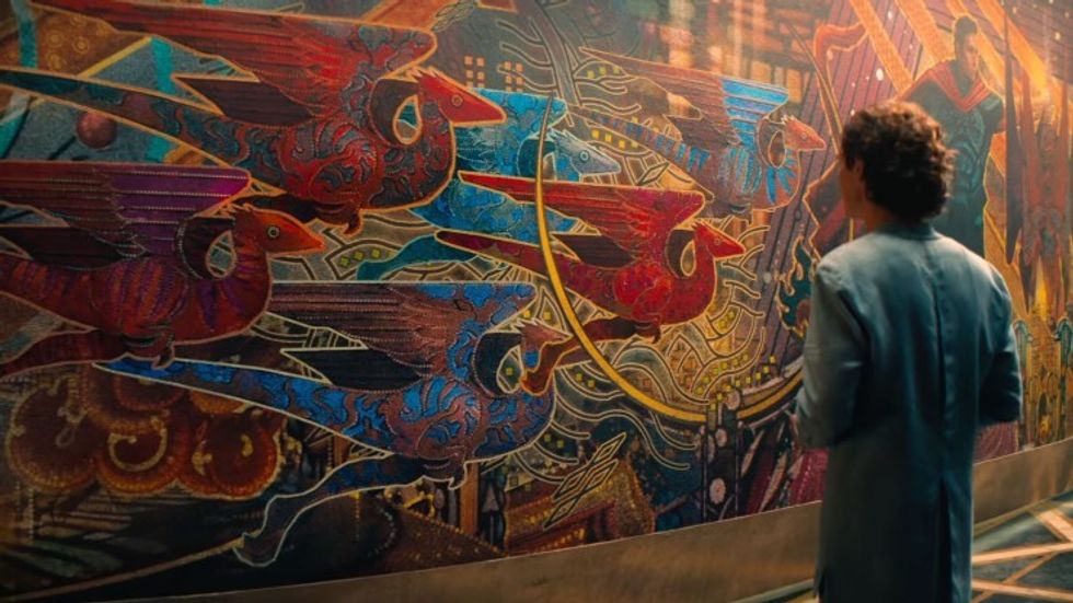 The Mural of Souls is a theme that runs throughout 'Foundation.'Credit: Apple TV+
“We then researched a ton of brutalist design concepts, old propaganda, sci-fi poster designs, color, typography, you name it. From digging through old books to scouring the internet for references, we all tried to contribute ideas to support the overall concept. Finally, we looked at how we could bring all those elements to life with particles and give a hint to how massive a world Foundation is.”
A galaxy of possibilities
The elegance of superb motion graphics can belie the intricacy of the process, from establishing the color palette, to creating the models, to figuring out the camera movement and transitions, to designing the typography—which all has to move and mesh with the music.
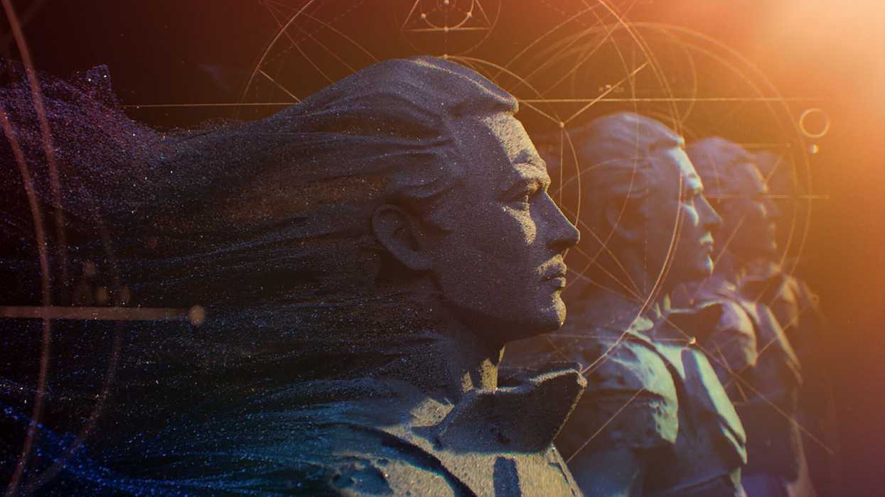
 Imaginary Forces’ intro hints at the complexity of the Prime Radiant—a visual representation of Asimov’s psychohistory.Credit: Apple TV+
What looks so smooth and seamless in its final form can take months of development, especially when you’re dealing with something as infinitely manipulatable as particle systems. In a nod to Asimov’s psychohistory theory, in which “an observer has great difficulty predicting the movement of a single molecule in a gas, but can predict the action of the mass of the gas with a high level of precision,” the team went to work to explore the behavior of animated particles.
“We were fortunate enough to have time to take an in-depth look at various aspects of the design,” Brandon says. “Everything from color, to the rigid angles of the models, to the density and reflective quality of the particles was really explored a ton to find the right balance of each.”
Brandon turned to the full Adobe suite of products, along with various 3D applications including Cinema 4D and X-Particles. “There are so many great tools already available. It’s really about pushing those to the limits and exploring new ways of utilizing them,” he says.
But while he declares Adobe After Effects and Photoshop to be his “best friends,” he also loves trying out new tools. “I tend to use anything and everything I can get my hands on. One thing I love about using new products is that you have no idea how to use them, so in the process of learning them you tend to find new techniques to incorporate into your creative process.”
Which means that when you have lots of powerful applications that can be used in tandem to create almost any kind of result imaginable, thorough exploration can send you down a rabbit hole of possibilities.
A constant evolution
Most editors will go through a dozen or so versions of a cut to get to a final. But when you’re dealing with something as creatively subjective as look development on animation, the number of iterations can go into the hundreds.
“With projects like these it takes a lot of trial and error to find the balance of what is too much and what is not far enough,” Brandon says. “For the design frames I simulated hundreds of iterations to find the right balance of the particles. Eventually the animation team took these even further inside of Houdini and really brought them to life.”
 'Foundation’s title sequence has a bold and vibrant color palette.Credit: Apple TV+
Not that thousands of iterations were shared, but when they were, Frame.io helped the team stay in sync with feedback—especially because they’re able to work with some of the best artists worldwide. “We use Frame.io a lot on reviewing and making notes, which has really come in handy during the past few years with all the remote work we’re doing,” he says. “Adding notes to particular frames of a video and using the Status feature is great, and that allows you to get on and see what needs attention.”
A high level of precision
By all accounts, this project involved many artists who spent many hours on the finest details, from perfecting the shimmer on the animated particles to the soundtrack, on which Bear McCreary reportedly used mathematical algorithms to help create musical “particles” that only a machine could generate—another nod to the character of Hari Seldon.
This almost obsessive attention therefore begs the question, How do you know when it’s finished?
“Often, when working on a project, there will be points where the design is telling you what it needs,” Brandon replies. “It’s like putting a puzzle together. With each piece, the picture becomes clearer. I’m also a perfectionist so it’s hard to say it’s ever really done, but we do have deadlines.”
It’s that level of perfectionism that earns Emmy nods. But even more than that, there’s the passion for the work, which is also a common thread among the Imaginary Forces creatives.
“I’ve always had a love for main titles, sci-fi, and particles, so this project was directly up my alley,” Brandon says. “Having an amazing team that was able to really push each other and for it to turn out as beautiful as it did is one of those things you can only hope for on a project.”
“As creatives, we put so much dedication and hard work into our craft, for it to get this much recognition feels amazing. For it to be up for an Emmy is really just the icing on the cake.”
It’s a sentiment echoed by several other members of the team, who agree that while the work takes time and passion, the privilege of being able to create such amazing art is, in itself, rewarding beyond measure.
Which resonates with us. Because seeing the incredible work our customers do is definitely its own reward.
This post was written by Lisa McNamara and originally appeared on Frame.io Insider on Sept. 12, 2022.