Four Tips for Color Grading the Perfect Summer Shot
These color grading tips will help you create an endless summer for your next project.
We all wish summer could last forever. Great weather, clear skies, yet some harsh lighting. We can work past harsh lighting, though. And unfortunately, summer doesn't last forever, yet some projects require summer to exist at all times.
Capturing that summer feeling is easier said than done. It could be that the camera’s settings are off or the fact that you’re shooting in the middle of winter, but creating a summer look can be done through the simple magic of color grading.
The magic of creating a shot that feels like summer can be perfected with a little color grading. Shutterstock Tutorials breaks down how to color grade your shot to make it feel like summer even if the raw footage disagrees. Check out his video below for some quick tips:
Create a whitewash spot in the sky
Nowadays, cameras are becoming increasingly better at capturing dynamic images that rescue highlights and shadows from being washed out.
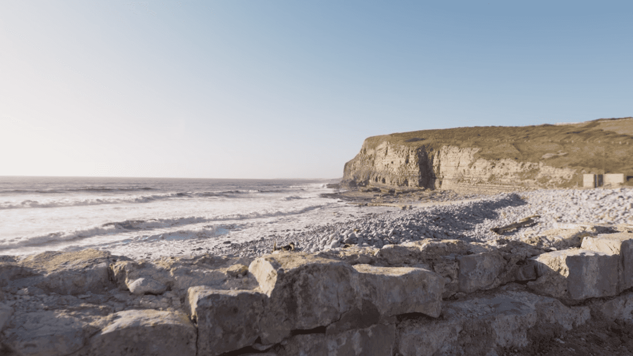
However, we don’t always want all of the highlights to be saved. If the viewer can see too much of the sky, then the subconscious tells us that there is something off about the image if it is trying to portray the summer. During the summer, the sun is positioned at a high point in the sky and bookended by the magic hour at the start and end of the day. Since the Earth is tilted toward the sun throughout the warmer months, there is always going to be a bit of a bright spot in the sky.
To create this bright spot in the sky, bring the highlight level up to the point where there is an area in the sky that is somewhat hot. Brightening up the image rather than overexposing it reinforces the idea of a sunny summer’s day.
Adjusting the highlights and the midtones in the curve panel will create an image so perfectly colored that everyone can recognize the season.
Warm up the image
Even if you did shoot in the summer and something feels off, it could be the temperature of the image. Your initial instinct may be to adjust the warmth of the shot, but that may do more harm than good.
The temperature tool's primary use is to correct the white balance of all regions of the image. Instead, you want the warmth to hit only the highlights. By using the color wheels, or the curves, you can add warm tones to the highlights and upper mid-tones to create a naturally warm image.
Follow the summer genre convention
Like any genre, some elements are essential to how that specific story is told. These elements may not be grounded in reality, but they are a trope that audiences have accepted. (Some of these tropes could stand to be bucked, like shots of Mexico always being orange. In our opinion, that's a bit tired.)
Summer has gradient elements that are a part of its genre convention. The heavy grade filter that we’ve seen countless times on any show that takes place at the beach. To create this look, take the gradient tool and position it midway in the sky. Then bring down the highlights to emphasize the blue in the sky.
If you’re wanting a more stylized look, it is better to keep the gradient line hard.
Make the sky teal
Changing the color of the sky sounds crazy, I know. Strange as it may be, a teal sky is an element that is a part of the summer trope. Kid shows, ads, and a lot of pop music videos alter the color of the sky to create complementary contrast with the warm, sandy beaches and surroundings.
To get the perfect shade of teal for your image, find the hue first tool and select the sky. Then, slightly change the hue until the sky falls into the teal shade. To finish up color grading the sky, bump up the saturation so it stands out. A teal sky is a more stylized element that may or may not work for your shot, but try it out and see if it makes your shot feel more like summer.
Do you have any other tips to color grade a shot to make it feel more like summer? Let us know in the comments below!
Source: Shutterstock Tutorials