This post was written by Michelle Gallina and originally appeared on Adobe blog on Sept. 29, 2023.
Intriguing visuals, captivating music, and clever editing spark curiosity about the storyline and characters, motivating viewers to watch further. Plains of Yonder co-founders Katrina Crawford and Mark Bashore are masters of the art, having produced opening sequences for two series nominated in the same 2023 Emmy Award category of Outstanding Main Title Design: The Lord of the Rings: The Rings of Power and The White Lotus season two.
To create the two completely different nominated sequences, Crawford and Bashore used Adobe Creative Cloud tools including Premiere Pro and After Effects, producing short visual stories that echo characters and events in the shows.
The White Lotus opening titles were so popular with viewers that they went viral on TikTok, with the world-famous Rijksmuseum in Amsterdam showcasing its collection by imitating the artwork in the sequence.
The White Lotus Season 2 Opening Theme Song | The White Lotus | HBOwww.youtube.com
Meanwhile, The Rings of Power made compelling use of music, vibrations, and shifting sand patterns to evoke the mythic symbols of J.R.R. Tolkien’s fantasy world.
The Lord of the Rings: The Rings of Power – Title Sequencewww.youtube.com
How did you first get into title design? What drew you to it?
We sort of fell into it. Main title design is a strange and lovable niche and seems to suit us well. We have always strived for film work that is beyond pleasing to look at and is emotional at its core—and main titles are a creative conceptual puzzle like nothing else. We want audiences to fall in love with the idea behind the titles as much as the executed sequence itself, and to see new things on repeat viewings. It’s a bit like being asked to make an original, short art film that captures the psychology and internal logic of a show in a very original way. It’s always a real puzzle, and we love solving puzzles.
What was the inspiration behind your title sequences? What were you trying to achieve?
With The Lord of the Rings: The Rings of Power, our goal was to create a sequence that felt primordial and vast in time and space, with deep allegorical symbology. Taking inspiration from J.R.R Tolkien’s Ainur (immortal angelic beings that sang such beautiful music that it created the world), we conceived a main title sequence built from the world of sound. To do this we used a process called cymatics, where sound vibrations at various frequencies cause small particles to form patterns. In this case we used sand to form the shapes of rings and other symbols that relate to the myths of Middle Earth.
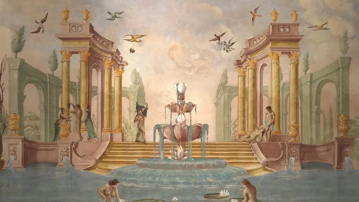
For The White Lotus, we took inspiration from the Italian locations of season two. Here, the sacred and profane seem to live comfortably side-by-side. We loved the idea of beautiful paintings speaking to themes of romance, lonely hearts, carnal lust, violence, and potential doom.
How did you begin these projects? Can you talk about the collaborative process with the director and the process of creating the sequences from start to finish?
At the start of The Rings of Power project, we built a cymatics rig. Katrina experimented with everything from humpback whale sounds to Gregorian chants, to see the effect on sand, flour, pepper, and other materials. She filmed the experiments, and we knew we had captured something beautifully uncontrollable. The entire project was really a massive physical and CG science experiment. In the end, we created thousands of images and motion samples in CG and live action to find the right answers. We also worked extensively with the team at the show to decide which symbols to visualize, as well as worked closely with Howard Shore’s score to make sure every moment of movement was tied to the music.
We took a completely different approach with The White Lotus. Director/Showrunner Mike White sent us some footage from his phone of a villa near Palermo where they were going to film an episode of the show. The walls are covered in trompe l’oeil frescoes. There was an obvious connection to our Hawaiian wallpaper theme from season one. Katrina traveled with a photographer to the villa and shot high-res photography for two days as a base from which to work.
Describe your favorite part or component of the title sequence. How did it come together and how did you achieve it?
By far our favorite part of The White Lotus was translating the script into the artwork. We picked up traits of the characters, broad story themes, or even re-visualized actual scenes, like a Vespa ride reimagined on a donkey. We came up with visuals for each character and we worked hard to delight audiences when they see those personality traits play out in the episodes.
The best part of The Rings of Power was the "celestial" section where we move away from the logic of a tabletop and the imagery is layered in space. It becomes spiritual and completely non-rational at that point. We also love the scenes where imagery is forming and collapsing at the same time, like the early shots of the rings. There is a sadness and deep metaphor there—nothing lasts, everything in life is in a constant state of forming and un-forming.
What were some specific challenges you faced in making the sequences and how did you go about solving them?
Virtually every shot in the titles of The Rings of Power has some combination of CG and live action. CG tends to be too perfect, too smooth, and can lack a sense of danger. The live action is the opposite, it’s feral and uncontrollable. Getting the live action to behave, and ‘breaking’ the CG was the key to bringing them together.
There is no actual moving film in The White Lotus title sequence. It’s all built from photography and still digital paint, so the idea of creating emotion, movement, and drama from stills was daunting and very rewarding. There was a moment at the start where we said to ourselves, “Oh no, we sold them a slideshow.” But in the edit, we came up with the idea of sliding around a world of painted imagery. We created some magical moments where the camera moves across a painting and arrives at a completely different painting. Rather than appearing to look at individual paintings, we were after a more abstract, painted world that sort of washes over viewers.
What Adobe tools did you use on this project and why did you originally choose them? Why were they the best choice for this project?
For The Rings of Power, we used Photoshop for the original style frames, Premiere Pro for editing, and After Effects for title animation and compositing. For The White Lotus, we used Photoshop to create completely original paintings while existing paintings were altered or re-combined. We also used Premiere Pro for the edit, including approximating the camera moves. After Effects was used in compositing and type animation.
If you could share one tip about Premiere Pro or After Effects, what would it be?
When cutting to music, we often make cuts at least two frames before the actual music shift, beat or hit. It creates an energy in the mind that is different than a perfectly synched edit. There are a couple of cuts in The Rings of Power that cut significantly before the music edit, so there is a noticeable moment between the image and music change. This is quite easy to do using the audio waveforms on the timeline. Simply find the audio moment and backspace twice to make your video edit. We promise you’ll like your edit moment better.
We also recommend creating shortcuts that become a personal language between you and the program. For instance, we love color-coding strong clips in the project bin with mango, which means that it’s a superior shot to all the rest. It’s a keyboard shortcut M. It’s a funny and dumb little game between ourselves and the software. Mango means “put it in the movie.” It also stands out on the grey workspace. If you don’t see at least fifteen mango shots in the project, you're just going to have to save the film with great editing.
Who is your creative inspiration and why?
Crawford: People who are polymaths are my inspiration. People who look at problems from countless angles and are ever curious.
Bashore: Michael Moore, Ai Weiwei, and today, Sinéad O’Connor. I revere them for their unrestful, rebellious application of film, art, and music, respectively.
What’s the toughest thing you’ve had to face in your career and how did you overcome it? What advice do you have for people aspiring to get into the motion design space?
Bashore: Fear. I didn’t have the confidence to do this until after doing many other things for a living and then being around film and design for many years. I owe a lot of the credit to some important people who simply said, “You can do this.”
My advice to those aspiring to get into this is to put your own personal worldview into your work. It’s possible to do so to some degree on every project. Try to find an emotional center for every project that has a part of you in it (sadness, anger, loss, laughter, mischief) and tap into your own sense of those emotions. Then, you are not really designing, but rather creating something with heart that viewers will feel.
Crawford: Probably getting over the idea that art was somehow soft. In my family growing up, visual art was not respected as career-worthy. It took three science degrees to get over that idea. Alas having that unique perspective is vital to art, so I guess my advice would be to take all your unique angles and put them into what you make.
Share a photo of where you work. What’s your favorite thing about your workspace and why?

Credit: Mark Bashore
Bashore: I like my edit area because it’s stripped down, un-slick, un-sleek and the opposite of a so-called professional editing suite. I like that paper, art, and physical things live next to the computer. I have a piece of pine board and a good strong C clamp to support my elbow for long-haul edits.

Credit: Katrina Crawford
Crawford: My workspace has a lot of light which I appreciate. It is also a space used for other forms of art making and so it tends to be alive with many ideas and projects in various forms.
This post was written by Michelle Gallina and originally appeared on Adobe blog on Sept. 29, 2023.
- Which 'White Lotus' Character Does Mike White Relate to the Most? ›
- 'White Lotus' Ends Without Answers to the Show's Two Biggest Questions ›