See 'Twin Peaks' Like You (Literally) Haven't Seen it Before
Things are not always as they seem.
Homey and disorienting, welcoming and dangerous, David Lynch's masterpiece Twin Peaks remains one of the most discussed, debated, and dissected examples of popular American television.
First premiering in April of 1990, the series, co-created by Lynch and Mark Frost, continues to capture the minds of fans old and new alike both for its ontological and visual flourishes.
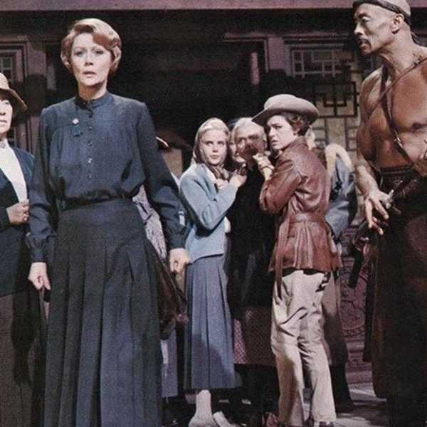
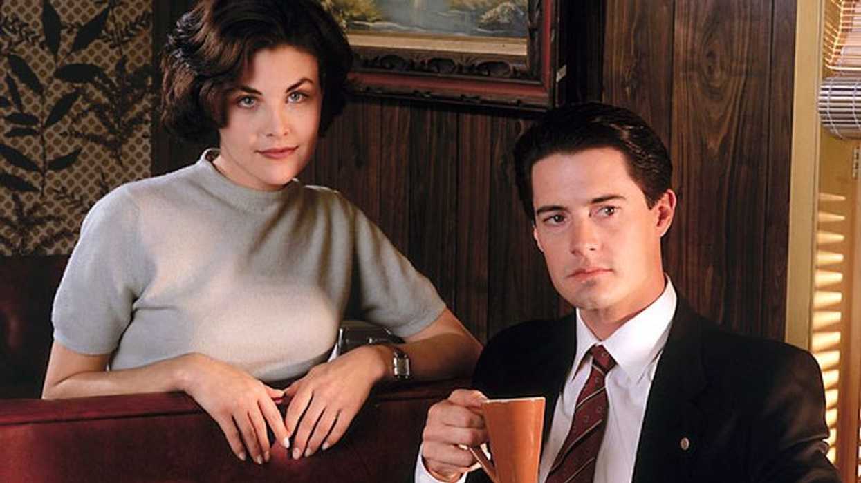
About those visual flourishes: often presented in a comforting and relaxing orangey-red, the series' cinematography captivates both the mind and the eye of the viewer. It's one of the series' strongest reasons viewers let their guard down before the enveloping evil hits.
In a video posted by Youtube user Robin Karl, we get a good look at how Twin Peaks would appear if it hadn't been color graded with that familiar red tint. Using DaVinci Resolve to toggle between the original and the graded footage, Robin Karl indirectly emphasizes the power of the familiar Twin Peaks image we know and love. It's warmer, brighter, more pulsating, filled to the brim with visual information that affects how we take in the scene.
Check it out below.
How do you use color grading for your own projects? Let us know in the comments below.