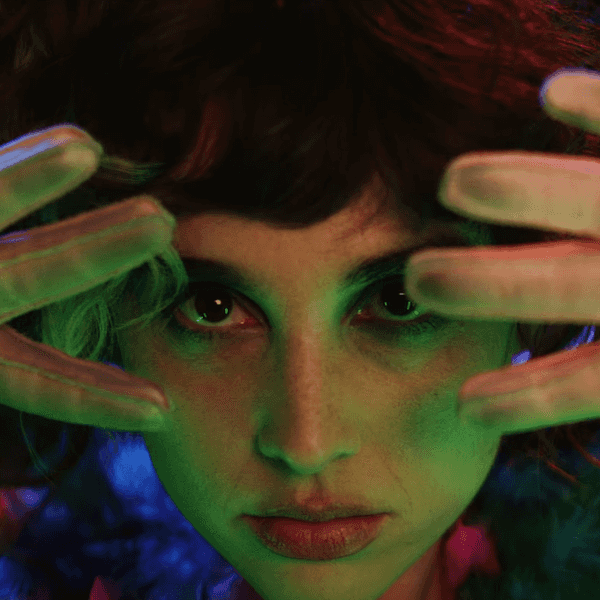
One of the things that always stands out to me when watching a horror movie or TV show is the color in each frame. Many times, people are too simplistic, assuming horror equals darkness, but that's not the reality.
Take Senior Colorist Joanne Rourke's work on acclaimed features and television series, including Vincenzo Natali’s In the Tall Grass (Netflix), Amazon’s Sci-Fi hit series The Expanse, Carlton Cuse’s Locke and Key (Netflix), and Spiral (Lionsgate).
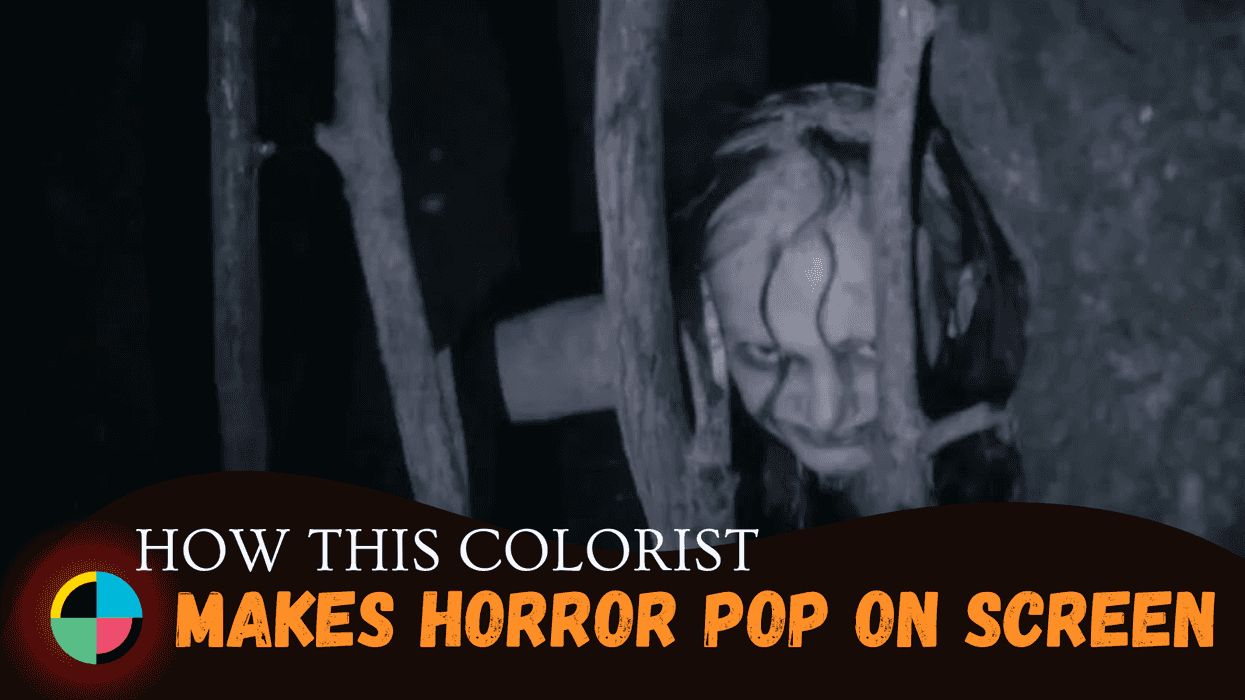
These creepy titles all pop off the screen.
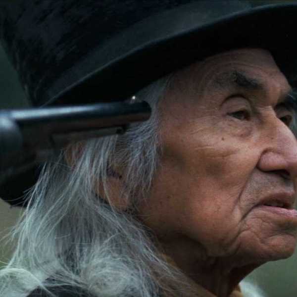
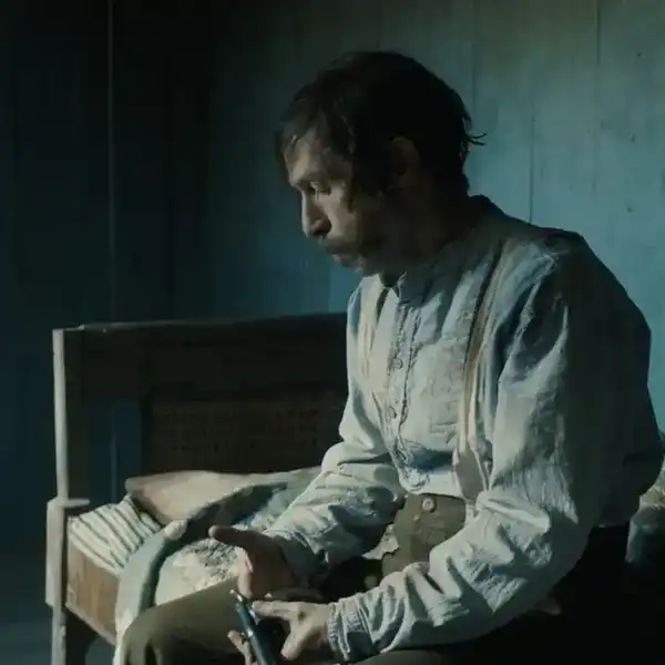
Most recently, she worked on the MGM TV series From, a terrifying show about a city in the middle of the USA that entraps all those who visit.
We were lucky enough to sit down with Joanne to talk about her job, the collaborative process of color correction, and the unique set of artistic opportunities you find in the horror landscape.
No Film School: How Did You Get Started as a Colorist?
Joanne Rourke: I was working at a post-production facility when the first DaVinci Resolve color correction system was released—it was love at first sight! We were encouraged to use the equipment to learn on our own time. I spent a lot of time doing that.
NFS: What inspired you to specialize in color grading for film?
Joanne Rourke: It was while watching The French Lieutenant’s Woman with Meryl Streep and Jeremy Irons that the lightbulb clicked. It is an aesthetically gorgeous film within a film. I began to understand the power of color and light to help further the narrative.
NFS: What are some aspects of the software that you enjoy using and/or make your workflow more efficient?
Joanne Rourke: Resolve allows colorists to customize their operations. There are many ways to use it and countless shortcuts to make it efficient that allow you to focus on the creative side.
Lightbox is very handy for episodic work. I have a Wacom set up directly under the joyballs which allows me to use shortcuts and draw windows with a pen. For every project, I set up power window presets. The midtone detail is a go-to for skin texture and refinement. I find the HDR color wheels very handy for quickly reining in the highlights. Some of my favorite Open FX are glow, light rays, color compressor, dehaze, texture pop, and beauty.
NFS: What is your process for collaborating with the cinematographer and director to understand their vision?
Joanne Rourke: Ideally, the cinematographer will come into the facility where we can set looks together. Otherwise, in a phone call or email, they will describe specific intentions for the episode and any issues they had while shooting they are hoping for me to address. They will send stills etc., and how they’d like it to look in reference to the dailies. Often, the vision is already present in the dailies, and it serves as a good reference.
NFS: How do you handle color consistency across different shots, scenes, and locations within the film to maintain a cohesive look?
Joanne Rourke: Generally, I will do a first pass establishing looks for a certain scene and then apply that look to all the shots within the sequence. I will take a master still for the scene and then match all the shots within the sequence to that still. It’s not the most glamorous part of the job but it is the most important. Once this is complete, I will do another pass to fine-tune, shape the picture, add windows where necessary, adjust hues in areas, etc.
By the end, several passes will have been done until I am satisfied that each scene is flowing as best as possible. Ideally, the client review will be done at this point in the process and then it is easy to add subtle changes to entire sequences. After the review, I will go through it again to ensure that nothing is amiss or has not been addressed.
NFS: How do you handle color grading for night scenes and low-light situations, ensuring that details and mood are preserved while maintaining visibility?
Joanne Rourke: Ideally there will be environmental highlights that will contrast with the blackness. This will help give shape to the image. From there it is just a matter of shaping parts of the picture, bringing down areas where there is too much light sneaking in (set lights in background skies coming in through the top of picture), and bringing up faces where necessary. Sometimes noise reduction will be added if the picture has been stretched beyond its intended parameters.
NFS: Is there a difference in your approach when coloring a horror movie versus coloring something lighter, like a comedy?
Joanne Rourke: There are no hard and fast rules. Generally, horror is seen to be dark and moody while comedy is light and colorful. An empty swing rocking back and forth in the bright sunlight can be just as spooky as shadows dancing across the wall in an unlit room at night.
Between the set design, costumes, and the cinematographer’s lighting and intentions, the approach to the film will fall into place. For FROM, I modified a Kodak vintage LUT to start as it seemed to lend itself to the incredible “old-fashioned” set design of the town. I believe it adds to the spooky, uneasy feeling that is prevalent throughout.
NFS: Were there any scenes in From where it was hard to get the color correctly?
Joanne Rourke: The end of season one ends with a bus pulling up to the diner in pouring rain. Season two begins with the bus scene and unfortunately, when the interior bus scene was shot there was bright sunlight outside of the windows. It was challenging not to go too dark on the actors but to darken the windows to make it feel like it was raining outside.
In From, when night falls, the monsters come out. If the townspeople are scrambling to get inside, the time of day becomes very important. I can spend a lot of time working on gradually making it feel like the sun is going down while ensuring the viewer can see the action.
NFS: What advice would you give to aspiring colorists who hope to enter the field of film color grading? Are there any essential skills or insights they should focus on developing?
Joanne Rourke: I think the best advice is to practice. Get to know the basics of the system you are working on, so it becomes like a well-worn piano. It is then you can focus on the monitor and the looks you are creating. Always remember you are servicing the client. It is a highly collaborative process and there are many people involved. Ideally, everyone is on the same page with the look. It is important to be diplomatic as many will have their own vision of how things should look and as a colorist you show the variations until everyone is happy with the result. Patience is key.
Each client will have their own interests but generally, producers like to see the actors and their eyes they are paying for, and cinematographers will want to preserve the integrity of the desired mood. It is usually a balancing act, but with patience and all the tools available, it is almost always possible to achieve the required results.
You work alone much of the time, so self-discipline is important. Because the work is not definitive, you need to learn when to wrap things up. You can spend a lot of time trying things. It is challenging to balance the creative side with the ability to meet deadlines while also adhering to the budget.
As you can see, Joanne Rourke is an amazing wealth of knowledge and insight into what it's like coloring for a horror TV series and for horror in general.
Hopefully, you were able to glean as much information from her insights as I was, and I will definitely be tuning into From on MGM.