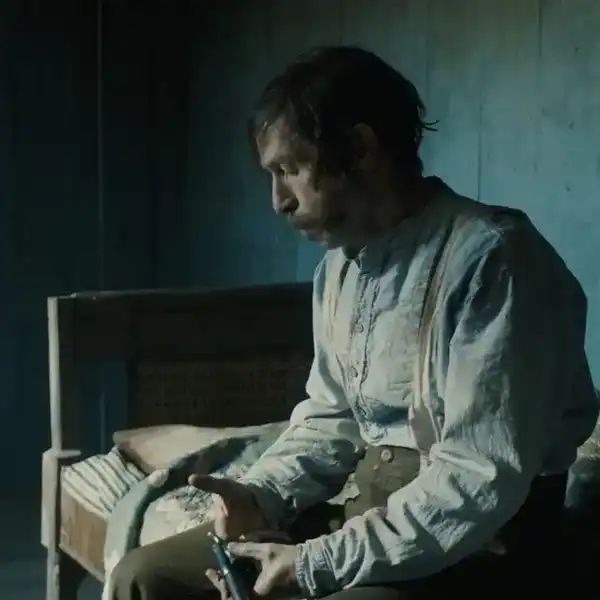
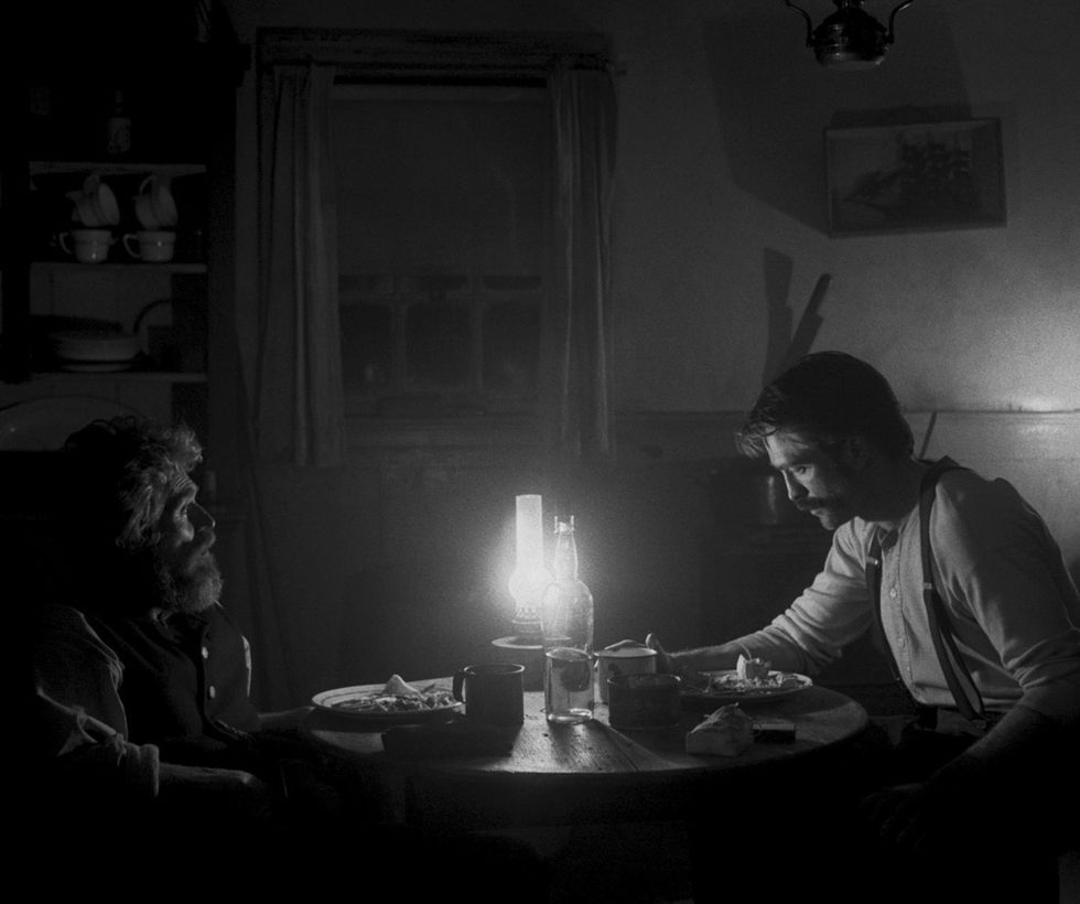
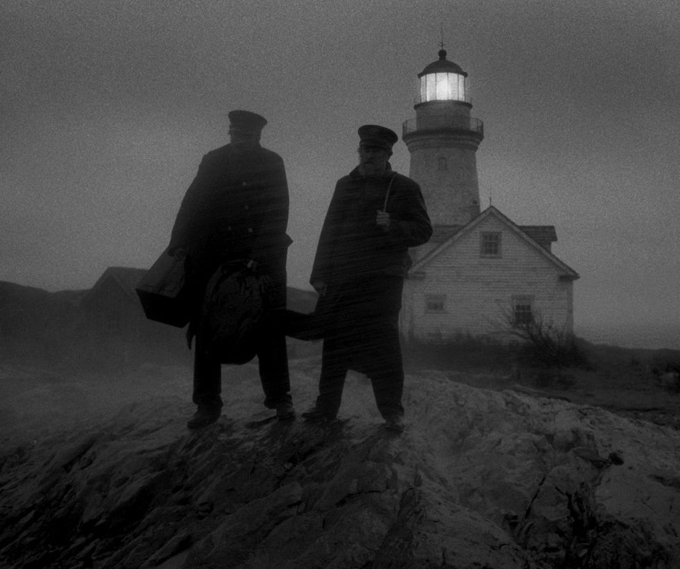
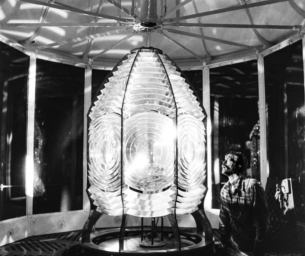
In the late 19th century, a young drifter and a veteran lighthouse keeper arrive at a desolate, storm-wracked island. Their mission is to operate and maintain the lighthouse, in total isolation, throughout an unforgiving winter. The scruffy, young Ephraim Winslow (Robert Pattison) hopes to learn the art of being a "wickie" from Thomas Wake, an aging, volatile seaman who speaks in gruff nautical verse. Wake takes his job seriously; he won't have Winslow messing it all up. He sees himself as the guardian of the lighthouse's traditions and superstitions -- "Never kill a seabird," he implores Winslow, "unless you want to disturb the soul of a sailor that "met his maker."
Wake reveres the lighthouse itself with a mysticism that suggests there are supernatural forces at play. Whether or not that suggestion becomes a reality will depend on your reading of the film. "The doldrums are eviler than the devil," says Wake, ever one for the salty, sea-faring truism. Yet this utterance foreshadows the maelstrom to come. In an apparent attempt to stave off oppressive boredom, Wake and Winslow's masculine-fueled rapport devolves into belligerence, then full-on insanity.
"I went to Panavision and said, 'What [lenses] do you have that are off the menu that I wouldn't even know about?'"
The Witch, Eggers' astounding feature directorial debut, showcased his mastery of mise-en-scene. (He has a background in production design.) The Witch was a genuinely disturbing horror film that wrought its scares from eerie long takes, sets with precise period detail, and performances that captured the tortured spirit of the Puritans. Here, Eggers continues in his tradition of finding the sinister in the mundane. Every camera movement in The Lighthouse is haunted; every detail of the set meticulously placed. With just one location and two actors (each giving a career-best performance in terms of physicality), the universe Eggers creates here is both otherworldly and visceral.
Shot in the Gothic style of silent cinema, the film took its aesthetic inspiration from Fritz Lang's M, one of the most famous films to have been shot in the claustrophobic 1.19:1 aspect ratio. Eggers and Jarin Blaschke, the film's cinematographer, underwent a lengthy process to achieve the film's early-period cinema look, including shooting on Kodak Double-X Film5222 (also the stock used for Raging Bull) with a custom-developed orthochromatic filter and rehoused lenses from Panavision's dustiest shelves. It was a complicated lighting set-up, too; Blaschke was forced to use nearly 20 times more light than he used on The Witch, which was shot on the ALEXA. No Film School sat down with the director and cinematographer to discuss all of this and more.
No Film School: I heard that you developed an entire camera language just for this film. What were the first conversations that you two had about the visual approach?
Jarin Blaschke: We have similar tastes, so we tend to visualize movies in similar ways automatically. This movie has been on the back-burner for years; I think we would just chat about it in a fragmented way over time.
Robert Eggers: If you look through our emails over the years, one of us might send a movie or a photograph as reference and just say, "This is for The Lighthouse." For years, I had only written 10 or 12 pages and had an awful lot of notes and visual research. But I didn't touch The Lighthouse in any serious way until a couple of years ago.
For the look, Jarin wanted to use a custom developer. We shot some test footage that Jaron developed --
Blaschke: -- in my bathroom, actually. It was awesome. I tested a special class of developer, pyrogallol, that was popular at the turn of the century. But it would take a year of R&D if we had used it. I would have to buy a motion picture machine to make sure you can translate it to that. So it didn't end up in the movie. But if Rob ever made another black and white movie at a larger scale, then I would shoot with it.
"Double-X is technically not an impressive film stock, but it works for our movie."
Eggers: Jaron also looked into some film stocks that are not made anymore for motion picture film, to see if we could get them made for us.
Blaschke: I looked at ILFORD films, which I use in still photography.
Eggers: They said that the guy who handled that stock is dead.
Blaschke: I think for our film, what we ended up with was appropriate. Double-X is technically not an impressive film stock, but it works for our movie. It has a rough-and-tumble look to it. The shadows fall off very quickly, but the highlights do a little better. It has some big restraints—I don't want to say problems, but it's limiting. You have to embrace it. We just couldn't get the look another way. Double-X came out in 1959. My understanding is that it's not been improved since.
Eggers: We would've wanted to shoot with orthochromatic film, but Jaron developed a filter with Schneider Optics that would give us that look. [More on that below.]
 'The Lighthouse'
NFS: What did you like about Double-X, specifically?
Eggers: The stock had a more aggressive strain structure and a great micro-contrast. It looks cool! It has that primitive quality.
Blaschke: Plus-X is actually a superior film stock, but they don't make it anymore. It would have been very expensive to develop. I think for a cleaner-looking movie, it would be preferable. But on this one, we wanted to spend the money elsewhere, and it just ended up being a better decision.
"The stock is crusty, dusty, rusty, musty. That mirrors the movie itself."
So in the end, Double-X kind of chose itself. It just has that palette we wanted. When you compare it to color film and the ALEXA color profile, it has what you would call micro-contrast: two similar tones that mask the overall contrast to the other medium, like color film. In this stock, the local differences in tone and texture just pop more.
Eggers: The film stock is crusty, dusty, rusty, musty. That mirrors the film itself. It's also austere and bleak. The orthochromatic filter helps with that.
NFS: Tell me about how you developed the orthochromatic filter to mimic real orthochromatic film.
Blaschke: If we went with true orthochromatic, we would have used a deep blue filter. But we needed so much more light to get exposure with the Double-X that we used a cyan filter. Schneider Optics custom-manufactured short pass filters so I didn't have to lose an entire stop.
The orthochromatic filter eliminates all red light to emulate film stocks that were predominantly used up until 1930. It makes The Lighthouse almost feel like an early ethnographic film. With the filter, things that have a lot of red in them, like skin tones, we'll record much darker. You see every pore and blood vessel. That helps to make Robert Pattinson and Willem Dafoe look more like salty seamen.
The filter also empathizes blue and UV, so your skies get really blindingly light. If we had any light clouds [in frame], they tended to fade away into the hazy sky. It's hazy. That look takes you back to early photography.
 'The Lighthouse'
NFS: You shot with some obscure lenses from the '30s. Did you have to retrofit them? How did you even find them in the first place?
Blaschke: I went to Panavision at one point early on and said, "What do you have that's off the menu that I wouldn't even know about?" I had tested plenty of vintage lenses for The VVitch, so I really wanted them to bring out what I hadn't seen before.
They brought out one lens about the size of a thimble—an early triplet lens. They had some modern lenses that were de-tuned.
Then, they brought out these lenses called Baltars. I said, "Oh, yeah, I know about the Super Baltars." And the Panavision person said, "No, not the Super Baltars. The Baltars." I wasn't even aware that there was an original version of this lens. So I [tested them] against Cooke Series Ones, which are from the '40s.
"The Baltar lenses have this shimmery quality. As a lens nerd, that was very enchanting to me."
The Baltars were the most stunning portrait lenses I have ever seen. They have this shimmery quality. The highlights glow. As a lens nerd, that was very enchanting to me. I also realized that with this very hard orthochromatic filter and the unforgiving film stock, the lenses could add another layer that gave the film more of a complex look.
Eggers: Panavision rehoused all of the lenses for us.
NFS: How did your choice in film stock, lenses, and filters impact the way you approached lighting?
Blaschke: We had to use so much light. It was blinding on set! We put 800-watt halogen bulbs in lanterns really close to the actors' faces. We used mostly ARRI M-series 9K and 18K HMIs.
I was shooting at 80 ISO mostly, but I lost almost another full stop when lighting with Tungsten, so I had to light for 50 ISO on night interiors.
 'The Lighthouse'
NFS: The 1.19:1 aspect ratio is a really strong choice aesthetically. It harkens back to classic cinema.
Eggers: Well, the movie was originally going to be shot in 1:33 when it was conceived, because on a very surface level that aspect ratio just seems old.
Blaschke: I've been telling people that's your go-to aspect ratio.
Eggers: Yeah, probably. But on this film, we're shooting vertical things like a lighthouse tower, and we wanted to have the cramped interiors of the lighthouse cottage. Also, the movie is full of close-ups on these two guys. It made sense to use [1:19].
"The sets were designed to work with the aspect ratio. We were able to build our entire lighthouse station, including the 70-foot working lighthouse tower."
NFS: I can imagine it was difficult to optimize the sets to that aspect ratio, especially since you weren't used to shooting it.
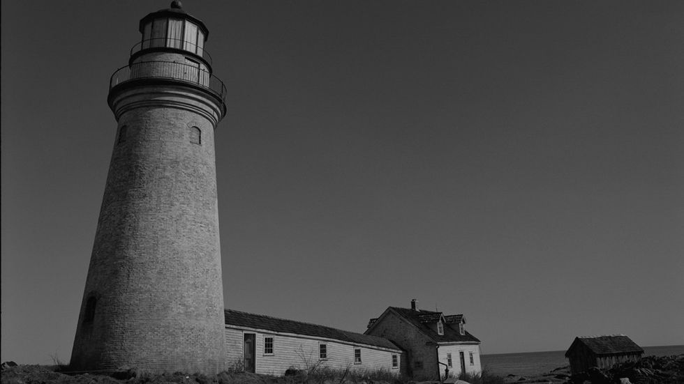
Eggers: Yeah, the sets were designed to work with the aspect ratio. We were able to build our entire lighthouse station, including the 70-foot working lighthouse tower. So we controlled and built the sets with that aspect ratio in mind.
For the interior of the lighthouse tower... I’m going to give away my secrets here, but we had to be able to move walls, because that is an 8-foot diameter space, and you can’t fit an actor and a camera in 8-foot space and move around with them. So we built the inside of the keeper's cottage based on ground plans of real structures like that.
 The set of 'The Lighthouse'
Eggers: When you're designing the set, you think about it like, "Okay, if we put the staircase here, we'll be able to see it in the shot," because you want to have depth.
The furniture also had to be built to accommodate the aspect ratio—the kitchen table needed to be a certain size so we could get a two-shot on a 50mm lens without blowing the walls out.
Blaschke: We originally had an appropriate table story-wise -- what they would have had for the era. But at one point I got two office PA's and a viewfinder, and I put them at opposite sides of the table and sat them down. It just made a shape that was too wide. The table should be smaller to have a really confined claustrophobic frame. So I had to go knocking on Rob's door and say, "You know, the table has to be smaller." Of course, it was the right table for every other reason. But it wouldn't work in the frame.
Eggers: The table we ended up with reminds me of the card table in the flophouse from Phantom Carriage, with a similar lamp hanging over it. So it worked out just fine! It doesn't seem too small in the movie. It seems appropriate for the space.
You couldn't have gotten a two-shot with a larger table. And if you can't get a two-shot, we've got a problem with this movie.
The Lighthouse is now playing in select theaters.