Was the Battle of Winterfell Too Dark?
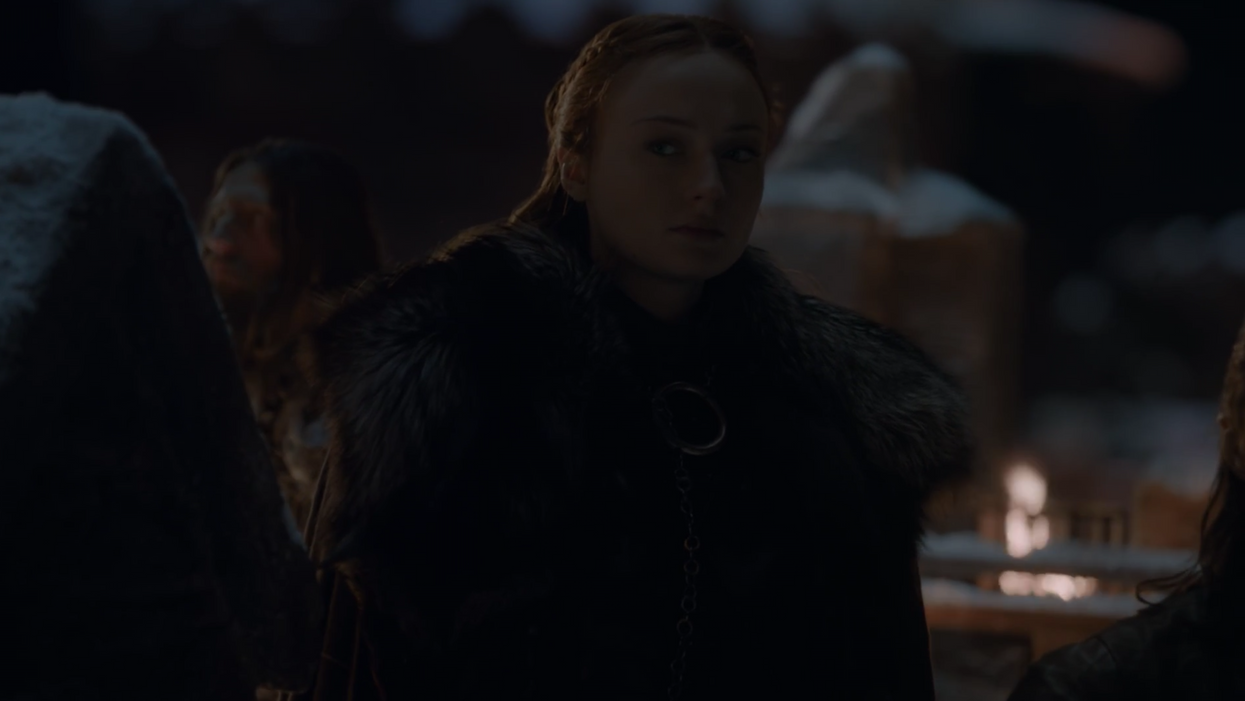
Many fans and critics complained that the battle of Winterfell was "too dark to see what was going on," but was it?

[WARNING: SPOILERS AHEAD.]
Last night's episodes of Game of Thrones, "The Long Night," detailed the final battle against the Night King and his army of White Walkers, an army of undead snow zombies determined to eradicate mankind.
Taking place over one very long night, the battle left many fans complaining that the battle was too dark and that they couldn't see key information during important sequences. While some of the disorientation was clearly deliberately included to help with the sensation of an overwhelming battle, it is showing up in practically every review of the episode.
So what was going on?

Shot by Fabian Wagner, and likely graded by longtime colorist Joe Finley of SIM/Chainsaw, who has been the colorist for the majority of the show up to last weeks "A Night of the Seven Kingdoms," under the direction of Miguel Sopachnik, the episode was visually stunning throughout.
While nighttime episodes are always tricky, especially in "historical" projects lit entirely by firelight or, in this case, the fire of dragon's breath, this episode did have something going for it in that the enemy is defined by its shiny white look, so white it's even in the name: the "white walkers."
That bright reflective white can be very helpful in night scenes since the contrast between the shiny white reflection and the night around it needs less backlighting (and light, in general) to be seen. For instance, the dragons against the night sky were harder to view than the night king.
The reason? Because most TVs are terrible, and almost all come setup wrong from the factory.
Many readers are likely arguing right now. "But, most things look fine! Football always looks okay on my set!" And they might be right.
The problem is that "brightness" isn't linear. You can have a TV that shows the "brighter" parts of frame at the right brightness level, but the way it handles the shadow area of frame isn't the same as the way it's handled on the calibrated monitor in the post suite. While "contrast" controls can help this somewhat, it generally involves a complicated process of manipulating all the picture controls in your menu in order to see the darker areas of frame properly. If not set correctly, the black areas of an image can "crush," with information disappearing into the shadows.
On properly setup TVs, you can see detail and expressions on Davos's face. On other TVs, the former smuggler is a silhouette.
Many users turned their TV to "Vivid" mid-episode to compensate and ended up with an overall brighter image that likely didn't look more like the image was intended to look, but at least let them see story information. Post pros try to compensate for this, but there are just too many different TVs and ways for them to be set wrong to possibly make it look good on every single one.
The good news for viewers is that modern TVs are getting much, much better. There are many televisions under $1000 that are capable of displaying images somewhat accurately, which was something that just wasn't true even 2 years ago. And any TV, with some time and a good calibration disc or system, can get much closer than the "out of the box" settings, though even the factory default settings are better and better if you turn off "motion smoothing."
This is also something post professionals understand and it's a constant balancing act. For instance, on our well-calibrated home TV, most of The Long Night looked too bright, and I found myself thinking, "Oh, I bet they watched this on a dozen different home TVs to find the right balance of looking too bright on a calibrated monitor and too dark in some home setups." Especially since things often look a little dark on a computer monitor, it's always exceptionally hard to find the right balance and often you make it brighter in the grade than you would ideally want to be "safe" for other situations.
It is one of the major frustrations of filmmaking to not be able to control the home experience with the consistency that we see in proper theatrical projection.
From where we stand, watching on an affordable TV, we didn't think the episode was too dark at all and thought it occasionally was too bright. But, we understood they were playing it safe. However, these frame grabs, from a desktop computer playing video through a web browser, are obviously too dark to really see what is going on.
What do you think? Was the episode too dark on your screen? Will you be calibrating, or at least turning your monitor to "vivid," before the rest of the season?


