Though not entirely mandatory, storyboarding is one of those aspects of filmmaking that takes your film from the deep, dank, and dark recesses of your imagination and brings it to life in the here and now. Not long ago, we touched on the basics of storyboarding, and after a little digging, we've found some excellent tips from DreamWorks, by way of cartoonist Ben Caldwell, for those of you who are ready to make your previsualizations, and consequently your shots, more dynamic, aesthetic, and masterful.
Storyboarding your films is helpful in a lot of ways, but there are two reasons why I do it. Firstly, I get to see my movie before I make it, which is great for my morale, and secondly (and most importantly,) it helps to determine whether or not the shots are dynamic, edits are motivated, or I'm missing something. However, what are you supposed to do if you do find an issue with your storyboards, or better yet, how do you avoid them?
Caldwell uploaded some storyboard tests he did for DreamWorks several years ago, and received them back with incredibly helpful and detailed notes. These tips are great if you're finding that your boards are flat (da dun tss) and lacking the energy, tone, or composition that you're envisioning in your head.

Avoid flat staging unless when necessary
DreamWorks advises Caldwell to avoid "tight rope" floors and to "think in 3-point perspective" as much as he can. Why? Because it's simply more dynamic, because the image contains three vanishing points. This adds more depth to your storyboards, which will in turn add depth to your shots.
Lay down grids to help "ground" your characters & compositions
Since I'm a terrible artist, I often am the only one who can understand my "drawings" in my storyboards, and almost every single cell contains a character that looks like they're floating in mid-air. Drawing a grid puts your character on an easily discernible plain, which actually helps you, the storyboard artist, gain more control and perspective as you draw. If you look at Caldwell's other cells, he actually puts a grid on the ceiling as well.

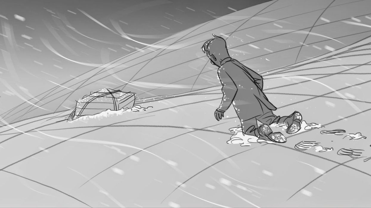
 Use foreground, mid-ground, background, & far background to sell depth
 Use foreground, mid-ground, background, & far background to sell depth
This is something that is easy to remember while shooting, but difficult while storyboarding. Setting up elements on all of these plains helps add depth, texture, and sense of location to your frame.
When dealing with multiple characters -- logically group them
This helps when it comes time to edit, because without some sort of order to how you stage your characters, cutting back and forth between them could be confusing to you, the editor, and your audience. Also, one easy way to manage multiple characters, is labeling them. Caldwell's image below has each labeled A -- D.
Check out Ben Caldwell's blog for more of DreamWorks' notes on his storyboards, as well as other great previsual, cartooning, and assorted art tips.
Were DreamWorks' notes helpful to you? Do you have any storyboarding advice you want to share? Let us know in the comments.
Link: story/design notes -- Purge Theory
[via Storyboard Secrets]