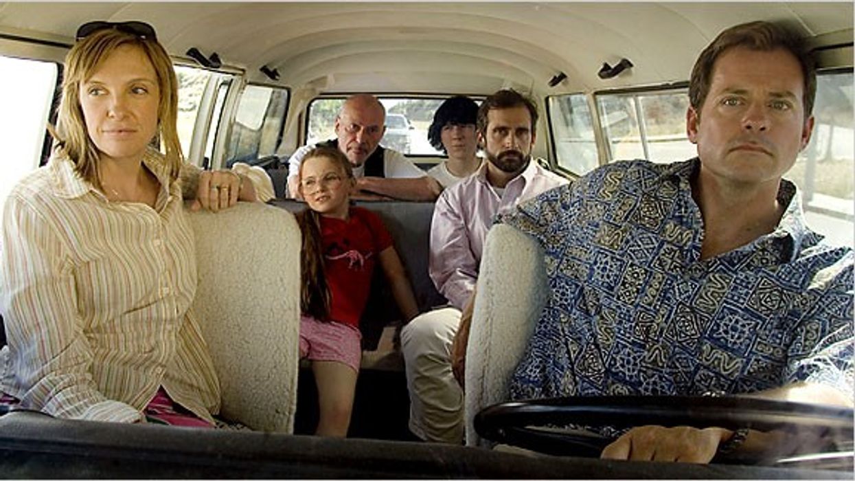
I started a new spec this week, and the first thing I did was go back to Michael Arndt's video on the subject to center myself. There's something calming about listening to a more experienced and wiser writer take you through the motions.
Beginning a screenplay is hard. You need to figure out how to introduce the characters, set up the stakes, and make sure the audience understands the tone.
Today, I want to go over Michael Arndt's advice on all this via his video and talk about what the best beginnings do and how we can mimic them.
Let's dive in.
Michael Arndt on Beginnings
Before we jump into the Arndt advice, I want to throw my two-cents in here. You really have to stringently outline before you dive into a screenplay. It will save you so much time and contribute to writing a faster first draft.
When Arndt writes, he uses the metaphor of climbing a mountain blindfolded to describe the difficulty of writing a screenplay. He says that the hardest part is not the climb itself, but finding the mountain in the first place.
I think the outline helps find the mountain faster, at least for me. You can use the Pixar rules for storytelling, which Arndt uses heavily. They're also so helpful.
Arndt outlines a four-step process for setting up a story:
Introduce your main character and their world. Show them doing what they love.
Give your character a flaw that stems from their passion.
Introduce storm clouds on the horizon, a threat to your character's world.
Completely upend your character's life by taking away what they love most.
In order to show us all these, Arndt uses three Pixar films as examples: Toy Story, Finding Nemo, and The Incredibles.
Let's go through them as well.
Toy Story's Beginning

Toy Story
Pixar
In the originalToy Story, Woody is introduced playing with Andy. Woody's passion is being Andy's favorite toy.
His flaw is that he takes this pride too far and can't share Andy's attention with anyone else.
The storm clouds appear when Andy's birthday is moved up, threatening to replace Woody with new toys.
When Buzz Lightyear arrives, Woody's life is turned upside down as he is no longer the favorite toy. Not only is he replaced, but he's replaced by a toy who doesn't even understand that he is a toy. To make matters worse, everyone is impressed by Buzz for the wrong reasons.
Woody makes the unhealthy choice of trying to get rid of Buzz, which leads to a crisis where the other toys confront Woody and tell him he has to find Buzz.
Finding Nemo follows a similar structure. Marlin, a clownfish, is introduced living in an anemone with his son Nemo, after his wife and other children have been killed.
Marlin's passion is protecting Nemo, but his flaw is his overprotectiveness.
When Nemo ventures out into the open ocean, defying Marlin's rules, he gets kidnapped by a diver.
Marlin's unhealthy choice is to chase after Nemo into the open ocean, despite his fear of the unknown. And it anounces the goal of the movie: finding his son, Nemo.
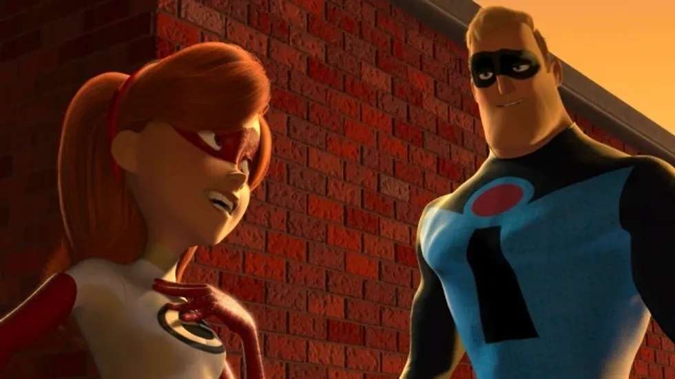
The Incredibles Beginning
The Incredibles
Pixar
The Incredibles also introduces us to Bob Parr, also known as Mr. Incredible. Bob's passion is being a superhero, but his flaw is that he craves glory and doesn't want to share the spotlight.
When superheroes are outlawed, Bob's life is turned upside down when he loses his job and is forced to live a quiet suburban life.
How does this all apply to your writing?
The Hunger Games
Lionsgate
As you can see, there's a bit of a formula, or really just a brain exercise you can do when starting your own screenplay:
Step 1: Show Your Hero Doing What They Love Most. Open with your protagonist in their comfort zone, doing something they're good at and that defines them. This establishes what's normal for them and sets the stage for disruption to come.
Step 2: Add a Flaw. No one's perfect. Reveal a flaw, insecurity, or vulnerability that hints at limitations your protagonist will have to overcome.
Step 3: Add a Storm. Introduce a conflict or inciting incident that disrupts the protagonist's world. This could be an external challenge or an internal struggle.
Step 4: Add Insult to Injury. Make things worse for your protagonist. Pile on the pressure, forcing them to make a choice.
Step 5: Make Your Character Pick the Unhealthy Choice. Your protagonist, driven by their flaw, makes a decision that seems reasonable in the moment but ultimately leads down a more difficult path.
If you know you want to do those things in the first act, then you have a bit of a beat sheet that you can start to fill in around to create a great foundation for the story.
Arndt's advice is to build off this foundation, but it is by no means prescriptive. It's just meant to get you thinking about your characters and your world.
Netflix series Monsters recently returned with second season Monsters: The Lyle and Erik Menendez Story and No Film School got a chance to chat with Matthew Flood Ferguson, the production designer behind both seasons.
As the series explores Menendez’s story, Matthew takes us behind the scenes of how he not only recreated the family home, but also brought back to life late 80s LA.
Let's dive in.
Production Designer Matthew Flood Ferguson Interview
NO FILM SCHOOL: How did you first approach designing Monsters: The Lyle and Erik Menendez Story? How did it differ from designing the Dahmer story for season one?
Matthew Flood Ferguson: Every show I have done with Ryan always starts with a color theme. For instance, on “Ratched,” it was green, “Hollywood” mustard, and “Dahmer” a dingy yellow. For Monsters, it was blue. Having a base color to work from is a great way to start the design process. It serves as a foundation that everything else will build from. Research is obviously a big part of the design process as well. I really like to scour bookstores (the ones that still remain) for history and inspiration. I enjoy the hunt. I sourced and looked at many history and photography books from the 70s and 80s, as well as looking through old LA Magazine’s front that period. With most shows I have designed, I tend to have one or two “hero” books that inspire me. On Dahmer, I discovered a photographer named Chauncey Hare, whose images were bleak and informative. On Monsters, I came across photographer Anthony Hernandez's book called Rodeo Drive. His candid images of people on the streets on and around Rodeo Drive were a great source of inspiration for design, wardrobe, color blocking, and even the classic cliche yellow and white awnings that hung over the Georgio storefront windows. Even Album covers like Devo, The Human League, and Toni Basil were great references for color and tone.
The house the family lived in was an important part of the story. Can you tell us how you first approached designing it? What elements of who the characters are and family dynamics did you want to include in the common spaces and bedrooms?
In first approaching the design and build of the Menendez home, we sourced the crime scene photos taken the night of the murder. Most of the images were focused in one room and in one direction - the TV room where Jose & Kitty were murdered. Set Designer Kristen Davis and I worked closely together, translating dimensions from fuzzy old black-and-white photographs to construction plans. From the oversized built-in bookcase that anchored the back wall to the vaulted beamed ceiling and even to the small distance from the open French doors to the back of the sofa. All these little details needed to be both historically accurate and still functional for filming. Set decorator Melissa Licht and I worked together to recreate and custom build the oversized sectional sofa. And she was even able to find the exact TV that Kitty and Jose were watching the night of their murder.
For the rest of the house we stuck with solid colors, staying away from prints & patterns. Color blocking, blues, strong reds, and cool grays were the palette. I researched many designers from the 1980s including Steve Chase; famous Palm Springs interior & furniture designer. We used oversized white silk sofas and side chairs in the formal living room inspired by his designs. Since Jose Menendez was a self-made man, the house needed to show a certain style of “new money” and lack a history that comes with generational wealth. We wanted the furniture and decor to appear as if it had all been purchased at the same time. Showing more of a focus on outward appearance and stylistic trends of the time, rather than a warm comfortable family home. We also used very bold colors. For instance, in Kitty and Jose's bedroom I used a garish red wall to wall carpet as a foreshadowing element and also to help create an uneasy feeling for the audience and the actors.
It’s funny, as I get more immersed in a project the characters' worlds begin to reveal themselves to me. For instance, in the TV room I felt compelled to hang a wall-mounted blue marlin fish. An area of the room I had no reference photos for. I remember as the red carpet was being installed in the master bedroom, I had a brief moment of doubt that it was too much, but you are moving so fast there is no going back. Much later someone found a Tik-Tok video which had a photo of Jose lying on the bedroom floor and it turned out that the carpet had indeed been bright red. The same was true about a wall-mounted blue marlin fish that I felt possessed to hang in the TV room wall not knowing until much later that there had been that exact fish hanging in that same place.
Your work takes us back in time into late 1980s LA. How much of that was shot on location, and how much was built on stage? What was the process of recreating some of the spaces we explored in the show, including Spago and The Chateau Marmont Suite?
50% was recreated and built on stage and the other half on location.
For example, Spago was shot on location. However, we were able to use the original site but it took a lot of work. Because today the space now serves as a barber shop and a commercial production house. It still had a few of its original architectural details. We ended up painting the walls and custom building the bar with the lattice half wall on one end, recreated the same oversize floral arrangements, the white wire metal chairs, the bright 80s artwork, menus, and even the monogrammed ashtrays and matchbooks. I felt strongly about recreating the set for Spago in its original location which helped give a sense of authenticity and history to the scene. When our actors and director walked on the set everyone was transformed back to 1989 Spagos.
Conversely, the Chateau Marmont Suite was built on stage. Art directors Helen Harwell, Craig Keller, and I were able to access one of the larger suites in the Chateau to survey and get an overall feel for what we would build on stage. We meticulously recreated the structure of the suite, from the casement doors and windows to the wrap-around balcony overlooking the Sunset Strip. It was a pleasure to have the opportunity to recreate two iconic locations in Los Angeles. We felt the responsibility to make them exact.
The show spends quite a bit of time in courtrooms and prisons. Could you walk us through creating those spaces?
Near the end of the series, we started getting scripts that had a lot of courtroom scenes. From Eric and Lyle’s arraignment to both trials, Van Nuys and Downtown, to a flashback of Dominique Dunn’s murder trial and a quick pop to one of Leslie Abramson’s earlier moments in court.
Since we had limited stage space and very limited time, we decided to build one large courtroom set that could have interchangeable walls and jury boxes that could change when needed. We designed three different back walls behind the Judges’ bench that hung off-chain motors that were rigged up to the perms. When the set needs to change, the wall could fly up in the air and move out of the way. We then were able to drop in another wall and change the carpet and the set dressing. The Jury boxes were on casters and could be wheeled out of position and switched if needed.
With the LAC Prison, we were able to use a small decommissioned area of a working Prison north of Los Angeles. There, we were able to build walls and modify the existing location to suit our script needs. We then built the rest of the prison sets on stage. Eric and Lyle’s cell block and outer closed-off hallway, the attorney-client interview room, and the outer hallway that wrapped around were built on stage. Due to scheduling, the prison showers and the small hallway leading up to them were a partial build at a 3rd location east of Los Angeles. The scene where Eric walks to the shower-he leaves his cell (stage), walks along the outer cellblock (stage), turns down a hallway (decommissioned prison location north of LA), turns again into the prison shower (3rd location hour east of LA). So basically, that 5 second seemingly continuous walk on screen was actually 3 different locations, all far apart from each other. The magic of filmmaking.
You used one location for more than one scripted space. Can you walk us through the process of finding a location that is versatile enough to achieve it without the audience realizing it? Was it something you planned from the start or thought about when scouting? What was the process of transforming it into the three different spaces?
Our scripts were very packed. Most scenes were quick and short, sometimes just half a page of dialogue and sometimes even less. This means that to make a working shootable day, we needed to combine these short scenes to fill out a day's work. If we weren't on stage, then it became crucial to combine different looks and sets in just one location. In scouting, I always keep an eye out for interesting architectural details -for me, that is what will drive the choosing location. Sometimes, if we are lucky, a location can offer a variety of looks.
For instance, I scouted an old, virtually gutted empty bank in Woodland Hills that still had a great 80s brick accent wall with a large concrete header above and floor-to-ceiling glass windows in the corner. We used those visually pleasing architectural elements and built the remaining walls around them. I added carpet paint and dressed the new area as our Adoption Agency, where Leslie and her husband are looking to adopt a child. The opposite side of the raw space had a small area with steel storefront windows and a low white beamed ceiling- we decided this could work for the quick moment when Lyle and Jose visit The Hair Replacement Center. The exterior of the building had a great brick facade with a large asymmetrical metal roof. It had a late 70s or early 80s look to it, and this became our Calabasas exterior.
What was your favorite space to design this season?
Honestly, it is hard to narrow it down to just one. Recreating Spago and Dominick Dunn’s suite at the Chateau was rewarding because of the history attached to them. Period sets are always a challenge I enjoy. Live Entertainment, where Jose worked, was fun because of the bold colors we used. With any set, the challenge is to create something with authenticity and historical accuracy to serve the story. I enjoy that process.