What’s New in Color Mode: A Faster Path to a Finished Look
Now shipping in the latest release of Adobe Premiere.
If you edit your own projects, color is rarely a separate phase of the job. You finish the cut, then notice the interview shots don’t match. The exterior is too cool. The interior is too green. One camera is flatter than the other. The client wants a warmer look, but the deadline is tomorrow, and you still need to export, caption, mix, and send the review link. This is the problem Adobe Premiere Color Mode is trying to solve.
Adobe introduced Color Mode in early Spring as a new way to work with color inside Premiere, built around the reality that many editors are also the colorist, finishing artist, producer, and sometimes the person delivering the final file. Since the first beta, Color Mode has gained several new features thanks to beta tester feedback that make that promise more useful in a real timeline: Auto Color, better reanalysis, more flexible Styles, easier grouping, and new tools for shaping midtones, vibrance, and the edges of the frame.
If you are new to Premiere Color Mode, start with the article Why Adobe Rebuilt Color—and Why It Matters for Filmmakers. After you read that article, check out Color Mode versus Lumetri, How to Set Up for Success, and the difference between Adjust and Style operations. These articles help you understand why Color Mode is intentionally different from any other color system you have used and what you can expect from it to help complement your editing skillset.
This article is intended to help you understand what is now shipping in Color Mode (and maybe a little sneak peek at what you can expect in future updates).
A Better First Pass
The first challenge for a one-person editor is often not creating a look. It is getting the footage into the right sequence on a timeline. That may be half the challenge. You may have log footage from one camera, Rec. 709 footage from another, an iPhone insert, and a few shots that were recorded under completely different lighting. Before you can make anything feel cinematic, you need to get the sequence to a point where you can judge it. That is where Auto Color helps you with the decision-making process.
From the Adjust operation, Auto Color can make an automatic adjustment to exposure and temperature/tint based on the frame currently under the playhead. You can also choose Auto Exposure or Auto White Balance separately if one of those is already working and the other is not. It is not a magic “finish my film” button. It is more useful than that and gives you a place to begin.
For a difficult interview shot, Auto Color can get the face into a reasonable range. For a scene with several related clips, it can provide a shared starting point before you make the creative decisions yourself. If you are working alone, that can be the difference between spending ten minutes making a scene coherent and spending an hour correcting every shot independently.
The Fix for the Wrong Analysis Frame
Color Mode analyzes a clip when you select it. The system looks at the frame currently visible and uses that image to establish zone thresholds and identify hues. Analysis is fast, but its accuracy depends on the frame you choose.
Maybe the first frame is a flash of white as the camera pans into a room. Maybe the exposure changes halfway through a take. Maybe the clip begins in a shadowed hallway and ends outside in direct sun. If the analysis is based on the wrong part of the shot, the controls can feel as though they are responding to an image you are no longer looking at. You can now choose a better frame and reanalyze the zone thresholds.
The important part is that reanalysis does not wipe out the correction you already made. It updates the underlying analysis while preserving your adjustments. You liked the direction; you just needed Color Mode to understand the shot from a different point of view.
There is also a reset-and-reanalyze command for those moments when the operation has become genuinely confusing. Think of it as the big reset button: clear the operation, rebuild the analysis, and start again from a known state.
That is particularly useful when you are experimenting with different color setups. It does not change the basic advice—choose your color setup before grading—but it gives you a way out when a demo, a test, or a changing sequence has left the analysis in a strange place.
Midtones Are Not Just Gamma With a New Name
The addition of the Midtones module addresses one of the most common reactions to Color Mode: “Where is gamma?” The short answer is that Midtones does what editors usually want gamma to do, but with more control over what happens around it.
Raise the midtones, and the system can protect the shadows from washing out. Lower them, and it can keep the highlights from being dragged down. You can adjust the amount of compensation, narrow the affected range, and shape the transition into the surrounding tones. That becomes especially important in HDR and wide-gamut work. A basic gamma adjustment does not necessarily understand that a bright HDR highlight should remain a highlight rather than being pulled into the middle of the image. The Midtones module is designed to make that distinction.
For an editor, the practical benefit is simple: you can brighten faces, shape the density of a scene, or soften the middle of a contrast curve without having to repair the rest of the image afterward.
More Color Without Wrecking Skin Tones
Variable Vibrance is aimed at another familiar problem. You want the background to feel more alive, but the skin tones are already close to the edge of not looking normal. Increase saturation globally and the faces become too red or orange. Hold back, and the rest of the scene stays dull.
Variable Vibrance lets you move between a traditional saturation-style adjustment and a more protected vibrance adjustment. One direction controls the amount of vibrance; the other controls how strongly the skin-tone protection affects the result. That makes it a useful tool for interviews, documentary footage, and branded work where the subject needs to remain believable while the rest of the frame gets a little more color.
It is also the kind of control that saves time because it reduces the number of compensating moves. You do not have to boost the background, pull the skin back, then adjust the overall balance again. The module gets you closer in one move.
Vignettes That Support the Shot
The new Vignette module is less about darkening the corners and more about directing attention. You can adjust its size, shape, color, and softness, which gives you more control over how it sits in the frame. A subtle vignette can help hold the eye on an interview subject or keep attention from drifting toward a bright edge of the image. Used aggressively, it can become part of the style itself.
The useful part is that Vignette can live inside a Style with the other creative decisions. It does not have to be a separate effect you remember to add at the end.
Styles Are Built, Not Simply Applied
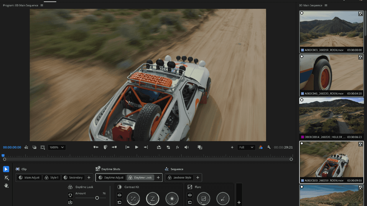
This is where Color Mode starts to feel especially useful for editors who work across many kinds of projects. A Style is not just a preset that you apply and accept. You can browse individual elements, combine them, and save the result as a custom look. Maybe you want a warmer image, low contrast, more vibrance, a particular color shift, and a heavier vignette. You can select those pieces together and save them as one Style. You can also start with an existing look and add or remove individual elements until it feels right.
That makes Styles useful as a personal toolkit. If you frequently create soft, warm interview looks, muted documentary looks, or higher-contrast commercial images, you can save those combinations and refine them over time. You are not starting from a blank operation stack every time a new project arrives.
Templates take that idea one step further. You can save a group of modules in a neutral state—perhaps Contrast Kit, Midtones, and Flare—so the tools you use most often are ready to go without forcing a particular look onto the image.
That is a better fit for real editorial work, where the same client may want a different mood from project to project but still expects you to work within a familiar visual language.
The Clip Grid Makes the Timeline Easier to See
Most editors learn quickly that grading every shot from left to right is a slow way to work. You fix one clip, then another, then another. By the time you reach the end of the sequence, the early shots have drifted away from the decisions you are making now. The work becomes a long series of small corrections, and consistency depends on what you can remember.
The clip grid gives you a different view. You can see the sequence as a collection of images, compare related shots, and spot the outliers before you start making changes. Grouping is what makes that view useful. Put clips from the same scene, camera, or lighting setup together, then make the shared correction once. You can now right-click a clip and add it to a selected group, or remove it from a specific group if it no longer belongs there.
This is the workflow we described in The Divide and Conquer Grading Workflow in Premiere’s Color Mode: start with the sequence, refine the groups, and use clip-level corrections for the shots that truly need special attention. For a solo editor, that is the difference between grading a timeline and managing a timeline.
Wide Gamut Has One Important Detail
Wide Gamut gives Color Mode more room to work with, especially when you are moving between SDR and HDR deliverables. It preserves more of the image through the processing pipeline and uses tone mapping at the output stage. But some of the modules are aware of reference white, and that affects how they behave.
In HDR, reference white represents ordinary bright objects: a white shirt, a wall, a sheet of paper. Highlights above that level are reserved for brighter elements such as direct sunlight, reflections, or practical light sources. That is why Midtones and Contrast Kit can shape the normal part of the image without automatically pushing every bright value into HDR territory. Their highlight controls let you decide how much of the operation should roll into those brighter regions.
If you are working in Wide Gamut but delivering Rec. 709, there is one setting to watch. For Contrast Kit and Midtones, set the highlight control all the way up. Otherwise, the adjustment may appear to affect only part of the signal, leaving a noticeable bend in the upper section of the curve. It is a small detail, but it explains one of the more confusing Wide Gamut behaviors. The tools are trying to respect the difference between ordinary white and HDR-strength highlights; Rec. 709 simply needs that highlight range brought back into the operation.
Color Mode is Built for the Person Doing Everything
The appeal of Color Mode is not that it removes the craft from grading. It is that it removes some of the unnecessary repetition around the craft.
Auto Color gives you a starting point. Reanalysis lets you fix the analysis without losing your work. Midtones, Variable Vibrance, and Vignette give Styles more range. Grouping and the clip grid help you make decisions across a sequence instead of one clip at a time. Wide-gamut-aware controls give you a better way to move between delivery formats.
For the editor who is also finishing the project, those details are extremely important. You still decide whether the image should feel warm or cool, restrained or vivid, naturalistic or stylized. Color Mode simply gives those decisions a structure that can keep up with the rest of the job. (For more on the zone-based approach to contrast and color, read Color and Contrast Controls in Color Mode: Why Zones Work Better Than Lift/Gamma/Gain.)
Color Mode is not trying to turn every editor into a full-time colorist. It is trying to make the color work that already lands on an editor’s desk less repetitive, less fragile, and easier to finish well. For the one-person editor, Color Mode can make the technical corrections, build a look, carry it across a sequence, and still keep enough control to make the final creative decisions yourself. The result is not a replacement for your eye—it is a workflow that gives your eye more room to do the work.