Color and Contrast Controls in Color Mode: Why Zones Work Better Than Lift/Gamma/Gain
Premiere Pro's new Color Mode replaces broad tonal controls with precise, zone-based adjustments, making it easier to target specific parts of an image without constantly rebalancing your grade.
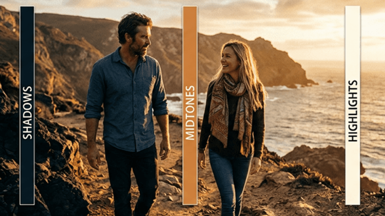
If you’ve spent any time with color tools, you’ve probably run into lift, gamma, and gain. Shadows, midtones, highlights: adjust each one, try to balance them against each other, and repeat until the image looks right.
Push the highlights up, and midtones shift. Pull the shadows down, and contrast changes in areas you didn’t intend to touch. You spend as much time compensating for the controls as you do actually shaping the image.
Color Mode in Premiere (beta) uses a zone-based system: you define precisely which part of the tonal range you’re affecting, and how far that effect extends.
Why Lift/Gamma/Gain Gets Complicated
The lift/gamma/gain model wasn’t poorly designed, but it was designed for a world where most footage lived in a narrow, predictable tonal range. When every camera was delivering Rec.709 and dynamic range was limited, three broad controls were often enough.
Log footage changed that. When a camera captures a wide dynamic range and compresses it into a log curve, the signal is distributed very differently. Highlights that would have been near the top of a Rec.709 signal now sit in the upper midtones. The boundaries between shadows, midtones, and highlights become blurry. The gain control, which is supposed to affect highlights, ends up pulling on a much larger part of the image than you intended.
You have a log-encoded shot of a subject outdoors with a bright sky behind them. The sky is sitting high in the signal but not clipped. You want to bring it up a little. You raise gain.
The adjustment doesn’t stay in the sky. Upper midtones come with it, and your subject’s skin starts to look wrong; a little too bright, a little washed out. You pull gamma down to bring density back into the midtones. That helps the subject, but now the transition into the highlights feels compressed and the sky loses depth. You adjust lift to rebalance the blacks, and now the overall contrast has shifted again.
You wanted to lift a sky. You ended up rebuilding the entire image. Each control introduced a new imbalance that required another correction. The more latitude your footage has, the worse it gets.
What Zones Actually Do
A zone in Color Mode lets you define a specific portion of the tonal range, with a center point, a width, and a controlled transition, and make adjustments that stay within that range.
Under the hood, zones are curves. But you don’t have to think about curves to use them. Instead, you define where in the image you want the adjustment to live, and the system handles the math.
If you want to affect the sky in that shot, you define a highlight zone that sits right where the sky lives in the signal. Adjustments within that zone stay there. The skin tones, which live in a different part of the tonal range, are unaffected.
The transition between a zone and the rest of the image is smooth, so there are no visible seams where an adjustment starts or stops.
Zones Aren’t Just for Exposure
Inside a zone, you can also adjust temperature, tint, color balance, and saturation. If you want warm highlights and cool shadows, define highlight and shadow zones and push each one in the direction you want. If you want to pull saturation out of just the brightest parts of an image, set up a highlight zone and bring saturation down within it.
Global Controls First, Zones Second
Global controls come first, zones come second.
Color Mode’s global adjustments cover exposure, white balance, and contrast across the whole image. Use them to get the image into the right general territory. Zones refine specific areas after the foundation is in place.
Skip the global pass and go straight to zones, and you end up doing compensatory work with targeted tools. That’s the same problem lift/gamma/gain creates, just in a different form. The grade will be harder to manage and harder to maintain across shots if the overall image isn’t in the right place first.
Get the exposure and balance right globally. Establish the overall contrast. Then use zones to shape what needs it.
How to Build a Zone Adjustment
Start broad, then get specific.
If you’re shaping the shadows, start with a default shadow zone to push the deeper tones where you want them. If the darkest shadow detail is getting crushed, add a narrower zone and pull just that area back. It’s similar to building a curve by hand: a broad move first, then anchor points to refine the shape.
Apply your adjustments to a simple black-to-white gradient clip and watch how it bends. Clean zone work creates smooth, controlled curves. Kinks or abrupt shifts mean the adjustment is doing something unintended.
The Limitation Worth Knowing
Zones are designed to refine a grade that’s already in good shape globally, not to replace the global work. Build a full contrast shape out of zones alone and you’ll likely overshoot and end up with something hard to keep consistent across cuts.
Like any tool, zones take some practice. But once the logic clicks, they tend to replace a lot of the workarounds that felt necessary with older tools.
This is article eight in a series on Color Mode in Premiere. In the next article, we’ll cover The Two-Dimensional Controls, including what makes the 2D controls feel unfamiliar at first and how they become intuitive once you understand what they’re doing
If you missed previous articles, start with the first: Why Adobe Rebuilt Color—And Why It Matters for Filmmakers. To try it for yourself, download the beta of Color Mode.