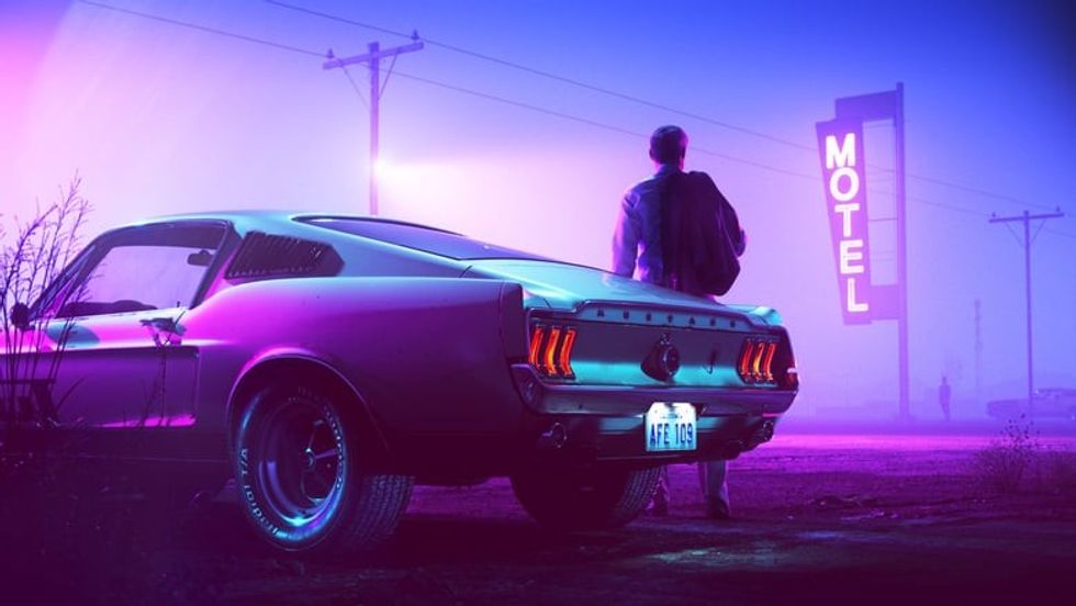
Sometimes, when I'm watching a movie, I am just basking in the colors and vibes they put out, and how they match the overall aura or mood set by the filmmaker.
I'm not sure a movie like Drive could work without the neon or Vertigo without red and green.
So, how do you get a cool color palette that matches the vibe of your movie? It turns out, there's a rule called the 60-30-10 rule that can help guide you on this journey.
Let's dive in.
The 60-30-10 Color Rule in Filmmaking
What is the 60-30-10 Rule?
This is a rule that breaks down the color palette of a scene into three distinct percentages:
- 60% Dominant Color: This color forms the foundation of the scene's visual identity, setting the overall mood and tone. It provides a sense of depth and three-dimensionality, immediately signaling to the audience whether a scene is meant to feel bright and cheerful or dark and somber.
- EXAMPLE: The use of yellow in La La Land bathes the film in a warm, nostalgic glow.
- 30% Secondary Color: Complementing the dominant color, the secondary color adds layers of realism and visual interest to the scene. Without this crucial element, the visuals can feel flat and artificial.
- EXAMPLE: In The Matrix, the secondary green hue works in stark contrast to the dark tones, creating a distinct and futuristic aesthetic.
- 10% Highlight Color: This accent color is used sparingly to create a pop of vibrancy and to draw the viewer's eye to important details within the frame.
- EXAMPLE: In Mad Max: Fury Road, we get little pops of red all over, from the guitar guy's red outfit to fire, that contrast with the desert and the sky.
The Importance of Intentional Color in Production
 'Mad Max: Fury Road'Warner Bros. Pictures
While color grading in post-production is a must, the most impactful and authentic results happen when you plan for your colors to be in the actual production process.
It's way more effectively to use colorful props or costumes than to just add in digital effects later. So work with your cinematographer, set designer, and peop master to find some fluidity here.
Practical Tips for Aspiring Filmmakers
 'Drive'
Credit: Le Pacte
When selecting your color palette, it's essential to consider how different colors will appear on various skin tones.
Do some camera tests with different palettes to see which you like best and what works with your actors.
For those working with a limited budget, a practical approach is to utilize existing furniture as the complementary color, paint the walls a dominant color, and then strategically introduce a highlight color to make a bold statement.
See what already exists in your locations and then design around that. It can make stuff feel more authentic and actually evokes realism as well.
This simple yet effective technique can elevate your film's visual language, giving it a professional and intentional look without breaking the bank.
Also, check out Goodwill! There's always a ton of cool stuff there. Or buy it from Walmart and then...just return it all after. That's the smartest way to do it if you have some money. I used to do this all the time, and it works.
Summing It All Up
Now that you know all about the rule, you can put it to good use in your next filmmaking endeavors. Hopefully, it helps guide you in the process.
Let me know what you think in the comments.
- How a Film Color Palette Can Make You a Better Filmmaker [W/ Infographics] ›
- Can Color Coding Characters Improve Your Story? ›
- This Infographic Reveals the Connection Between Color and Emotion in Film ›
- Red Hot & Feeling Blue: An Exploration into the Psychology of Color in Film ›
- The Psychology of Color in Film (with examples) ›
- A Color Grading Case Study of the New Music Video from Hip-Hop Artist Killer Mike ›
- What's With The Colors Green and Red in 'Vertigo'? ›