Good Secrets on Crafting a Bold Visual Identity for HBO’s 'U.S. Against the World'
Creative Director Casey Latiolais explains how Good Secrets built a hip-hop-meets-punk graphics package for HBO’s U.S. Men’s National Soccer Team docuseries.
‘U.S. Against the World’
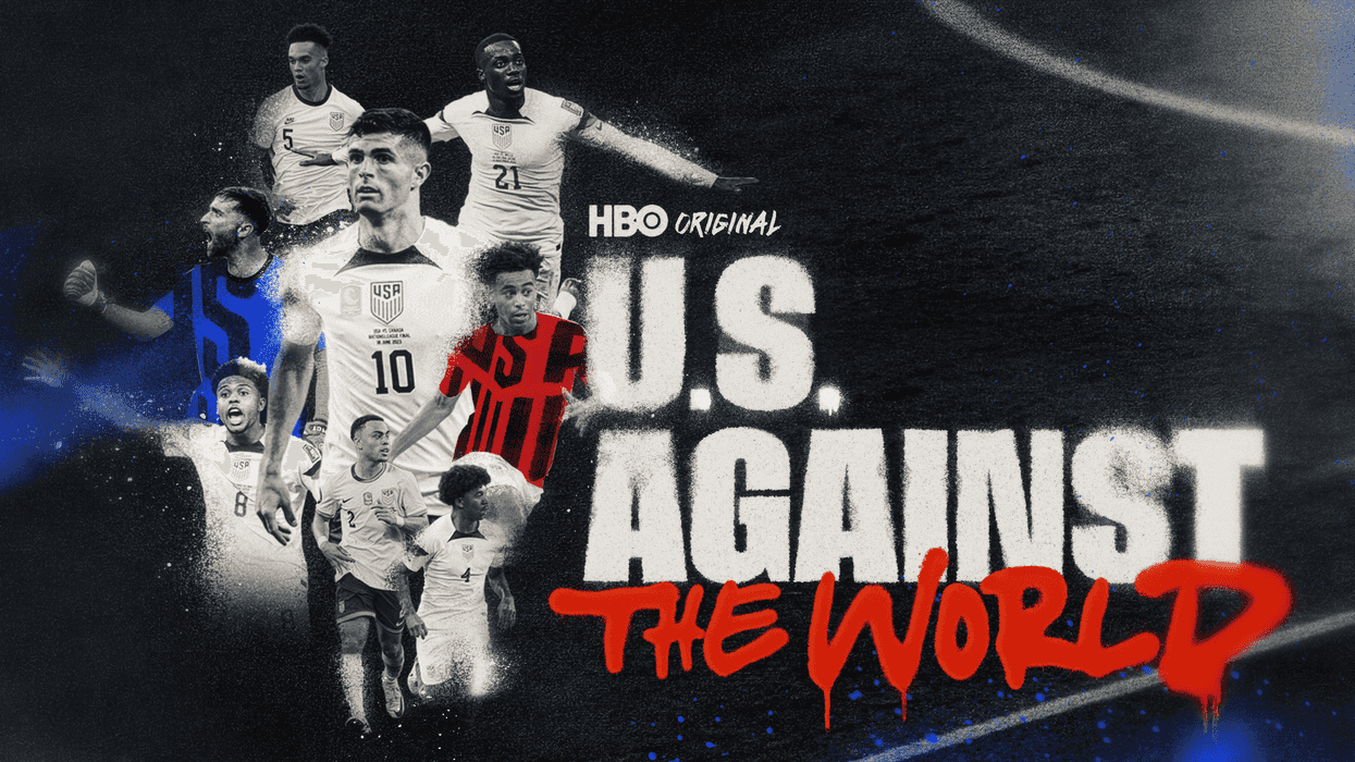
For animation and design studio Good Secrets, finding the visual language of a project always starts with understanding the heart of the story. On the HBO docuseries U.S. Against the World, that meant creating a bold, handcrafted visual identity that matched the grit, swagger, and emotional intensity of the U.S. Men’s National Soccer Team in the lead-up to the 2026 World Cup.
Working closely with the series creators, Good Secrets developed a dynamic title sequence and graphics package that helped anchor the docuseries' non-linear narrative, seamlessly blending archival treatments, scorecards, maps, and animated sequences into a cohesive visual world. The team grounded their workflow in a scalable design system with Adobe After Effects, Essential Graphics, and Motion Graphics Templates (MOGRTs), ensuring their assets could evolve alongside an edit that was constantly changing.
We spoke with Creative Director Casey Latiolais about building the show's distinctive aesthetic, balancing creativity with the demands of a five-hour docuseries, and why sometimes the best design starts with scissors, paper, and spray paint.
How did you begin the design process for U.S. Against the World?
Casey Latiolais: We got involved because we liked the story and knew the show was going to be good. We were also handed a huge canvas, and that's an offer you can’t turn down.
We coordinated closely with the post-house so our graphics dropped into their pipeline without friction. Episodes and segments kept changing right up to the end, so we built for change. Templates for everything, sorted into categories: archival treatments, scorecards, locations, maps, etc.
With a non-linear story, there's a lot of jumping around. Our job was keeping the viewer grounded through all of it.
What conversations did you have with the wider team to align on the creative vision for the project? What did collaboration look like throughout production and post?
CL: Our earliest conversations with series creators Rand Getlin and Janina Pelayo, alongside Creative Director Lucas Harger, centered around giving these athletes a profound human authenticity. We agreed it needed to feel 70% hip hop and 30% punk rock to match the team's raw, scrappy energy. Throughout production, collaboration was a year-long marathon of constant iteration. Once we collectively cracked that gritty, handcrafted recipe, our animation team shifted into high gear and chewed through the massive workload.
Tell us about a favorite scene or moment from this project, and why it stands out to you.
CL: The main title sequence is undoubtedly our favorite moment and our absolute pièce de résistance. We actually designed the in-show graphics first to nail down the aesthetic, which meant the title sequence was one of the final pieces we created. We looked at the elements we had peppered throughout the episodes and asked ourselves, "If those sequences are a 5, what does a 10 look like?" We threw everything we had at it; spray paint, collages, and scratched film, to create an intro that perfectly sets the tone for the series.
What tools did you use on this project and why did you choose them?
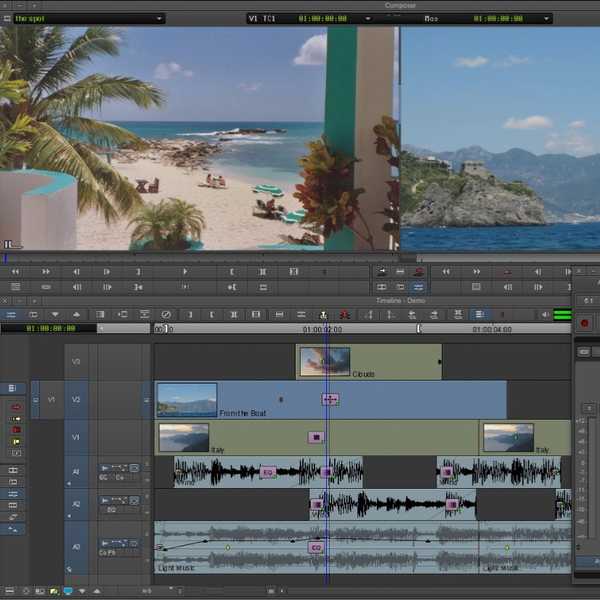
CL: For the heavy-handed/complicated designs, we built within After Effects’ Essential Graphics. By building a robust system, we were able to have designer/animators jump in quickly to make changes to an ever-evolving edit. We also set up the editors with some Motion Graphic Templates (MOGRTs) to make all our lives easier. This gave them the power to change in-game clock/score, lower thirds, and subtitles without having to make the round trip to Good Secrets.
What were some specific post-production challenges you faced that were unique to the project? How did you tackle them?
CL: The sheer volume of deliverables, spanning a docuseries with five hours of non-linear storytelling, was our biggest hurdle. We had to figure out how to make hundreds of assets, scorecards, timeline portals, and archival photo treatments feel visually interesting without overpowering the narrative. We tackled this by establishing a scalable, repeatable visual recipe early on, allowing us to plow through a massive graphics order while maintaining a handcrafted look.
Who is your creative inspiration?
CL: Justin Harder and Mike Russo are two incredible designers we have looked at for years as inspiration. So we just reached out and asked if they wanted to jam together. There’s something really liberating about having a cool project; it’s hard to find a creative who would say no. We’ve gotten to work with a couple of the greats, and it was an incredible experience having them integrated with our CD/Designer/Animator Preston Gibson and the rest of our team.
What advice do you have for aspiring filmmakers or content creators?
CL: Don't be afraid to step away from the computer and get your hands dirty. The human authenticity of our project came from literally printing out frames, cutting them with scissors, and using real spray paint before ever hitting keyframes. Sometimes, the best way to stand out in a purely digital world is to embrace the imperfections, scratches, and happy accidents of physical art.