How Wes Anderson Uses the "3 Color Rule" to Master the Palate
These colors help Wes Anderson sculpt such calm and collected movies.
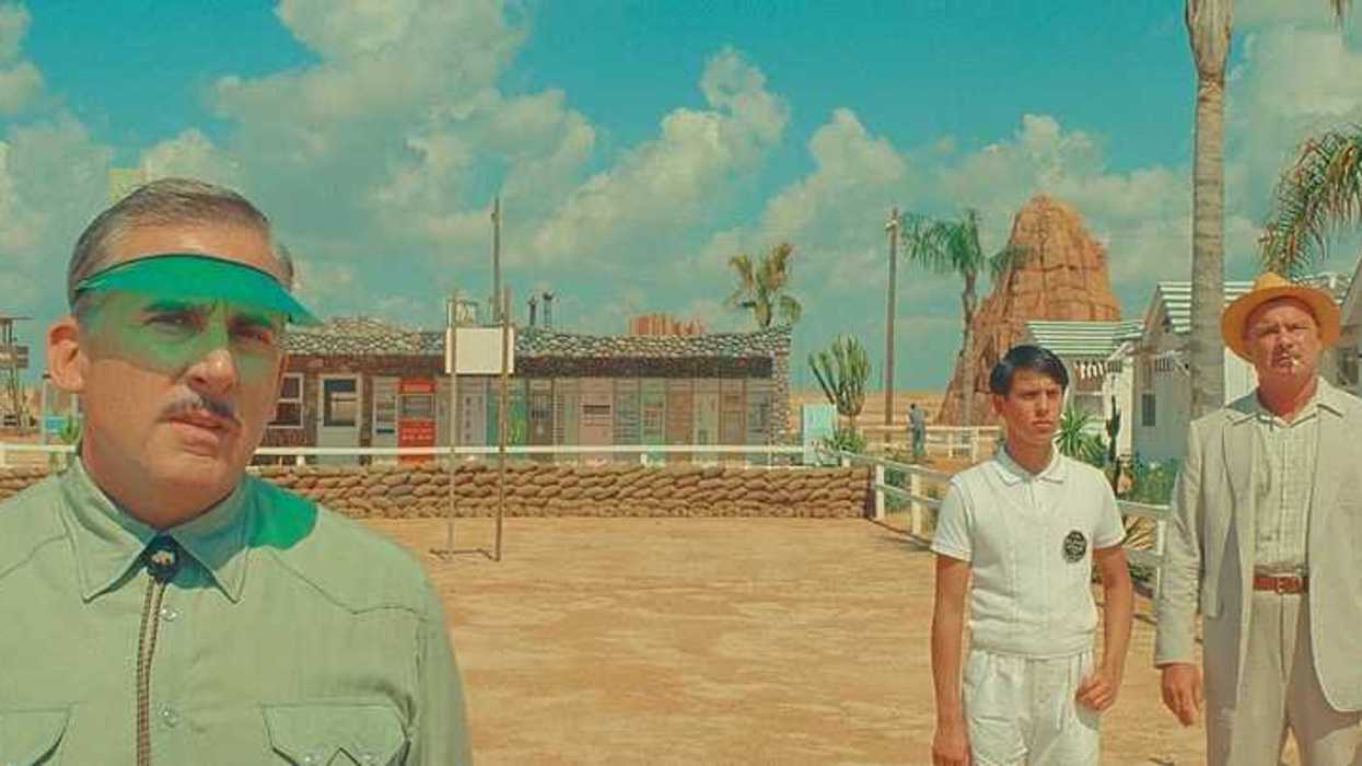
'Asteroid City'
Whenever I need to calm down and just need to sink into the couch, I like to watch a Wes Anderson movie. He makes such immersive experiences that take me out of my own world and into a place I find much more soothing.
And if you’ve ever watched a Wes Anderson film, you know that his aesthetic is unmistakable. And I think each of his movies has a color palette that truly brings his worlds to life.
A recent viral YouTube Short by Movie LUTs highlights a design secret Anderson often uses to achieve this perfect visual harmony: The 60-30-10 Rule.
Let's dive in.
- YouTubewww.youtube.com
What is the 60-30-10 Rule?
We have a whole post on the 60-30-10 rule, but I can summarize it here. The 3 color rule is a formula used to create a balanced color scheme.
Here is how it’s broken down:
- 60% Primary Color: This is the dominant base color. It’s usually a neutral or a muted tone that sets the overall mood of the scene.
- 30% Secondary Color: This color supports the main one but is distinct enough to create interest. It often appears in furniture, clothing, or specific architectural elements.
- 10% Accent Color: This is a bold, "pop" of color used sparingly to draw the eye to specific details or characters.
Why It Works for Wes Anderson
Look, Wes Anderson movies work because he's an incredible auteur who feels deeply and crafts characters and worlds that engage us. But the color helps.
His films feel like living paintings. And the 60-30-10 ratio helps him avoid visual clutter. Even when his scenes are packed with detail, the strict color discipline ensures the audience isn't overwhelmed.
And it helps us notice all of the painstaking details he puts in everything.
Here's how it applies to some of my favorites of his movies:
- Pastel Pinks and Reds: In The Grand Budapest Hotel, Anderson uses a dominant 60% pink, a 30% deep red, and a 10% gold or white accent.
- Moody Blues and Yellows: In The French Dispatch, he uses a 60% muted blue/grey, 30% yellow, and 10% black/darker tones to create a vintage, journalistic feel.
- High Contrast Accents: Occasionally, he flips the script with a bold 10% accent, like a bright red circle or object, to create an immediate focal point in an otherwise monochromatic scene.
How to Apply This to Your Own Projects
You don't have to make films that look exactly like Wes Anderson for this kind of stuff to matter and to work. You just have to make a concerted effort to design your scenes and bring some of this stuff forward. You can do it with locations, wardrobe, lighting, etc and get what you want.
- Pick Your Trio: Start with a palette of three colors.
- Assign Roles: Decide which will be your background (60%), your supporting (30%), and your "hero" (10%).
- Stay Consistent: Once you choose your colors, stick to them throughout the scene.
Summing It Up
The best directors know that color is not just for decoration; it actually means something inside your story and even brings the themes forward.
The 60-30-10 rule can help you define the look and feel of your movie. You don't have to be Wes Anderson to utilize it, although it seems to help.
Let me know what you think in the comments.