In indie filmmaking, set design can sometimes be an afterthought. You’ll see characters placed in an empty room against a white wall with no visual interest or character, and the team calls it good.
Unfortunately, bad set dec is immediately obvious and signals a lack of money, time, experience, or all three.
But you can do a lot even on a low budget, if you just know how to use the resources you have. A DP friend recently shared this video from Caroline Winkler to help others who might be running into production design walls.
Winkler is an interior design creator whose video below breaks down how to make a space feel inhabited and real. Her approach, developed for anxious Redditors trying to make their apartments feel like home, translates almost perfectly to what set decorators do for a living. The goal is to make a space feel like someone lives in it, which means making choices that feel inevitable rather than random
The basic tips (layering, light sources, height, materials, color) are visual design rules that can apply in real life or film sets.
Start with a North Star
Winkler says before you touch a room, you should start with a reference image or mood board.
“Before you start tackling your own home, you do want to have a North Star, something you're aiming toward,” she says. “That can be your vision board, your Pinterest board, a collage you made, a picture you drew, a dream you had, whatever. But you need to have a North star that just helps keep you focused on, like, what's the look we're aiming for?”
In film, this is called a lookbook, a visual blueprint that the entire art department works from. We’ve got an explainer on how to make a lookbook and how they’re used.
A set without a visual reference ends up looking as if nobody has made deliberate choices. For low-budget filmmakers dressing real locations, committing to a reference image or lookbook before you start sourcing props is what keeps the space from feeling random.
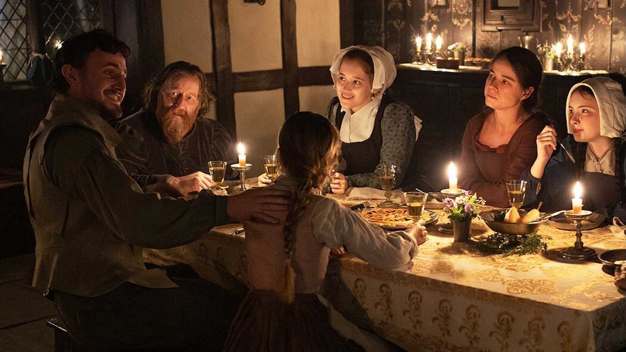
And this is important because set design can tell an audience what kind of person a character is. An unkempt home signals one thing, a room full of meaningful objects signals another. So don't make random choices.
Layering Is Everything
Winkler looks at a sleek living room set-up with several pieces—art on the walls next to tall plants, a small rug on top of a larger area rug, side tables as well as a coffee table. All that is layering and creates depth.
Now think of the opposite, a room with no design sense. It might just have a couch and a TV in it. That’s flat and boring.
Set decoration is fundamentally about depth. The eye needs somewhere to travel in a frame.
And remember, everything within the frame tells a story, and dressing the set to match the tone of a film or a character's persona is what pushes the narrative forward. Unless the room you’re designing is for a sad college student who’s just moved into a new place and hasn’t made any improvements since then, maybe avoid the empty set with flat dressing.
Lighting Is Not Just the Gaffer's Problem
In reality, I’m not a “big light” person, meaning I don’t use my home’s ceiling lights at all. I have several lamps placed throughout my space instead.
I’m happy to say I’m following Winkler’s rule: “I say aim for three sources of light that are not overhead.”
She’s talking about practical lamps, and practical lamps are a set decorator’s call, a decision made in cooperation with the DP. Some sets will require you to just blast the whole area with a “big light,” but especially in small, home settings, that won’t be the call.
As StudioBinder points out, set design is 75% lighting, so you can make a set look expensive on a lower budget by being strategic with your lighting. I think about Hallmark holiday movies, which are usually shot fast and cheap—but because they can just pile in string lights and lots of textures, they usually end up looking really good!
 'The Holiday Sitter' | Production design by Jordan NinkovichCredit: Hallmark
Natural Materials Signal “Lived In”
One of Winkler’s biggest pieces of advice for blank spaces is to add texture in the form of natural materials. These can be wood, leather, stone, marble, metal, textiles, or plants. Plants are a big one that, when used thoughtfully, can add a lot to a room.
Don’t just pick a big palm or fern and plop it in. Remember layering here, too. A plant person rarely has just one plant, and they would be thoughtful about placing it near a light source rather than in a corner to fill space.
Winkler says, “I would say one of the biggest materials I see missing from a lot of male living spaces is just natural materials like wood. I would say if you add nothing else in, think about adding wood because chances are you haven't yet.”
You might have an instinct to dress a set with metal and plastic (because it’s cheap, available, and contemporary), but that is exactly what makes low-budget sets feel sterile. Take a trip to your local thrift instead and see what affordable options there are.
Use Vertical Space
Don’t forget to think tall as well as wide. Winkler makes the case for varying heights across furniture and decor, especially in large rooms with high ceilings.
Sets notoriously waste vertical space because almost everything ends up at eye level. And of course, framing plays a role in that, and the fact that you might have lighting rigs and sound equipment above that you don’t want to see.
But in production design, you can think about bookshelves, tall plants, wall-mounted art, and sconces to pull the audience's eye upward and make a space feel three-dimensional on camera.
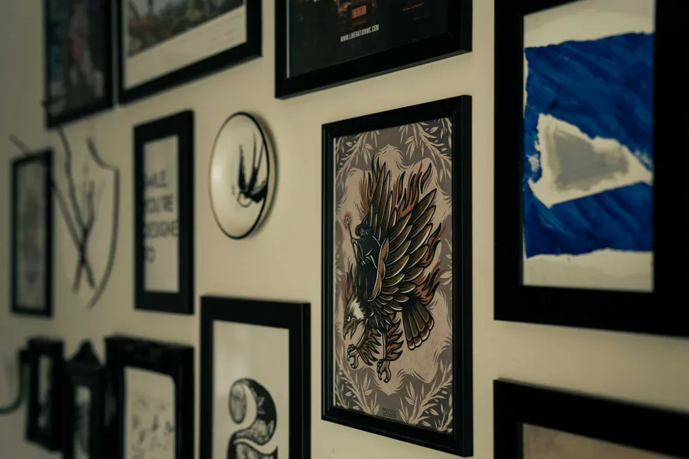
Sidebar. If you want wall art, please consider a gallery wall instead of just one lonely, small framed piece on a huge blank wall. That’s another tell that points to a lack of experience and/or money, and will only distract instead of adding what you want it to.
Mix sizes, shapes, textures, and colors.
 Credit: @felirbe
Pick a Main, Secondary, and Accent Color
Winkler's color advice is simple. Pick a main color, a secondary color, and then one accent color.
“That accent color is what's going to make it feel designed,” she says. It gives a space that extra oomph of intentionality.
She’s describing, in plain language, exactly what production designers call a color palette, and it functions identically on a set. The right color palette means the room is acting too. Learn more about color theory in film.