Why Filmmakers Use Monochromatic Color Palettes
Exploring the emotional impact of a unified color scheme.
'Drive' (2011)
Suppose you are watching a movie and realize that you are experiencing a certain mood. Maybe you haven’t noticed that the film is dripping in shades of one single color. It’s not an accident.
You are deliberately manipulated into having a certain mood. Filmmakers use this trick all the time to pull you into a story without saying a word. That’s the magic of a monochromatic color scheme—sticking to one color (and its many shades) to create a certain vibe that’s essential to the viewing experience of that movie.
From the moody greens of The Matrix to the sun-bleached yellows of Breaking Bad, monochrome palettes do more than just look cool. They create a nurturing environment for the story.
Let’s explain how they work, why they are so powerful, and how your favorite films use them to knock your socks off.
Monochromatic Color Scheme: Definition
A monochromatic color scheme is a design approach that uses a single color palette and its different shades, tints, and tones.
This means taking one base hue and adjusting its brightness or darkness by adding black, white, or gray. The result is a cohesive, visually harmonious look that can evoke specific emotions and moods.
This technique is often used in films to create a strong atmosphere, guide the audience’s emotions, or highlight thematic elements without visual clutter.
Let’s now explore some movie examples that have used the monochromatic color scheme and see what they achieved.
1. The Matrix (1999)
Director: The Wachowski sisters
The Matrix is iconic for several reasons, but one aspect that the common audience doesn’t realize is that the Wachowskis straight-up defined a generation by using that eerie green-tinted color scheme.
It’s like they dunked the whole simulated world of the Matrix in shades of sickly green. That monochrome palette wasn’t just for style. It made everything feel artificial, like you were staring at an old CRT monitor where reality had been hacked. And here is the sneaky part: the second you step outside the Matrix into the “real world,” that green tint vanishes, replaced by a cold, grungy blue-gray.
The colors alone tell you something is off before Morpheus even drops his mind-bending truth bomb.
2. Mad Max: Fury Road (2015)
Director: George Miller
Okay, so Mad Max: Fury Road bends the color palette rules. Not much, just a smidge.
Technically, it’s not strictly monochrome, since those deep blue shadows sneak in. But hey, let’s be real, this movie is all about that scorched earth, dust-in-your-teeth orange. George Miller cranked the saturation to hell and back, turning the desert into a full-blown apocalyptic wasteland.
Every frame, in rusty, sun-bleached tones, looks like it’s been under the sun for a thousand years. It made you feel the heat, the grit, and the sheer madness of the wasteland. They graded the whole film to look like an old, overexposed photo, which is why it sticks in your brain like the wild ride that it is.
3. 300 (2006)
Director: Zack Snyder
Gerard Butler and his Spartan warriors exist in a world called 300 that looks like it’s been painted in pure, unadulterated testosterone. Every single frame is drenched in deep, rich crimson and rust tones that make the entire movie feel like a living, breathing comic book.
And why not? It was a direct translation of the graphic novel’s visual language. The monochromatic red scheme screams violence, passion, and mythical heroism.
4. Schindler’s List (1993)
Director: Steven Spielberg
Steven Spielberg shot Schindler’s List in black-and-white to give a raw, documentary-like feel, as it was pulled straight from history itself. But then, there is that one pop of red—a little girl’s coat. It’s the only real color in the film, and it hits like a punch to the gut.
The girl represents innocence, and what happens to her later is absolutely heartbreaking. That single use of color made the moment unforgettable.
5. Hero (2002)
Director: Zhang Yimou
This Chinese martial arts epic is great for teaching color psychology. The film is divided into segments, and each segment is told in a different dominant color scheme—red for passion and deception, blue for calm and truth, yellow for enlightenment, and white for resolution.
It’s like a painting that has come to life, where every color shift changes the entire mood of the scene.
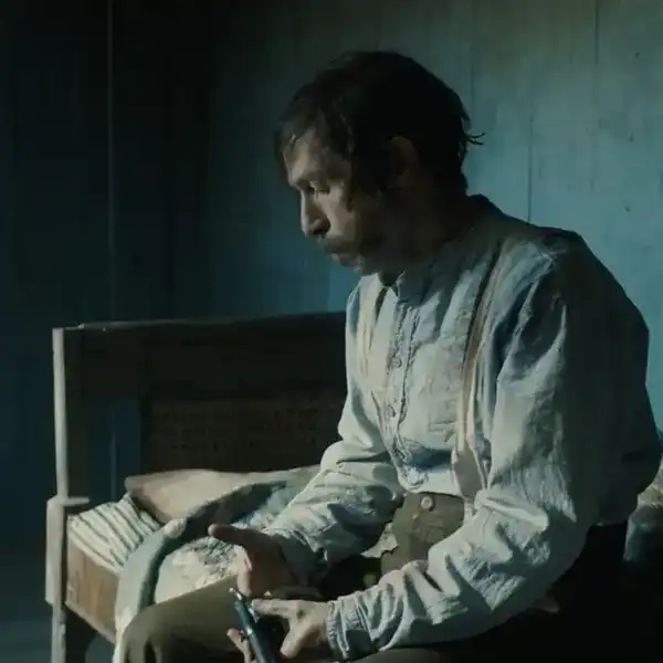
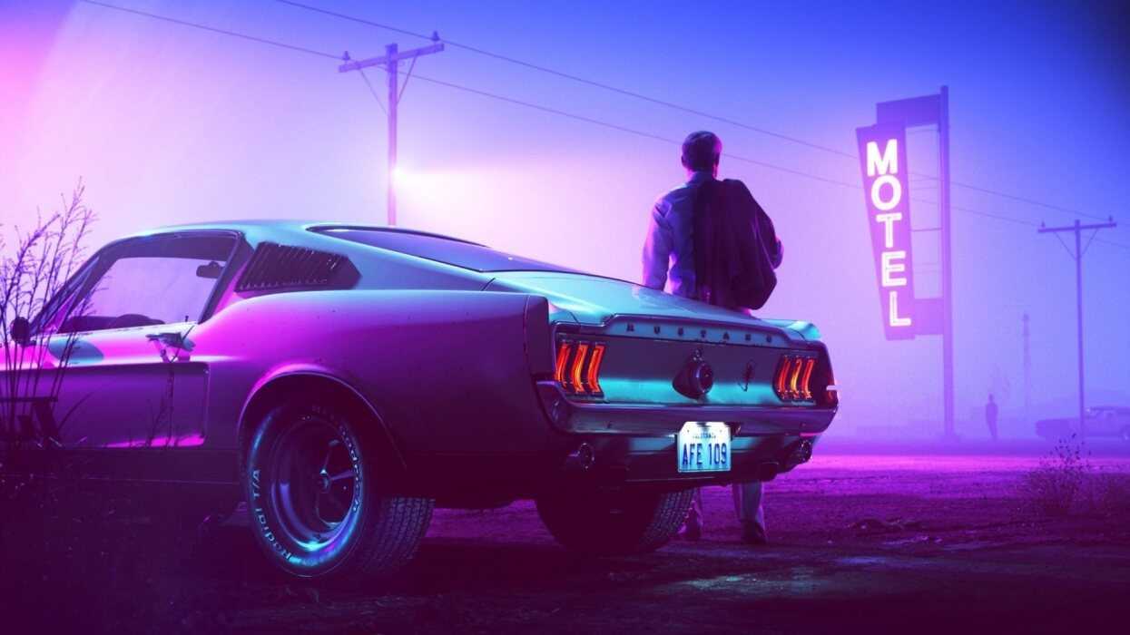
6. Drive (2011)
Director: Nicolas Winding Refn
This film is pure ‘80s nostalgia. The whole movie is soaked in moody neon, like deep purples, electric pink, and blues that make LA nights feel dreamy yet dangerous.
That color palette makes Ryan Gosling’s ultra-quiet and cool driver feel even more mysterious, like he is a part of the city but doesn’t really belong to it. Oh, and the hot pink title font? Chef’s kiss!
Conclusion
Films don’t only talk through dialogue, and colors are one of the stealthiest aspects of any film. Before you realize it, a single hue can set the mood, spark emotions, and pull you deeper into the story.
Monochromatic color schemes are pure storytelling magic. These carefully chosen color palettes shape entire worlds and make us feel without a single word.
Next time you watch a movie, try looking past the action and the dialogue—notice the colors. In the right hands, a shade is an entire universe waiting to be explored.