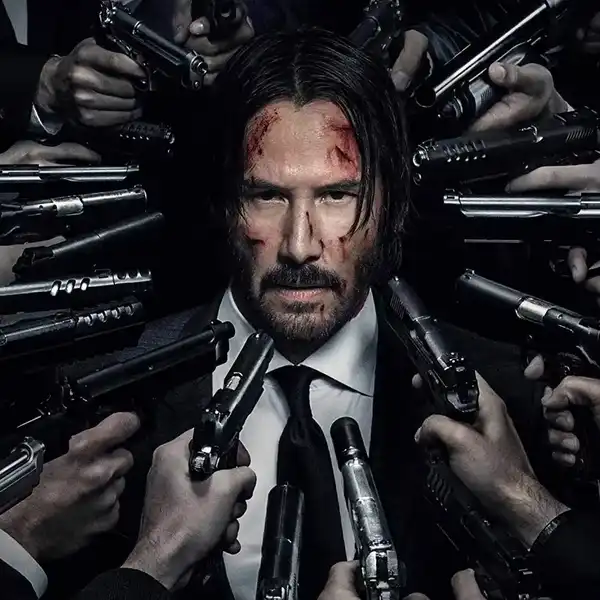
Designing Indie Horror: The Production Design of 'Obsession'
“Everything has to have a texture.”
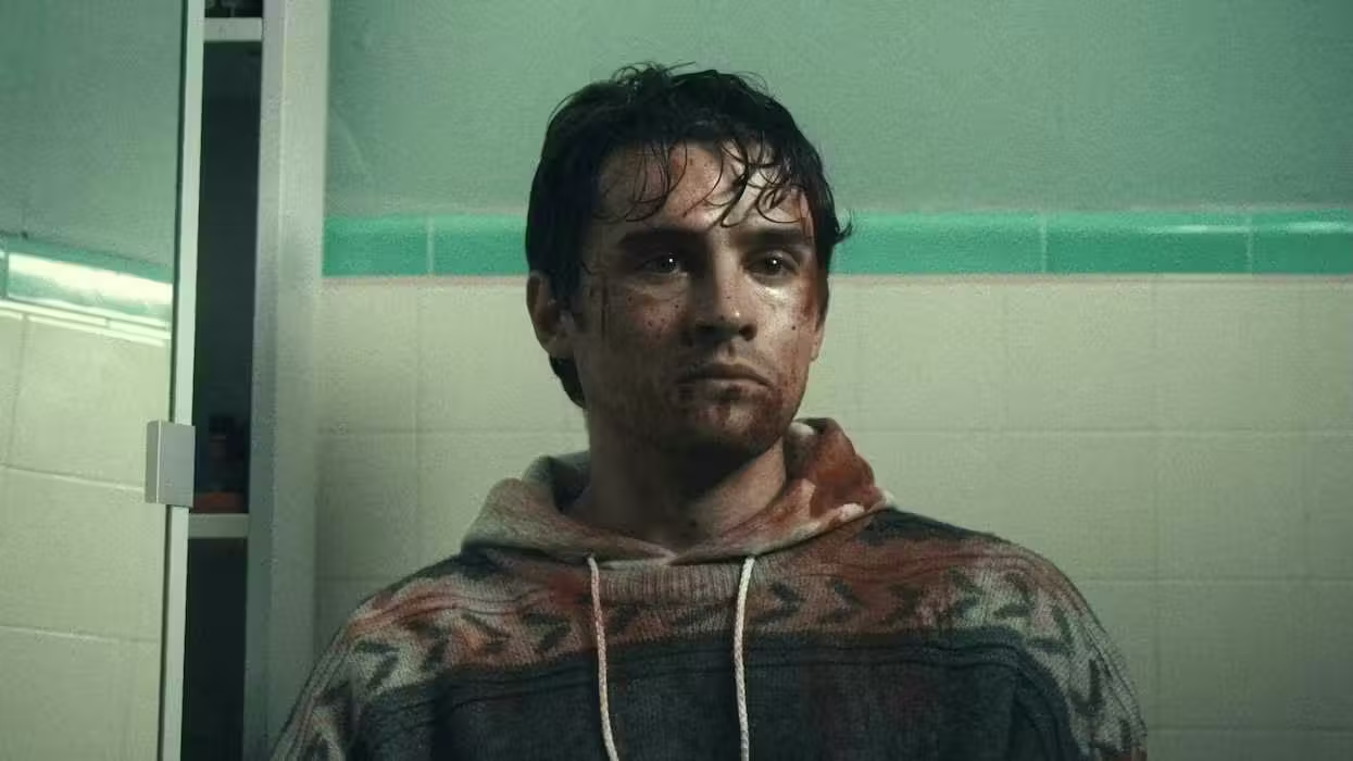
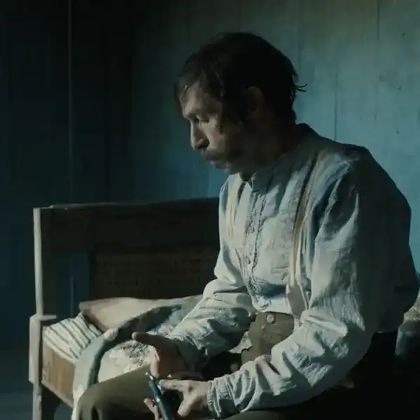
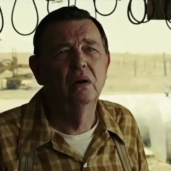
'Obsession'
In this episode of the No Film School Podcast, GG Hawkins speaks with production designer Vivian Gray about building the visual world of Obsession, from Southern Gothic references and texture-heavy interiors to practical blood gags and micro-budget problem-solving.
They discuss what a production designer actually does, how Gray collaborated with the director, cinematographer, costume designer, and art team, and why color, texture, aging, and window treatments can make a major difference on an indie horror film.
In this episode, we discuss:
- What a production designer does and how the role shapes the visual world of a film
- How Vivian Gray landed the job on Obsession through a recommendation and visual pitch deck
- Building the film’s Southern Gothic and Midwestern Gothic-inspired visual language
- Why production designers should come onto a project as early as possible
- Collaborating with cinematography, costumes, props, set decoration, lighting, and graphic design
- How a small indie crew used hands-on collaboration to make the film’s world feel cohesive
- Designing horror environments through texture, color, maximalism, and unease
- Practical lessons from blood gags, aging props, window treatments, and set dressing
- The highest-impact production design choices for micro-budget filmmakers
- Vivian’s advice for aspiring production designers
Guests:
Subscribe to the No Film School Podcast on:
Get your question answered on the podcast by emailing podcast@nofilmschool.com
Listen to more episodes of the No Film School podcast right here: