Storytelling in movies doesn’t happen only through actions and dialogue. Visual storytelling is a big part of narrative art. Color grading your film is a very important part of it. A good cinematographer will always know which specific color palettes will define a film’s emotional atmosphere.
Unless you make movies or work with a camera, chances are you might not understand the technicalities and intricacies of color grading. But you can still feel it. Try to recreate your movie-watching experience. You might notice that every once in a while, without realizing it, you feel a certain vibe. You feel it even before a character speaks or events happen. That’s neither your intuition nor serendipity. That “feeling” is the result of calculated color grading. It directs your feelings in a way that enhances your understanding of the movie.
Call it the interior design of the screen. Instead of just “lighting” a scene, a filmmaker bathes it in specific hues that correspond to the film’s emotional tone. It keeps you in the right state of mind to absorb the film’s narrative. Sometimes, you might actually notice it: “Why is everything so blue?” “The screen is so weirdly orange!” you might remember wondering. Well, the next time it happens, know that you are witnessing a deliberate artistic choice.
It might help you understand better with familiar examples. These eight examples set the standard for visual storytelling through color grading.
Masterpieces of Mood: 8 Iconic Film Color Grades
1. The Wizard of Oz (1939)
Cinematography by: Harold Rosson | Directed by: Victor Fleming
Color Grade: Three-strip Technicolor
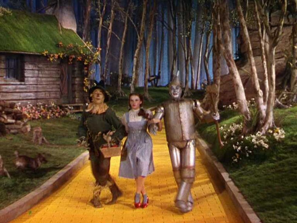 The Wizard of Oz (1939)Credit: Metro-Goldwyn-Mayer
The film’s tonal transition from the muted sepia-hued reality of Kansas into a saturated, Technicolor wonderland of Oz is iconic. At the heart of this transition is the Three-Strip Technicolor (Process 4) grading process, which used a special camera to record red, green, and blue light into three separate black-and-white film strips simultaneously. This process gave the visuals the kind of vibrancy that felt almost impossible at the time. The intense saturation was meant to be the unambiguous distinction of the fantasy world from the mundane reality. You can see the cultural landmarks it created in the Yellow Brick Road and Dorothy’s iconic ruby slippers.
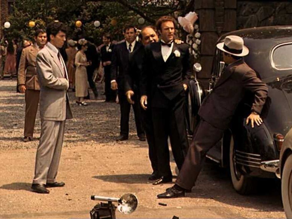
2. The Godfather (1972)
Cinematography by: Gordon Willis | Directed by: Francis Ford Coppola
Color Grade: Sepia-Toned Amber/Brown
 The Godfather (1972)Credit: Paramount Pictures
As legendary as The Godfather is, there is no denying the role its hues play in the film’s narrative. Gordon Willis, a.k.a. The “Prince of Darkness,” used a thick, underexposed amber tint to evoke that distinctive nostalgia of the ‘40s. Throughout the movie, you get the sense that you're looking at an old family album. That heavy, dignified atmosphere balances the violence of the story. This grading forms bold shadows and forces you to concentrate on the expressive, golden-lit faces.
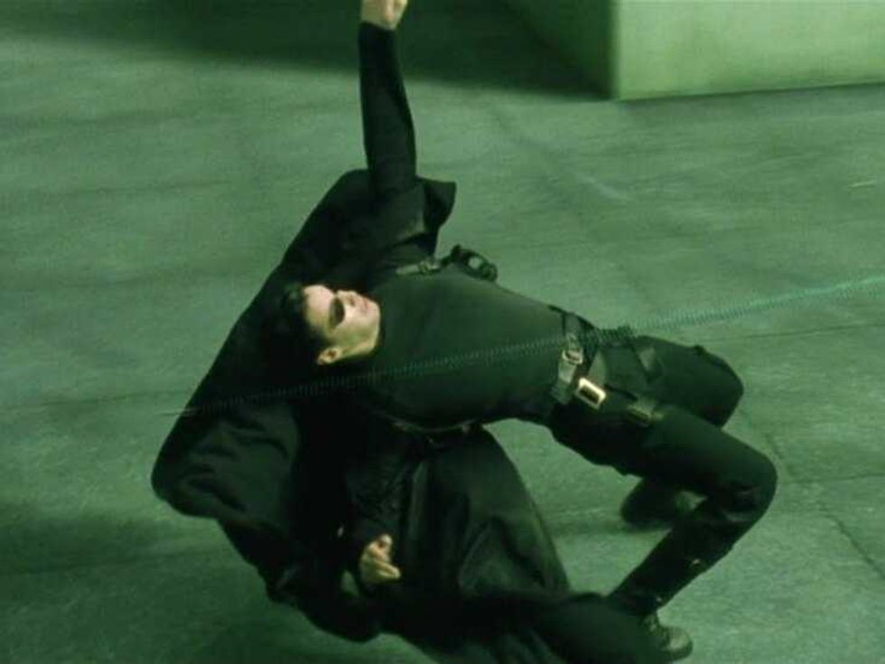
3. The Matrix (1999)
Cinematography by: Bill Pope | Directed by: Lana and Lilly Wachowski
Color Grade: Green Tint
 The Matrix (1999) Credit: Warner Bros.
Similar to how mundane reality changes into a technicolor wonderland in The Wizard of Oz, The Matrix’s real world (as we know it) changes into a simulated reality called “the Matrix,” and it’s sickly, monochromatic green. This grading is reminiscent of an old computer monitor. It gives the surroundings an artificial “digital” feel. Every time you see a scene taking place inside the Matrix, this green tint tells you that nothing is authentic. This choice famously and effectively turned a simple color into a storytelling device.
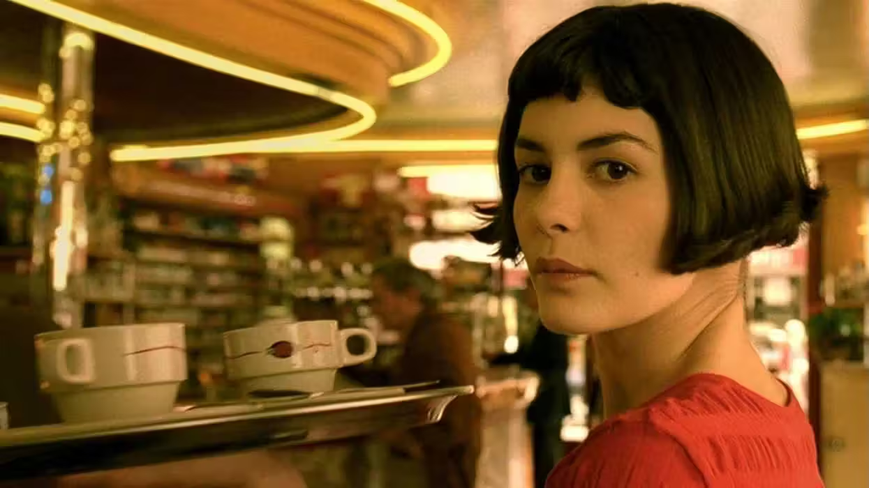
4. Amélie (2001)
Cinematography by: Bruno Delbonnel | Directed by: Jean-Pierre Jeunet
Color Grade: Warm Green and Gold
 Amélie (2001)Credit: UGC Fox Distribution
This film is pure art. Even its color grading choice is inspired by the paintings of Juarez Machado. The heavy use of lime greens and mustard yellows creates a quirky, idealized version of Paris. It also pairs smoothly with the film’s overall whimsical tone. When you watch Amélie, don’t you feel like a storybook was brought to life? It does, doesn’t it? And that feeling further emphasizes the protagonist’s eccentric worldview. The most important contribution of this grading was that it softened the harshness of the urban environment, giving it a soft glow that makes every frame feel cozy, inviting, and deeply sentimental.
5. Sin City (2005)
Cinematography by: Robert Rodriguez | Directed by: Robert Rodriguez and Frank Miller
Color Grade: High-Contrast Black and White with Selective Color
 Sin City (2005)Credit: Miramax Films
The movie is a standout and has a definitive recall value, thanks to its dark, ink-like film-noir aesthetics that are intermittently broken by vibrant colors. The film was shot digitally, and the footage was later manipulated during editing. The film is 95% grayscale, only interrupted by selective “splashes” of red, yellow, and blue to draw viewers’ attention to a specific element. These colors are neither random nor gimmicky. When they highlight blood, eyes, or clothing, they are trying to create a jarring, rhythmic visual experience. This technique underscored the “pulp” nature of the film.
6. 300 (2006)
Cinematography by: Larry Fong | Directed by: Zack Snyder
Color Grade: Bronze and Sepia High Contrast
 300 (2006)Credit: Warner Bros.
The movie’s aesthetics proved iconic from the moment it hit theaters. That legacy is still intact two decades later. For this distinctive effect, Fong and Snyder used a process called “the Crush,” in which the mid-tones are desaturated while the black tones are “crushed” to create a metallic, bronze look. If you ever felt like the movie looks like an ancient fresco, then you must thank the Crush. The high contrast comes in handy in masculating and texturing the battlefield. The softness of the real-world colors is replaced by a gritty, hyper-masculine aesthetic—wherein lies the movie’s iconic screen presence.
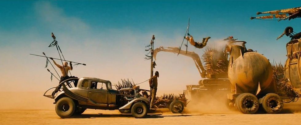
7. Mad Max: Fury Road (2015)
Cinematography by: John Seale | Directed by: George Miller
Color Grade: Hyper-Saturated Orange and Teal
 'Mad Max: Fury Road' Credit: Warner Bros. Pictures
When you think of a post-apocalyptic world, the typical washed-out, muted atmosphere comes to mind. This is where Miller’s Fury Road stands apart. It leans heavily into vibrant, eye-searing color. The desert sands are deep, fiery orange, while the sky is rich, stylized teal. The intention is not only to make the colors complement each other, but to create a visual energy to match the film’s relentless pace. This film offers a different look at the post-apocalyptic world: it doesn’t always have to be grey and listless. It can be colorful and yet terrifying.
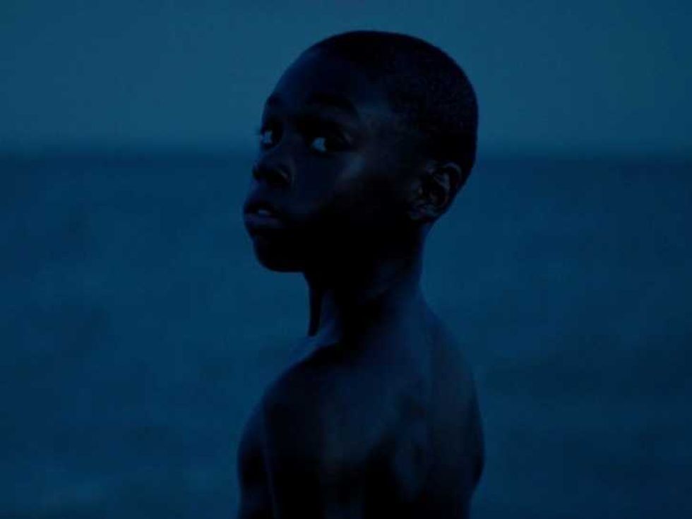
8. Moonlight (2016)
Cinematography by: James Laxton | Directed by: Barry Jenkins
Color Grade: Deep Blue and Neon Purple
 Moonlight (2016)Credit: A24
Blue plays an important role in the film’s narrative. It represents intimacy and vulnerability, especially pertaining to the protagonist, Chiron (Trevante Rhodes, Ashton Sanders, and Alex Hibbert). By emphasizing it, alongside vibrant purple hues, it creates a dreamlike, intimate atmosphere. It also helps in turning the urban setting into something poetic and ethereal. This unusual grading managed to ground the story into a lush visual poem about identity and human connection.
- Why Everything in ‘Eternal Sunshine of the Spotless Mind’ Is So Blue — And What It Really Means ›
- The Matrix’s Most Iconic Move Was Almost Impossible ›
- Bet You Didn’t Notice 'The Godfather' Uses Oranges as a Death Signal ›
- 8 Movies That Use Color to Manipulate Your Emotions | No Film School ›
- 11 Great Technicolor Movies Across History | No Film School ›
- The Story Behind “Alright, Alright, Alright”: Three Words That Made Matthew McConaughey Untouchable ›