8 Movies That Use Color to Manipulate Your Emotions
Films that flaunt their colors.
Amélie
What’s one of the greatest visual tools at a filmmaker’s disposal, you ask? It’s color.
Colors are versatile. They can direct the viewers’ eyes, highlight a certain aspect of the narrative, underscore themes, and most importantly, evoke emotions. What makes them even more powerful is that colors, when used intentionally, do half the talking for you in your frames.
In this article, we’re listing movies that used colors to their full potential. If colors are not your strongest suit, this article is sure to simplify things for you.
Best Use of Color in Movies
1. The Wizard of Oz (1939)
The use of color in The Wizard of Oz was way ahead of its time. Director Victor Fleming uses color to create a contrast between the magical world of Oz and Dorothy's reality, presenting the former in color while the latter in sepia.
The entire world-building of Oz is based on the basics of primary color theory and uses the Technicolor three-strip process, which gives it its quintessential “children’s magic land” look.
The Technicolor three-strip process required recording each scene onto three separate strips of black-and-white film in a Technicolor camera, with each strip capturing a particular primary color: red, green, or blue. In post-production, three separate negatives were combined, and each matrix was then dyed in a complementary color—cyan, magenta, or yellow. Following the dye, each layer was overlaid onto the others to achieve a full-spectrum image.
In the Wizard of Oz, yellow becomes a central motif with the Yellow Brick Road representing optimism, hope, and promise. The Emerald City in green represents both ambition and deception. Green for Oz, the Wizard, enhances his allure and intimidation. Also, you can’t forget the ruby slippers.
2. The Godfather (1972)
Francis Ford Coppola uses colors to create a distinct visual style in The Godfather. While bright yellows signify joy, Coppola drenches every frame in ochre or golden yellows that evoke a sense of corruption and decay, giving it a visual style that has its own legacy today. The use of orange in The Godfather is widely acclaimed.
Orange, a color usually associated with energy, creativity, and warmth, becomes a harbinger of death and warning in Coppola’s treatment. We see real oranges right before moments of violence; for instance, Vito plays with oranges right before his assassination attempt. Even moments before his death (by a heart attack), he was spending time with his grandson in the orange garden.
3. The Sixth Sense (1997)
M. Night Shyamalan is famous for his use of colors and is known to have an affinity for red. The Sixth Sense uses red as the film’s central motif, which represents the supernatural and serves as continuous foreshadowing of the film’s climax, where it is revealed that Dr. Malcolm is dead.
Interestingly, Shyamalan also uses red to represent a sense of security and comfort, while serving as a visual cue to the spirit world. The door with the red doorknob at Malcolm’s home that he relentlessly tries to open but cannot, the red balloon that Cole follows upstairs during the birthday party, Cole’s mother’s red sweater at the end of the film, and more, become moments of emotional high once you know the final plot twist of The Sixth Sense.
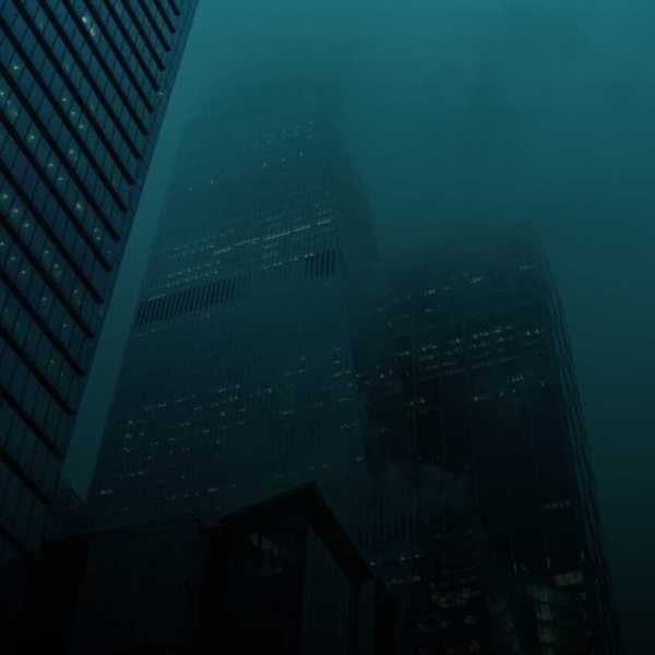
4. Blade Runner (1982)
Not many know that Blade Runner got its iconic cold, blue, rainy, and foggy look due to budget constraints. I’d say it was a boon in disguise, because Ridley Scott’s dystopian, futuristic L.A. is distinguished by its shades of blue and green and its damp visual tone.
While warmer shades of these colors evoke joy and prosperity, cold shades of blue and green, like those used in the film, exude misery, a lack of warmth, and murkiness. Colder hues are also perfect to create a sense of gloom, pollution, and alienation.
The use of saturated neon colors in blues, greens, violets, and reds becomes the identity of the futuristic city, further cementing the essence of detachment and technological dominance in the lives of both humans and replicants.
5. Traffic (2000)
Steven Soderbergh color-codes the entire narrative in Traffic, assigning color palettes to each storyline to visually differentiate them.
He uses a cool blue for the East Coast, a sun-baked yellow for Mexico, and green for San Diego. This not only helps us navigate the interwoven stories but also makes it easier for us to navigate shifting emotions.
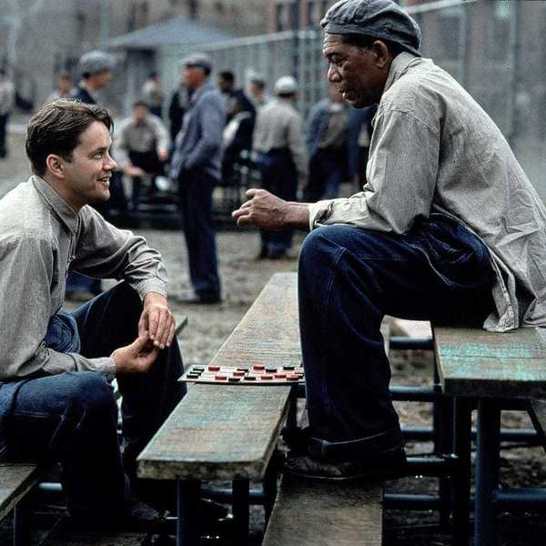
6. The Shawshank Redemption (1994)
Frank Darabont’s The Shawshank Redemption uses color to set the tone and indicate the characters’ growth throughout the story. Darabont keeps the gloom lingering within the high prison walls, with icy blues masterfully interwoven into the visuals through props and costumes, such as the prisoners’ uniforms.
He also plays with the brightness of the color, beginning with dull blues for Andy’s costume that gradually brighten, foreshadowing a positive turn in his life.
7. The Matrix (1999)
The Wachowski sisters have demonstrated a masterful use of an analogous color scheme in The Matrix. The directors rely on green as their primary color (a color widely associated with poison) to create a dystopian digital world that enslaves mankind.
The green is also reminiscent of the graphics of old analog computers or high-end coding software (green text against black), which further heightens the sense of digital simulation.
In addition to a green monochromatic color scheme, the Wachowskis also green-coded a lot of their visual motifs, including the digital rain.
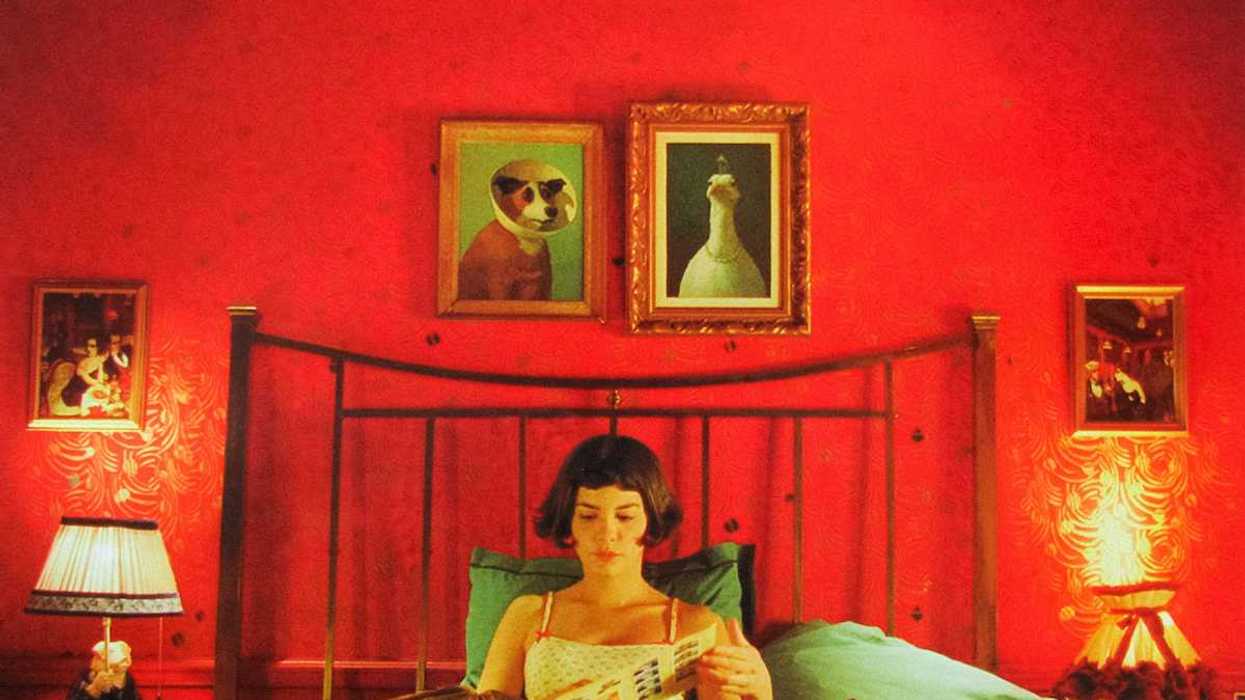
8. Amélie (2001)
Jean-Pierre Jeunet’s Amélie is notable for its contrasting use of color. Jeunet draws inspiration from across a wide range of art—classical to modern surrealism, primarily from the works of Brazilian artist Juarez Machado, whose paintings also adorn the walls of Amélie’s room. The narrative uses red for passion and love, as we see it prominently in Amélie’s apartment and in young Amélie’s costumes.
Also, her childhood scenes feature prominent red: the red raspberries or her bright red outfits come at you with emotional intensity. Amélie also embraces green as a representation of vitality and hope. The color balances the red, creating a contrast that adds to the surrealism. Amélie frequently wears green, sometimes adding tiny touches of red, maintaining a sense of both contrast and comfort.
Blues come in pops, such as the blue lampshade in Amélie’s living room.
The intentional use of color can seriously take your filmmaking game to the next level, adding dimension and depth to your narratives without sacrificing precious runtime, so make sure color is always an important part of your movie's visual design.
These sneaky colors are always communicating! Might as well direct their conversation in your own storytelling!
- The Secret of Movie Poster Color Schemes Explained ›
- How Color Has Become Such An Important Storytelling Tool in Cinema ›
- How a Film Color Palette Can Make You a Better Filmmaker [W/ Infographics] ›
- Learn the Basics of Using Color as a Powerful Storytelling Device ›
- What's With The Colors Green and Red in 'Vertigo'? ›
- The Psychology of Color in Film (with examples) ›
- Associative Colors Explained: Just One Can Impact An Entire Movie ›
- 10 Movies With Exquisite Monochromatic Color Schemes ›